Branding Portfolio
Brand is a valuable asset. When your naming and brand identity is relevant it sets you apart from your competition and establishes trust.
Chargenet branding
PSN and Lifeline brandin
Niko (Tesla Consultants) branding
Health branding
Health branding builds trust and connection by conveying care, credibility, and wellbeing through every aspect of a brand’s identity.
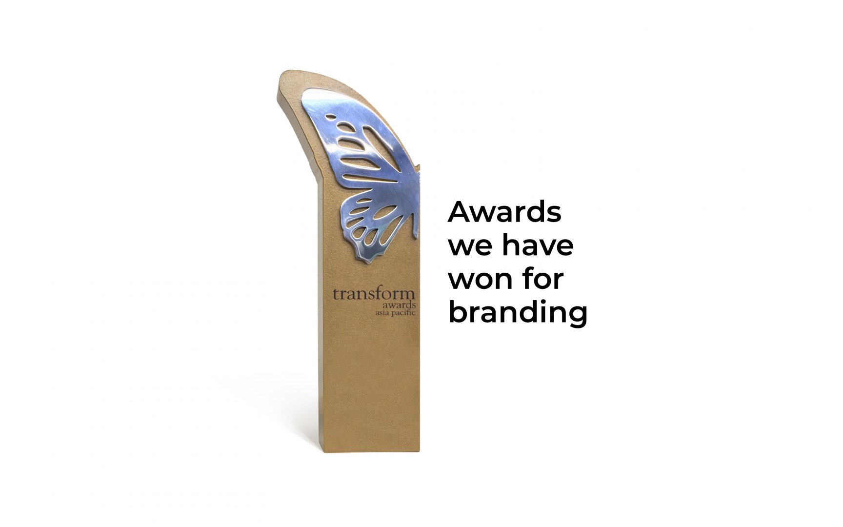
Our Awards
Explore Re:brand’s regional and international awards for naming, identity, and strategic branding work.
Cancer Support New Zealand
A brand that leads the charge. A brand evolution for ChargeNet – New Zealand’s leader in EV charging and infrastructure.
Allevia
Allevia: a modern healthcare brand for New Zealand, carrying forward a 140-year legacy through clarity and strategic naming.
Chinese Medicine Council of New Zealand
A brand that integrates. The Chinese Medicine Council of New Zealand needed a visual identity to bring to life this new organisation recognising Chinese Medicine as a relevant part of the kiwi patient journey.
Hospice New Zealand
Our services started with reviewing, redesigning, and rebuilding their website to allow a much more modern, functional and engaging members portal experience.
Cancer Society
Branding and design of the Cancer Society’s retail brands for NZ and export markets, across multiple ranges over 15 years
Intra
Branding that cares. A full rebrand, including name change, for New Zealand’s leading image-guided healthcare company.
Mercy Hospice
Rebranding for Mercy Hospice who have a long tradition of providing specialist community palliative care and hospice services.
Proactive
A gold-award winning brand project for Proactive who are New Zealand’s leading health provider for accident rehabilitation.
Corporate branding
Corporate branding defines how a company presents its identity, values, and reputation to create a cohesive and trusted image across all audiences.
enteria™
A brand that leads the charge. A brand evolution for ChargeNet – New Zealand’s leader in EV charging and infrastructure.
Revive Residential
A brand that revives. A rebrand that allowed this amazing building company demonstrate they were not your typical builder.

Hawkeye Finance
Explore how we named Hawkeye Finance, a brand that brings clarity and perspective to property financing.
Knowhow
A brand that knows. Knowhow wanted to grow their business, so they sought our help to intimately understand their business and new market opportunities.
Harrowfield People Development
A brand that shapes people. We re-envisaged the brand for Harrowfield who wanted to really stand out and demonstrate their uniqueness.
NZ Banking Association
A brand to bank on. An organisation that intertwine the interest of both banks and New Zealanders to lead to a strong banking system benefiting all kiwis.
Finance Law
A brand for greater outcomes. A rebrand that allowed this organisation focus on helping their client’s finance grow and protect their business, through the perfect legal advice, lead and support.
Torlesse
A brand that is underground. A geotechnical engineering expertise that is all about knowing clearly what lies underneath, helping builders to build above it.
Social Nature Movement
Social Nature Movement. A nature immersion for team building that needed dedicated online content.
Cordiner King
A brand that finds leaders. Cordiner King (Australian Executive Search firm) had an old, dated website did not help attract premium clients. A new website now does.
Capire
A brand that clarifies. Capire, formerly Helen Bradford Editor, needed a new brand to match the highly professional experience she has. Capire now delivers clarity.
Marley Loft
A rebrand and brand design for Marley Loft – one of Newmarkets oldest accountancy practices. A brand that informs business decisions.
Hobson Leavy
Rebranding for NZ’s leading executive search company based in Auckland. We elevated their brand to an executive feel and presence that matched service quality and expectations.
Technical Recruitment Solutions
TRS had grown their reputation to become a recognised recruitment leader across various engineering, construction & technical industries.
Naming
Naming is the art and strategy of creating a distinctive, memorable name that captures a brand’s essence and connects with its audience.
Cancer Support New Zealand
A brand that leads the charge. A brand evolution for ChargeNet – New Zealand’s leader in EV charging and infrastructure.
enteria™
A brand that leads the charge. A brand evolution for ChargeNet – New Zealand’s leader in EV charging and infrastructure.
Allevia
Allevia: a modern healthcare brand for New Zealand, carrying forward a 140-year legacy through clarity and strategic naming.
Mai Lighthouse
We transformed Franklin Family Support Services into Mai Lighthouse—a brand that empowers and guides whānau towards wellbeing.
Real Meals
A brand that is real. We helped Absolute Wilderness navigate a very successful rebrand to Real Meals to drive brand loyalty & sales.
Okin
Okin – a brand that’s dependable. Read how we rebranded the trusted office brand Icon to give it a stronger, consumer-focused identity.
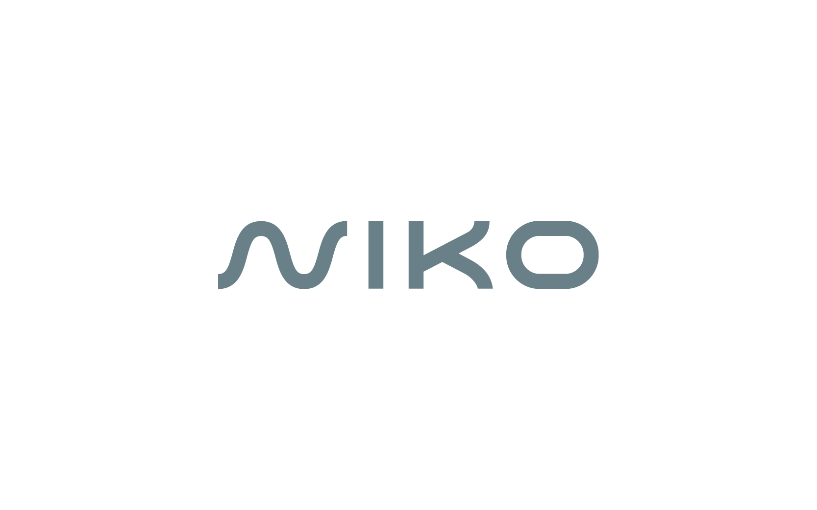
Niko
A brand that electrifies. Electric power engineers from Niko needed to move away from their beloved name to avoid confusion with an certain EV giant.
Octo
A brand that multitasks. Wanting to agglomerate three industrial service organisations, Mike came to us to find the perfect name and identity for the new brand.
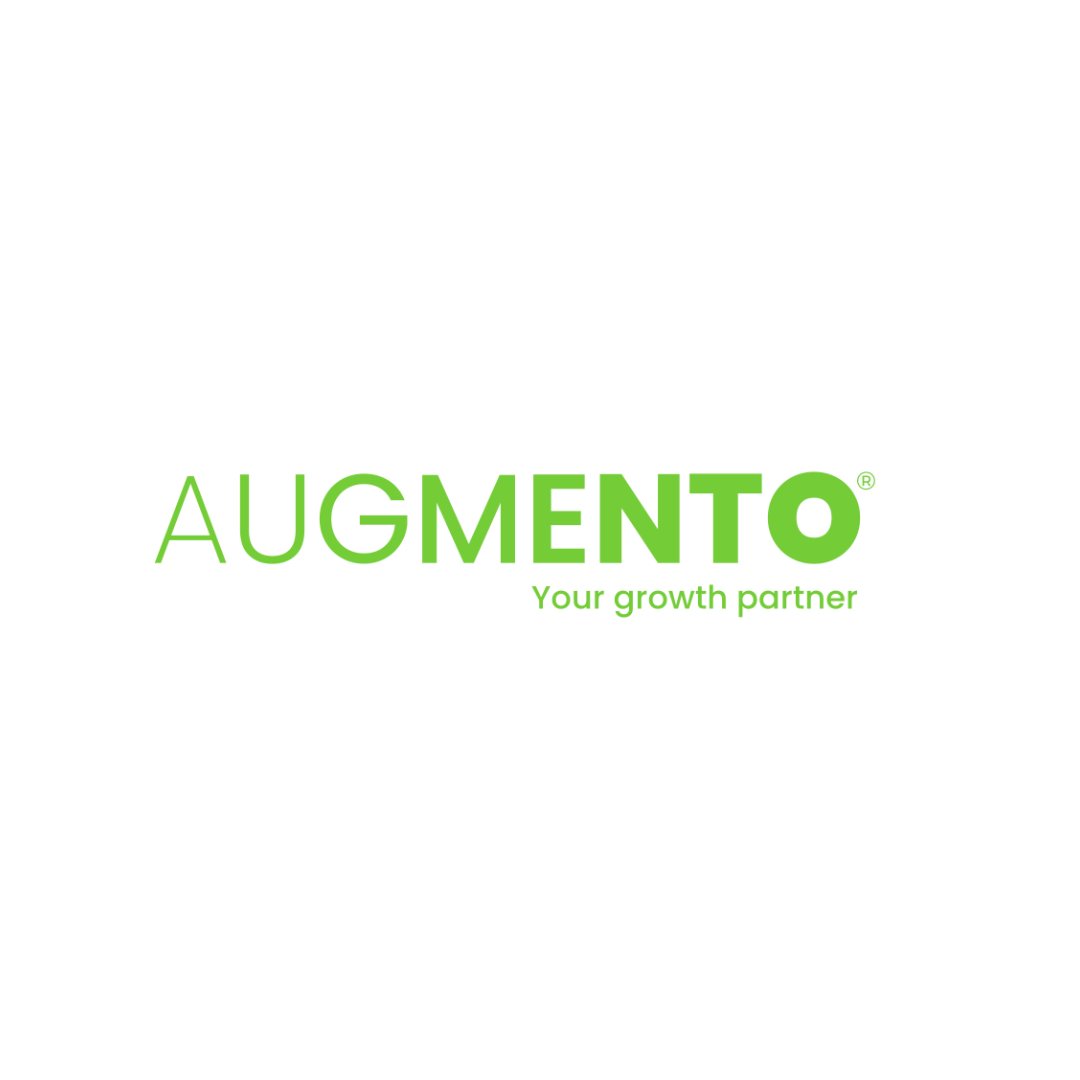
Augmento
Augmento, a brand that grows. Evolving from a traditional supplier to a strategic growth partner thanks to a refreshed approach to the brand.
Envisory
A brand that Energises. Envisory wanted to leverage and embrace their uniqueness to create a new future.
Hawkeye Finance
Explore how we named Hawkeye Finance, a brand that brings clarity and perspective to property financing.
Finance Law
A brand for greater outcomes. A rebrand that allowed this organisation focus on helping their client’s finance grow and protect their business, through the perfect legal advice, lead and support.
Future Partners
A brand that’s future-focused. Kirsty Burnett needed a brand to embody her commitment to support development project services in the Pacific area.
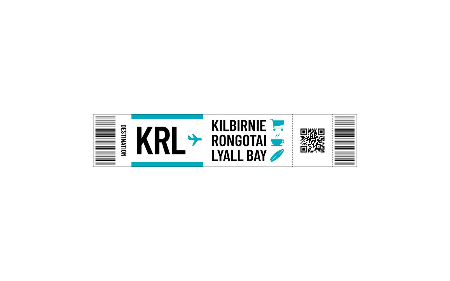
KRL
We created a new brand to launch the merger of the Kilbirnie Business Network with Rongotai and Lyall Bay – three distinctive areas in Wellington.
Capire
A brand that clarifies. Capire, formerly Helen Bradford Editor, needed a new brand to match the highly professional experience she has. Capire now delivers clarity.
pH7
A brand that neutralises hazards. PH7, formerly Dalton International, wanted to evolve their brand to stand out in a cluttered market and be more engaging to consumers.
SEQA
A BRAND THAT IS SECURE.
Design and rollout of information-security company SEQA, pronounced “secure”.
Intra
Branding that cares. A full rebrand, including name change, for New Zealand’s leading image-guided healthcare company.
ZeroJet
Formerly Voltaic Jet Systems, ZeroJet’s story began in 2014 when they opened the world’s first Jetsurf Experience Centre.
FMCG branding
FMCG branding creates instant recognition and emotional appeal, driving consumer preference and loyalty in highly competitive, fast-moving markets.
Real Meals
A brand that is real. We helped Absolute Wilderness navigate a very successful rebrand to Real Meals to drive brand loyalty & sales.
Okin
Okin – a brand that’s dependable. Read how we rebranded the trusted office brand Icon to give it a stronger, consumer-focused identity.
Augmento
Augmento, a brand that grows. Evolving from a traditional supplier to a strategic growth partner thanks to a refreshed approach to the brand.
Cancer Society
Branding and design of the Cancer Society’s retail brands for NZ and export markets, across multiple ranges over 15 years
Packaging
This type of graphic design can be used for packaging, printing, signage, and labelling.
Māori branding
Māori branding weaves cultural authenticity, whakapapa, and storytelling to create brands grounded in te ao Māori values and meaningful connection.
Allevia
Allevia: a modern healthcare brand for New Zealand, carrying forward a 140-year legacy through clarity and strategic naming.
Mai Lighthouse
We transformed Franklin Family Support Services into Mai Lighthouse—a brand that empowers and guides whānau towards wellbeing.
Presbyterian Support Northern
Presbyterian Support Northern – A brand that empowers. The centennial charity brand needed a refresh, through cohesive and inclusive design.
NZ Piling
Discover how we transformed NZ Piling’s brand with a modern logo and a user-friendly website, driving their success.
NZ Banking Association
A brand to bank on. An organisation that intertwine the interest of both banks and New Zealanders to lead to a strong banking system benefiting all kiwis.
Growing Spaces
A brand that’s grounded. A proud Māori owned and operated business, ready to embrace their whakapapa and leverage this part of their identity to create “spaces that matter”.
Te Kete Hono
A brand that’s woven. Improving educational outcomes and equity for all learners in New Zealand through a solid branding inspired by Māori weaving symbolism.
Te Kupenga
A brand that is Unified. Te Kupenga is a new ‘mother’ brand for an existing stable of Catholic organisations where we defined the brand architecture, identities, and designed the website.

Māori Branding Expertise
Māori Branding and Expertise Waitohu Māori, Tohungatanga Tā Return to our Work page See also Māori illustration
Technology branding
Technology branding combines innovation and clarity to build trust, convey expertise, and make complex ideas accessible and engaging.
ChargeNet
A brand that leads the charge. A brand evolution for ChargeNet – New Zealand’s leader in EV charging and infrastructure.
Niko
A brand that electrifies. Electric power engineers from Niko needed to move away from their beloved name to avoid confusion with an certain EV giant.
Liquid IT
Branding that is fluid. A brand refresh for Liquid IT who are experiencing rapid growth as a new leader in IT services.
Envisory
A brand that Energises. Envisory wanted to leverage and embrace their uniqueness to create a new future.
Bastion – Security Group
A brand that protects. Facing a pivotal merger, Bastion Security Group needed a relevant, unified identity.
SEQA
A BRAND THAT IS SECURE.
Design and rollout of information-security company SEQA, pronounced “secure”.
ZeroJet
Formerly Voltaic Jet Systems, ZeroJet’s story began in 2014 when they opened the world’s first Jetsurf Experience Centre.
Qual IT
Qual IT faced a new issue. While they had good growth in a new market they realised the market wasn’t clear on the brand positioning and offering.
Industrial branding
Industrial branding communicates strength, reliability, and expertise, positioning businesses as trusted partners in delivering high-performance solutions.
NZ Piling
Discover how we transformed NZ Piling’s brand with a modern logo and a user-friendly website, driving their success.
Alliance Fire & Security
A brand that safeguards. How a refreshed brand identity sets a new standard for protection and reliability.
Octo
A brand that multitasks. Wanting to agglomerate three industrial service organisations, Mike came to us to find the perfect name and identity for the new brand.
pH7
A brand that neutralises hazards. PH7, formerly Dalton International, wanted to evolve their brand to stand out in a cluttered market and be more engaging to consumers.
Keola
In a sector where the level of design is typically lacking, we designed the business as modern, sophisticated and reflecting the construction industry.
Pragmatix
Pragmatix are a specialist project and property consulting company and comprised of internationally experienced senior professionals.
Social Services branding
Social services branding focuses on building trust, empathy, and community connection while clearly communicating the organisation’s purpose and impact.
Cancer Support New Zealand
A brand that leads the charge. A brand evolution for ChargeNet – New Zealand’s leader in EV charging and infrastructure.
Mai Lighthouse
We transformed Franklin Family Support Services into Mai Lighthouse—a brand that empowers and guides whānau towards wellbeing.
Presbyterian Support Northern
Presbyterian Support Northern – A brand that empowers. The centennial charity brand needed a refresh, through cohesive and inclusive design.
Auckland Rescue
Auckland rescue – a brand that save lives. Read how we helped the Helicopter charity brand move to the forefront, boosting visibility.
Busy Bees
A brand with buzz! The leading global childcare centre brand Busy Bees needed a genuine NZ-inspired take on their brand to launch in Aotearoa.
Future Partners
A brand that’s future-focused. Kirsty Burnett needed a brand to embody her commitment to support development project services in the Pacific area.
Olé Football Academy
A brand that shows the way. Ole FA went through a full brand evolution including detailed brand research, strategy and brand design.
Wellington Community Fund
Rebrand was commissioned to undertake brand research with community and iwi partners for the Wellington Community Trust.
KRL
We created a new brand to launch the merger of the Kilbirnie Business Network with Rongotai and Lyall Bay – three distinctive areas in Wellington.
Te Kupenga
A brand that is Unified. Te Kupenga is a new ‘mother’ brand for an existing stable of Catholic organisations where we defined the brand architecture, identities, and designed the website.
Hospice New Zealand
Our services started with reviewing, redesigning, and rebuilding their website to allow a much more modern, functional and engaging members portal experience.
Trail Fund
Trail Fund Testimonial Return to our Work page