BRANDING THAT IS CERTAIN
A brand refresh for Qual IT – a leading company in the IT quality assurance space for large Government and private organisations.
Strategy | Positioning | Internal Clarity | Tone of Voice | Design | Signage
 Project Outline
Qual have been a client of ours for 15 years and we’ve evolved their brand a few times (some large, some small) during this time. However, they faced a new issue. They’d seen good growth in a new market (Auckland) while also expanding their service lines but they realised the market wasn’t clear on the brand positioning and offering.
We engaged the Senior leadership Team (SLT) to understand where the company was now, where they wanted to be and what this could look like. We did extensive competitive analysis to understand the marketplace, how they looked/talked and how they all positioned themselves in the market. What became clear was a cluttered marketplace with generic claims to success and not a lot of differentiation. We had an opening.
We distilled the brand to a clear What, How and Why and mapped how we can differentiate through position, vernacular and identity.
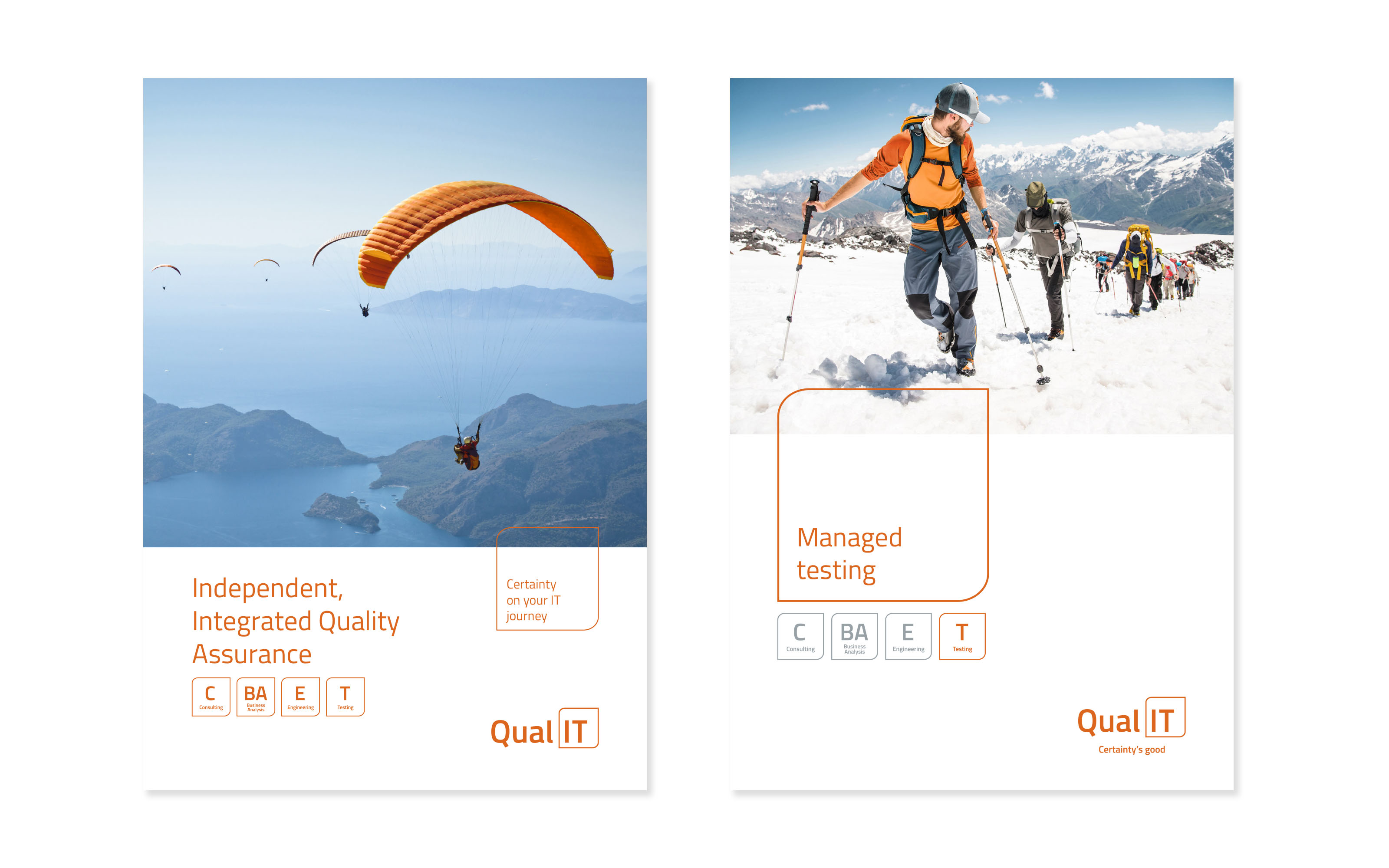
This resolved to one word – certainty.


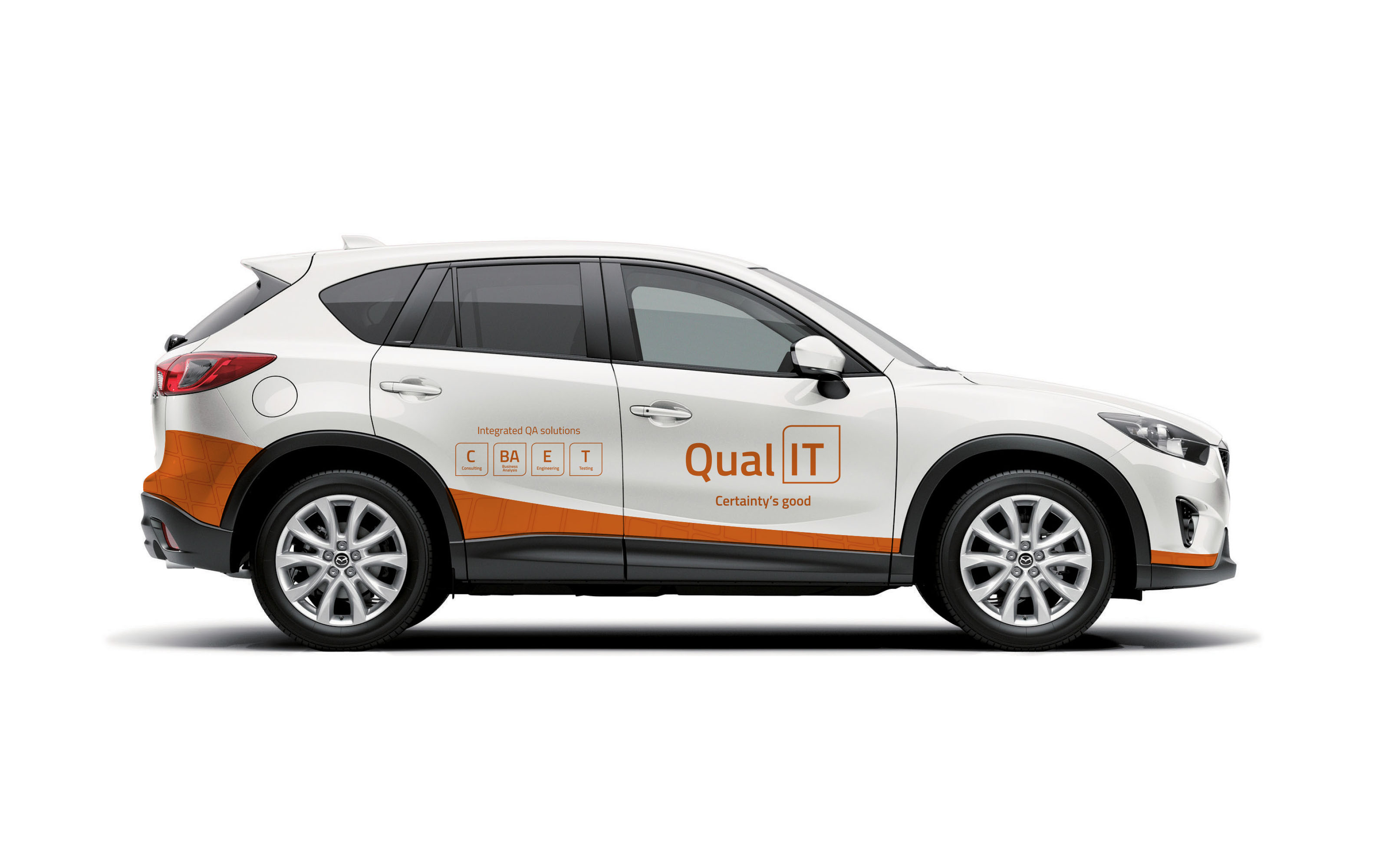
The design direction took this cue and reinforced it with strong visual images that differentiated from the bright, colourful shapes and ‘tech’ feel. We created a clean, sophisticated and confident brand that stamps their mark on the industry to their pedigree and trust they deserve.
The result is a brand that is certain of who it is.
![]()