A brand that integrates
Brand workshops | Competitive Assessment | Positioning | Brand Strategy | Brand Design
Project overview
The Chinese Medicine Council of New Zealand was created in 2023 to establish regulatory standards for Chinese Medicine in New Zealand.
The intention was to bring two benefits to the population – protecting the public through practitioner registration in a national structure and compliance with professional national standards; and recognising Chinese Medicine as a relevant part of the kiwi patient journey.
The Chinese Medicine Council of New Zealand board appointed us to help them bring their new organisation to life through a strong and relevant visual identity. We therefore worked on creating a brand that would integrate Chinese Medicine in New Zealand patients journey.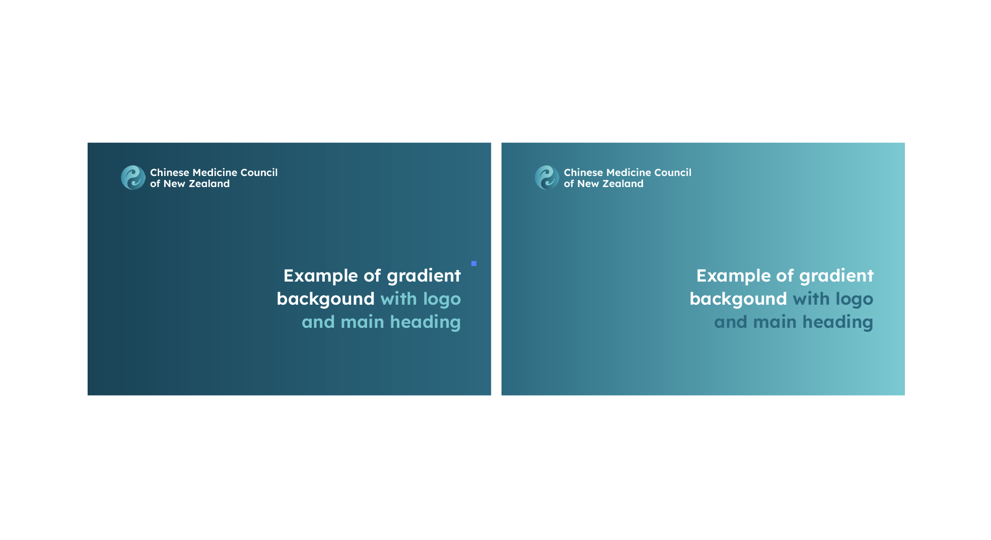
Research and Strategy
We conducted a workshop with a passionate team who needed to translate the essence of Chinese Medicine while positioning it as a legitimate and efficient part of the patient’s recovery or treatment journey.
The workshop helped us understand the clear need for a “serious” looking brand. It needed to own a position of “regulator”, a “National Authority” that was sitting above professional independent associations. The Chinese Medicine Council of New Zealand needed to be a brand that integrates both patients and professionals.
The project team also needed the brand identity to encapsulate both tradition and modernity. Its visual depiction needed to sit halfway through traditional/ancestral practices and the modernity of a strong and reliable patient option in modern medicine.
Finally, the New Zealand aspect was critical to this new brand. Although being the “Chinese Medicine Council”, it was intended to live in NZ, and designed to help the NZ public. The brand needed to integrate, even merge, New Zealand, and possibly Māori, and Chinese cues. They were adamant that the red colour should not be part of these cues and that was both a surprise and a great challenge!
While the name of the brand had been decided by the government health organisation and couldn’t be changed or amended, we had full latitude to explore concepts to visually convey the above positioning.![]()
Creative and Brand Design
We first settled on the Qing colour, a delicate and sophisticated teal that Chinese mythology associates with dragon scales colour. Then, we worked on a fusion of Chinese and Kiwi aesthetics, building on the similarities between Ying Yang and Māori koru ‘spiral’. Both have comparable meanings of positive-negative balance and none was ‘tapu’ in terms of allowing variations.
The intention was to symbolise the regulation of Chinese medicine in New Zealand. Inspired by Gordon Walters (mid century NZ artist) and the modern adoptions of koru aesthetics in New Zealand art, we therefore looked at extending ying yang dots to form koru.
The project team immediately embraced this concept and the development of the new identity rolled out very quickly to meet the launch timeline the Health Organisation was aiming for.
Results
As the Chinese Medicine Council of New Zealand was officially launched this spring 2023, the board felt confident. Empowered and full of hope, they were certain to make a positive difference in the lives and health of New Zealanders. And we were really proud to have been part of this.