Te Kete Hono

A brand that’s woven

Brand workshops | Brand Messaging | Brand Design |Graphic Assets

Project overview

Te Kete Hono – SchoolTalk (formerly just School Talk) is a social enterprise that turns innovation in education into products and tools that improve learning outcomes for all students. From software to applications and methodology proposed to the teaching workforce to improve and ease learnings, Te Kete Hono is all about improving educational outcomes and equity for all learners in New Zealand.

When they reached out for help, they were in need of a new brand identity to convey this new name. We soon also figured out they needed help to clarify their offer to convey a more efficient messaging to their target audience.


Te Kete Hono web banner

Research and Strategy

We’re an evidence-led agency.

From our first workshop with the project team, we understood that Te Kete Hono was all about collaboration. Teachers, parents and kids were to work alongside and with each other to make the most of the tools.

As their mission was to build this powerful collaboration to drive educational improvement and equity for all learners, we knew that the concepts of connection and interdependence were going to lead the messaging part and the visual identity of the brand.

Their name itself “Te Kete Hono” was deeply conveying this partnership approach.

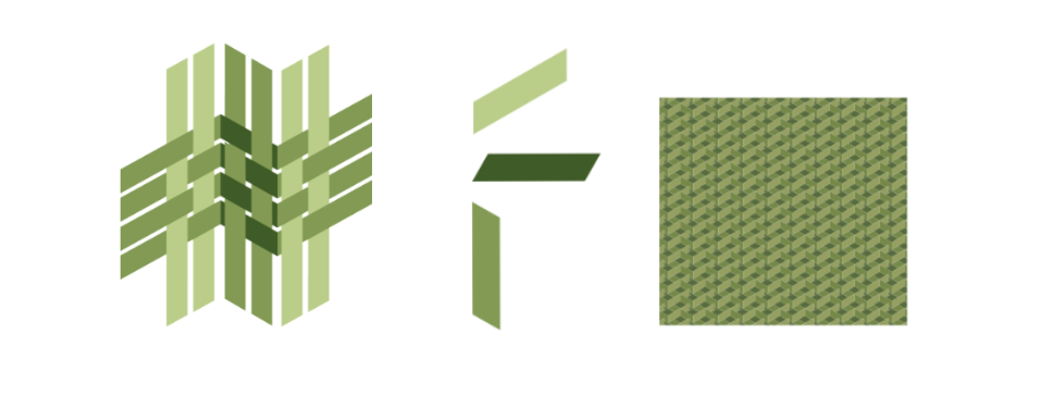
“Te Kete” means “the basket”, and to us, it was an illustrative way to express the organisation’s ambition to hold the child safe while they learn. As the fibres – representing parents, teachers and children- join together to be woven in a basket, they create a solid net of support and cohesion to enhance and nurture the learning experience.

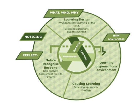
“Hono”, that means to link, to join, to connect, was strengthening this concept, referring implicitly to the TLA (teaching, learning & assessment) cycle that Te Kete Hono is promoting.

We identified this end-to-end, on-going weaving as their unique way of working, their way of creating an efficient process to improve learning equity. From the singular and specific, individualised learning approach dedicated to each child, the collaborative association of every actor within the online tools that Te Kete Hono was developing, allowed effective teaching, ensuring progress for every learner.

Te Kete Hono Learning Teaching Assessment

Creative and Brand Design

From there, we obviously wanted to bring up the three dimensions of Te Kete Hono commitment:  a woven approach to teaching and learning, a multi dimensional support, online and physical, serving learners unique pathways by encouraging them to cross others to make progress.

Our creative team explored numerous options to communicate the concept of basket and weaving but also to include diversity and the process element that was at the core of the brand positioning.

It was decided to focus on the weaving part of the messaging as we believed it was the strongest way to visually articulate the brand’s purpose.

The logo was based on a symbolised Harakeke (New Zealand flax) weaving into multi-dimensional, organic pathways. The three strands were to represent the child, the parent and the teacher. The green colour was preferred to carry the organic, original, natural aspect of rangitahi (youth) growth.

We also provided them with background patterns and strands shapes to be used as graphic devices wherever they felt a need for them.


Te Kete Hono shapes and Patterns_Green


Conclusion

The project team was very enthusiastic with their new branding and populated it straight away on their website and collateral. Since their launch, they have developed new products that truly live and breathe through their new brand identity.

They can now fully focus on turning innovative school leadership and practice into educational systems, products and services that can be impactful at scale for New Zealand teaching and learning – ka pai!

Te Kete Hono website Mock up

Te Kete Hono Testimonial

Return to our Work page

Log in with your credentials

Forgot your details?