NZ Banking Association

A brand to bank on.

Brand workshops | Competitive Assessment | Positioning | Brand Strategy | Messaging | Brand Design 


Project overview

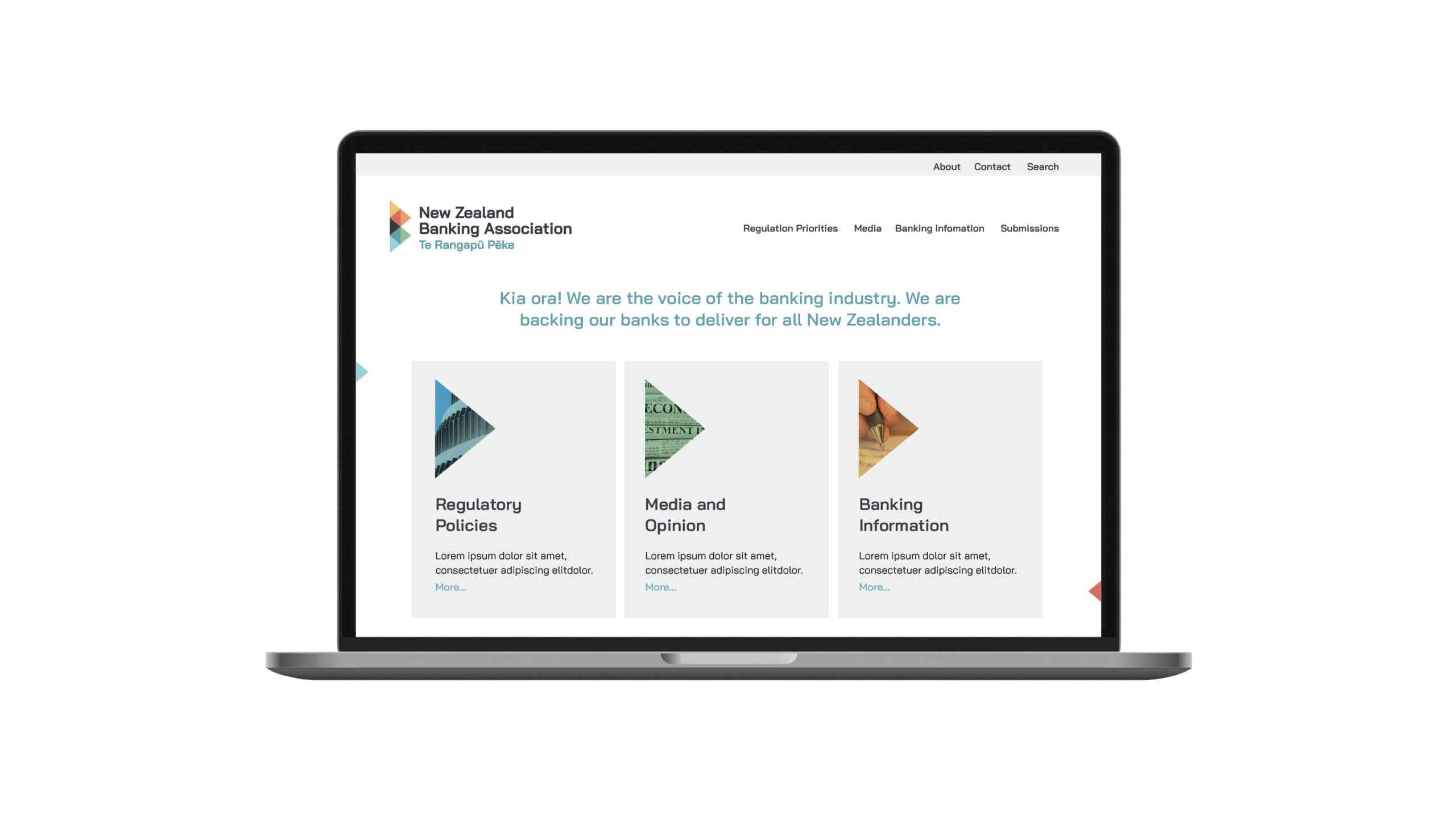
The New Zealand Banking Association (NZBA), formerly known as  “New Zealand Bankers Association”, is a forum for member banks to work together on non-competitive industry issues. Being a non-profit, unincorporated organisation funded by its members (banks) through subscriptions, it needed to better reflect the actual banking environment through an overall modernisation.

As they were wanting to embrace their credible yet inviting, authority yet approachable positioning, the NZBA team wanted to strengthen their New Zealand anchorage, enabling them to convey their main messages to kiwis.

To move in this direction, they had their name translated into Te Reo. However, they were unsure how to display and use it relevantly and in a genuine way.


NZBA website

Research and Strategy

We’re an evidence-led agency.

To better understand where to take the refreshed brand, we engaged with them in a team workshop, and guided them through a brand assessment. This unveiled that success for them was to be recognised straight from their acronymed name, adding a pertinent Māori lock up or design to support their Māori name choice.

Their Māori name, “Te Rangapū Pēke” was built on the idea of a partnership that also has a strong connection to business: “Rangapū”.

Ranga – short for raranga, or to weave – was highlighting the role of the NZBA in weaving together the collective voices of the NZ Banking Industry. “Pū” was bringing the double meaning of a “skilled person”, a “wise” person, and “money” (taken from “Pūtea”), the main business of banks. 

This translation and its meaning was therefore questioning the “Bankers” terminology. As the objective was to weave, to intertwine, the interest of banks and New Zealanders to lead to a strong banking system benefiting all kiwis, “Bankers” sounded too narrow and too far from New Zealanders everyday lives.

We proposed a slight evolution to “Banking”, reinforcing the authority status while making the organisation more approachable from a public perspective.

NZBA Report templates

Creative and Brand Design

As we moved into brand design, we focused on concepts that would clearly express the relationships between banks that are stronger and more stable when working collectively (weaving a system together), and therefore more able to talk with a united voice, supporting the NZ economy the best possible way.

Inspired by the Te Reo Māori etymology of the name, we designed a woven ‘B’ for Banking, using triangular shapes inspired by “raranga”/ “weaving”. Based on the Māori tāniko pātikitiki style (finger weaving triangle pattern.), this “triangle-B”, intends to represent NZ banks moving forward together to deliver for all New Zealanders.

NZBA creative process


Conclusion

As we handed over their refreshed brand assets and guidelines to the NZBA project team, we were delighted to hear them praise their new identity and while their members shared great feedback on this evolution. Ka pai!

NZBA Testimonial

Return to our Work page

NZBA website

Log in with your credentials

Forgot your details?