pH7

A brand that neutralises hazards

pH7 work – Brand workshop | Consumer research | Brand research | Competitive Analysis | Positioning | Brand Strategy | Brand Naming | Brand design | Vehicle signage | Catalogue design

Background

Dalton International was a successful hazard protection distributor in New Zealand for over 20 years. They operated in the B2B market with a very high reputation and standing for customer service and product breadth and quality.

The Challenge

Dalton had been aware for many years there was confusion in their market about their name and people often struggled to find them easily as another Dalton (landscape supplies) existed. Equally the business had been refining it’s strategy and felt that possibly now was the time to reshape their positioning and brand to market.

Re:brand undertook a detailed workshops with the directors, competitive analysis of the major players in the NZ market (which is quite fragmented) as well as depth-interview with their retailers to understand market need and perceptions of Dalton International.

PH7 - Brand guidelines

The Results

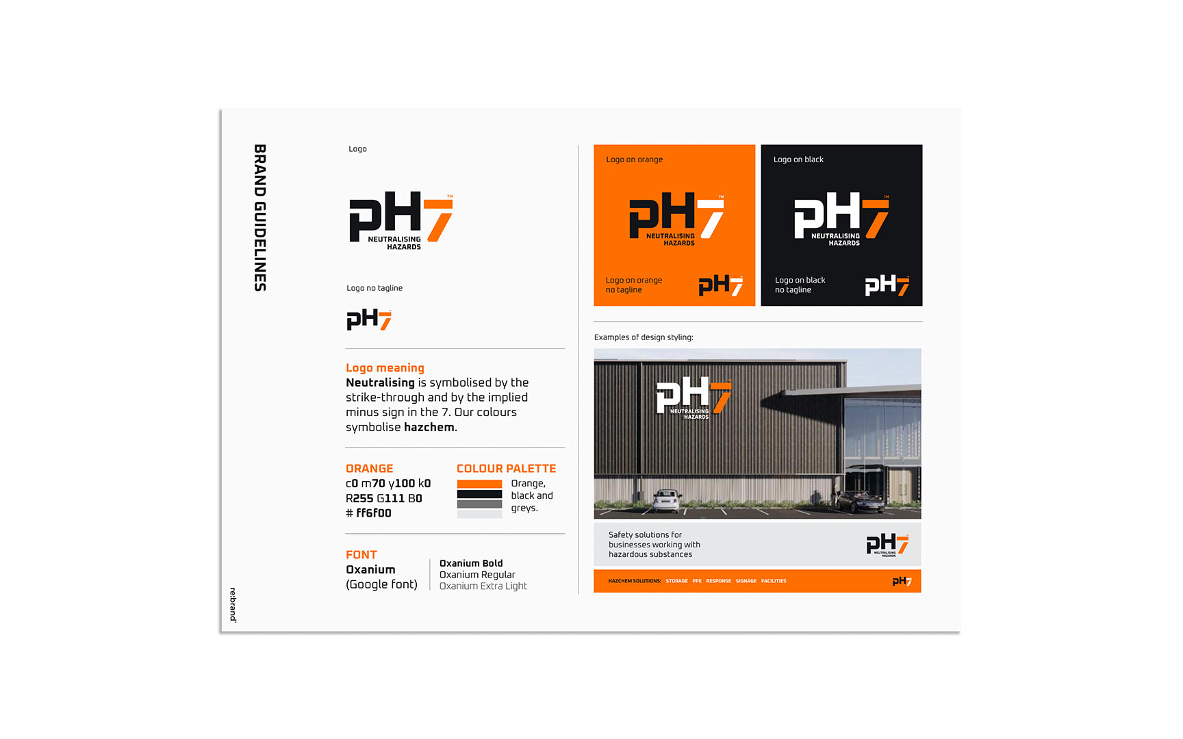
After distilling this research into a refined strategy and definition of the business it became clear that a name change would align best to the strategy and direction of the company. We undertook a naming process and developed the concept of neutralising hazards. This was then perfectly captured by the neutral ph score (of 7) in a litmus test of acidity.

After assessing a number of options this route was a clear winner. A short, meaningful name which was hoped would capture market attention.

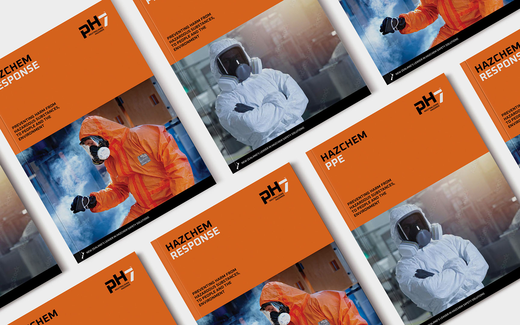
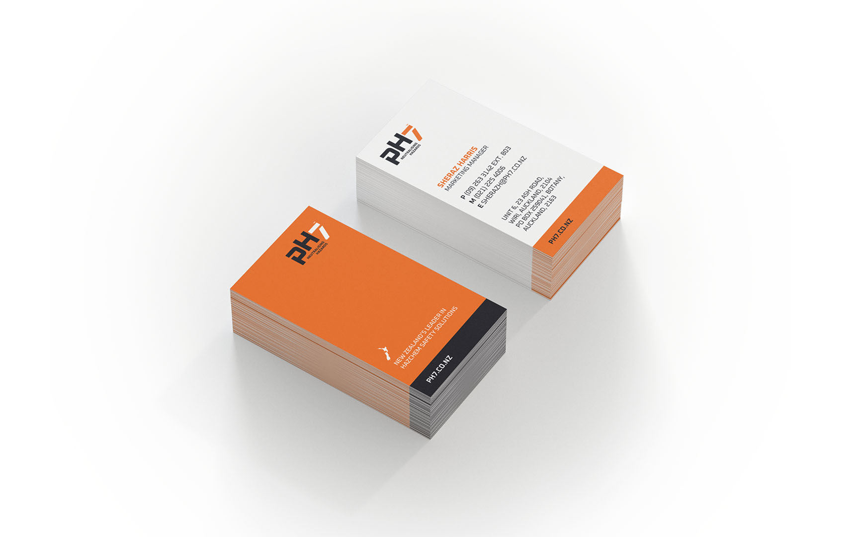
A new identity crafted around the hazard industry palette and look/feel was developed and refined. A strong, bold, trustworthy look was the way to signal to retailers and the market that pH7 was a brand-leader in this space.

PH7 - Catalogue cover designPH7 - Van graphics/livery designPH7 - Business Card Design

RESULTS

“Our recent change of name and branding to pH7 has been a huge success, feedback from our customers has been universally positive with many specifically pointing out that they remember pH7 being “neutral” from their high school chemistry classes. The most effusive feedback came from one of our suppliers who went through the thought process in real time while on a call to me. The conversation started with him asking why we changed our name but before I could answer he said “wait, pH7 is neutral, you’re providing safety products for the chemical industry and your tag line is neutralising hazards…oh man that’s so clever!”

While it’s very difficult to link specific sales results to the name change, anecdotal evidence is clear that the change has been well received by three important groups. Firstly, our own staff have got behind the change which has seen us create uniforms and marketing material that provides a clear focus for our business. Our staff are proud to be associated with a business that has a clear vision that can be easily communicated. Secondly, our suppliers have commented that the new branding makes it a lot clearer for them where our focus lies. They appreciate the fact that their products fit well with our core strategy, which will ultimately generate more sales for their business. Finally, our customers have commented that the new name and branding helps clarify our position in the safety market and is easy for their staff to remember.

The change to pH7 was driven by the desire to create a brand that communicated the why, how and what of our business, that stood out from the crowd and would help focus the minds of our staff, customers, suppliers and end users around the niche we want to lead in. I’m happy to say that four months on from the launch we’ve achieved all of these goals.”

Darryl Burn – Managing Director

Return to our Work page

Visit the pH7 website

Log in with your credentials

Forgot your details?