A brand that energises
Brand workshops | Consumer research | Brand research | Competitive Analysis | Positioning | Brand Strategy | Brand Naming | Brand Design | Website design and build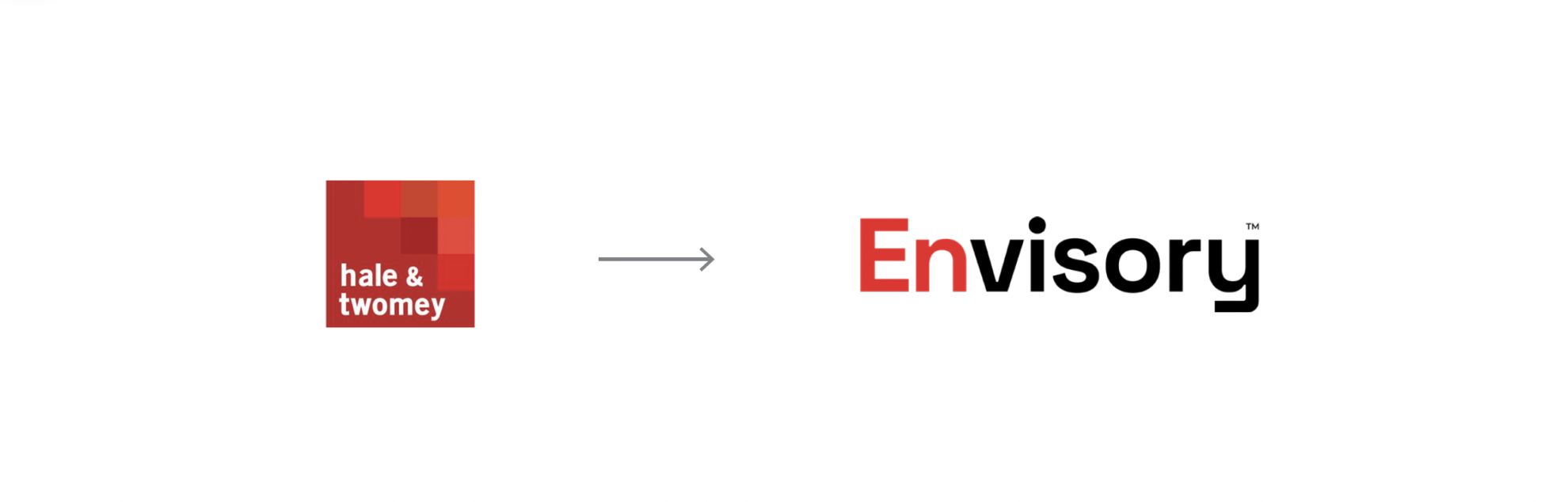
300% increase in clients acquired
“Since we rebranded in May 2023, we have secured 3 new clients when we would expect one, over a three-month period.” – Lisa Hobbs, ENVISORY
Project overview
Hale & Twomey (as they were known) are based in New Zealand and operate in the Energy Consultancy sector, serving clients in Australasia, the Pacific and Asia. When one of the founding and named partners, Richard Hale, decided to retire, they knew that now was a time to review their brand and how they position themselves in the market.
We conducted detailed research to understand them and the ecosystem they operate in – we undertook discovery workshops internally, we assessed the brand identity, we researched and mapped the competitor landscape and critically we spoke to 8 clients spanning Government and private clients to understand their needs and the perceptions of Hale & Twomey.
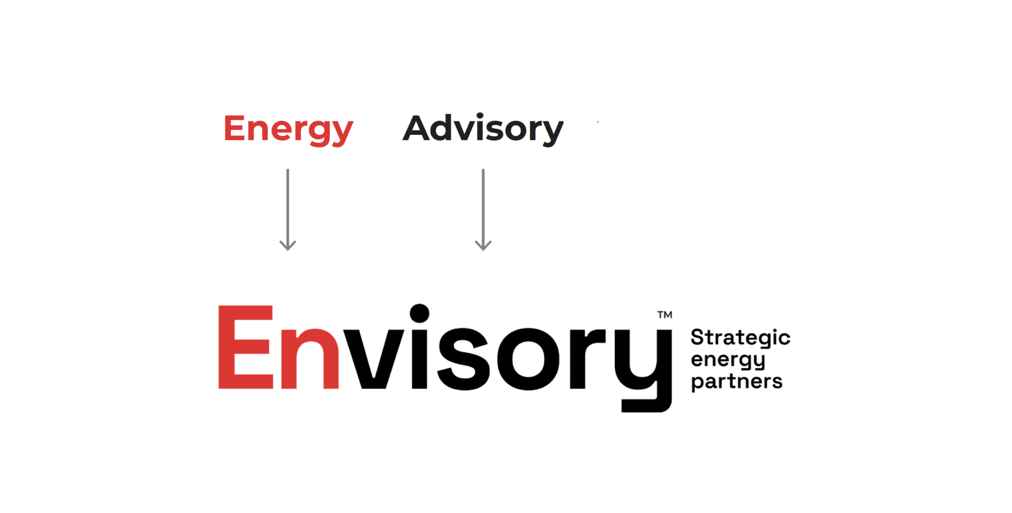
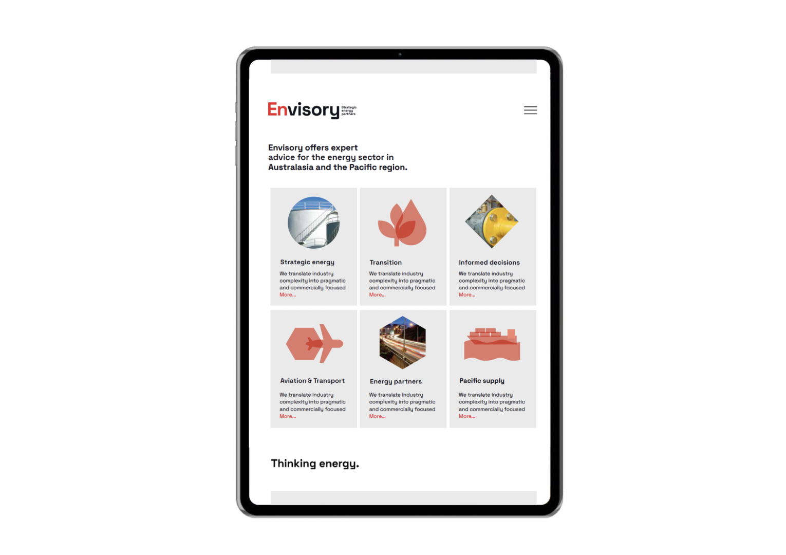
The unique name does the heavy-lifting in this brand:
The result is a name that has energised Envisory to own it’s rightful place at the top of the Energy consulting industry – and that’s translated into a 300% growth in clients acquired since launch.
“We are delighted with the results, and it has been well received in the market for a company that had been trading under its previous name for 22 years.”
– Ian Twomey, Director.
Industry Context
Hale & Twomey (H&T as they were known) have operated in the New Zealand energy sector for 22 years in a strategic advisory capacity. One of the three original Directors, Richard Hale, whom the company was named after had decided to retire so they thought this was the opportune time to have a look at their brand and their name.
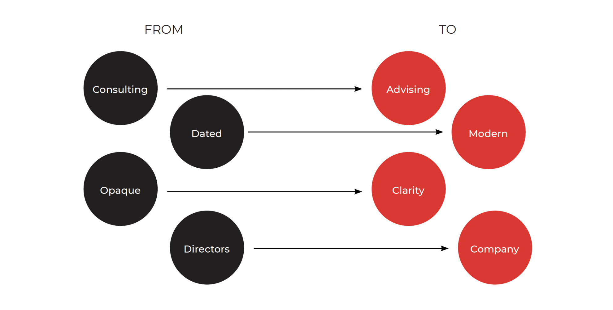
The Energy Consulting sector in New Zealand has very few ‘real’ players – mainly consisting of individuals who’ve worked within the industry in some capacity and decide to leave to ‘go out on their own’. They do however compete more so with consultancies from Australia and even as far as Singapore so they knew they had to be modern and relevant in an ever-increasingly competitive landscape.
The Challenge
The challenge was how do we move the business & brand forward when we’re losing a key personality and named partner from the business. Also, how to ensure we don’t lose any trust from a client-base of International government departments and large private companies, yet convey that we’re progressive and relevant in the modern world of energy consulting.
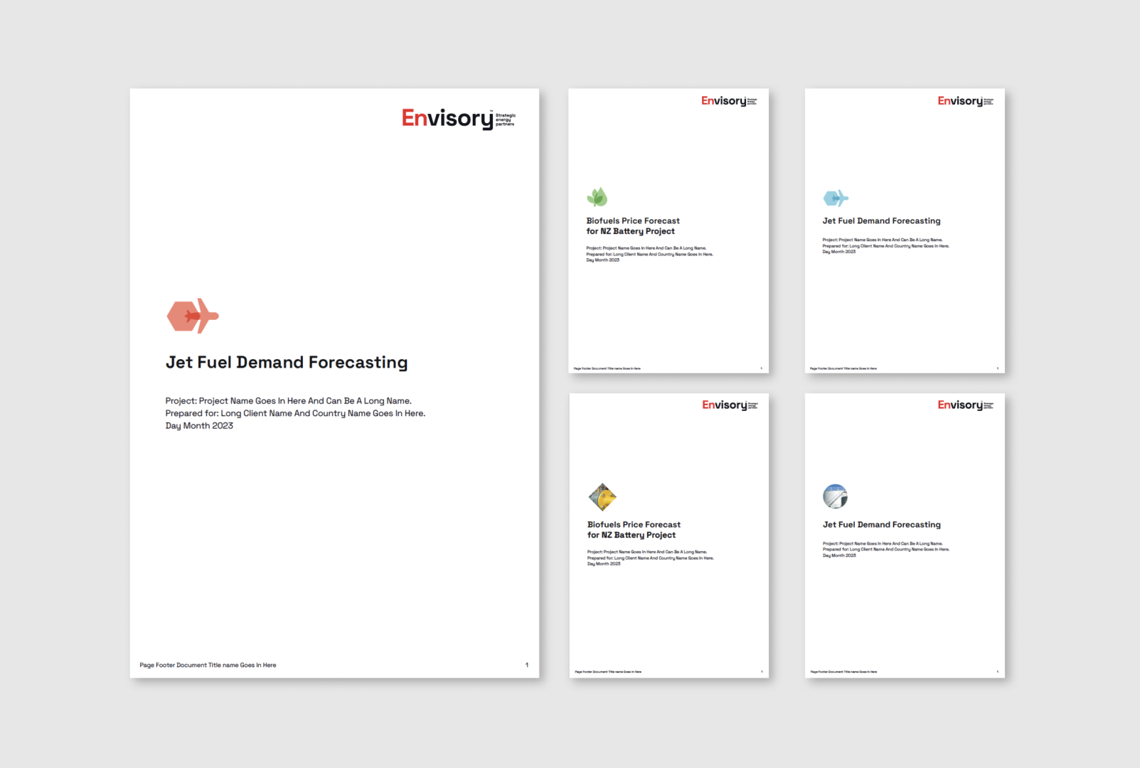
The brief was not to change name necessarily, it was to advise on what is the best outcome for the business and should we do a small change from Hale & Twomey or a giant leap away. The last challenge was to bring this brand to life through the identity and collateral – of which they are a report-heavy business as a critical output for clients.
Strategy | Evidence-gathering
Clearly we started with a discovery workshop with the directors & three staff to define the problem, understand the history and see the future. We obviously assessed the current brand – by pulling this apart we knew what was working, how they were positioning themselves and what cues (verbal and visual) they were using to do this. It was clear the brand was very old and dated and needed a big leap forward in modernity. Especially when we compared them to some of the competitors – which weren’t amazing but were still ahead of H&T.
Critically, we spoke with eight clients spanning Government and private organisations across the Pacific. These depth interviews allowed us to build up what their needs were from the sector, how they viewed the service and personnel from H&T and how much brand recognition and recall they had, and in particular ‘what did they think of the name: Hale & Twomey’.
The key insights were these audiences had more connection to the people in the company than the brand. They didn’t really understand the story and breath/depth of services H&T offered but did have strong recall of the original red colour used in the brand.
The objectives we devised were to move the brand:
We then explored a continuum of names from tweaking the current name (HT Energy) through to concepts in the Energy Consulting space – ThinkEn, Ensure, Ensight and Envisory. At first there wasn’t a clear-cut winner from a conservative directors group. We discussed these at length and rationalised how the ‘story’ would be told.
In the end, Envisory won out and a new name was born.
Name
The name perfectly summarises ‘what’ they do – Energy Advisory.
This clarity of positioning, compared to the competition, makes them stand out. It demonstrates a clarity of thinking, sophistication and intelligence (through the play on words) that they lend to projects. These traits perfectly articulate the personality and approach of the Directors and staff so it feels authentic. This was paired with a tagline – Thinking Energy – which reinforces the intelligence and insight they deliver.
Visual Identity
The unique name does the heavy-lifting in this brand and the visual identity simply supports that. The original red was retained – due to good client recall and uniqueness amongst the competitor set. A set of energy icons and shapes was designed to bring the name to life.
 Director Testimonial
“The process to produce the new business name involved specialised steps that assessed our core business and values in depth. The process was thought provoking and really focussed our attention in developing a new name that would suit the forward positioning of the business. Understanding market insights and particularly, client feedback was a useful tool in navigating the process.
We were given a large selection of names to choose from and received help from Re:brand in narrowing these down. We felt that we were listened to if we wanted to explore alternatives. It was great to work together as a team and consider different options and designs that we could choose from.
Having the rebrand experts made it a streamlined, more efficient process, than it would have been otherwise. We are delighted with the results, and it has been well received in the market for a company that had been trading under its previous name for 22 years.”
– Ian Twomey, Envisory Director
A few clients quotes…
“Love the new name”
“The new logo is very clear and looks sharp”
“We have had lots of positive comments on our new name Envisory. People have commented that they love the colours and clarity of our logo.”
– Lisa Hobbs, ENVISORY