Revive Residential

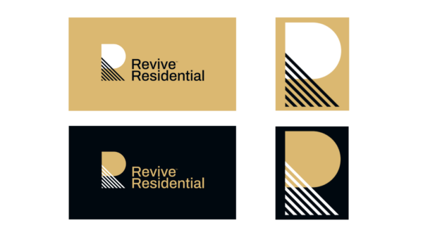
A brand that revives

Workshop | Competitors assessment |Positioning | Brand strategy | Brand Design | Guidelines

Project overview

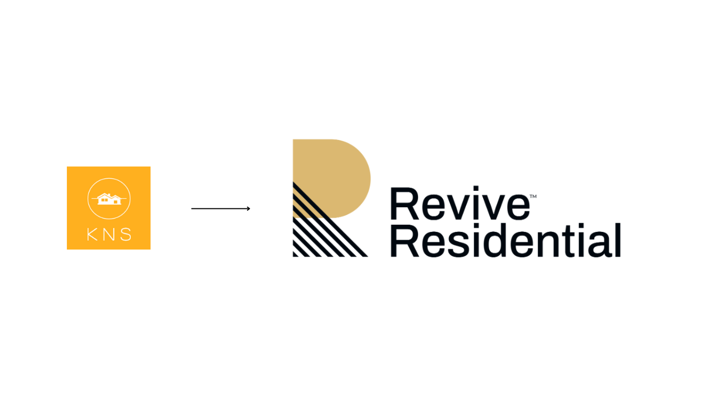
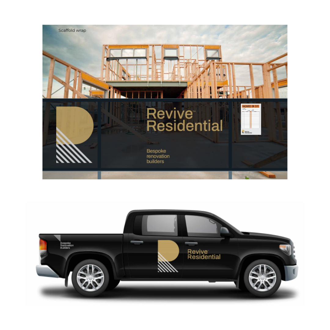
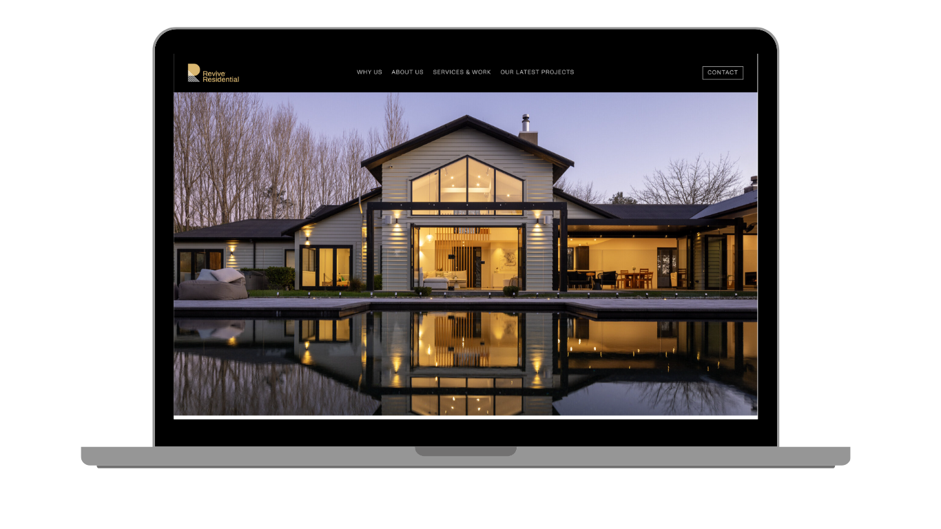
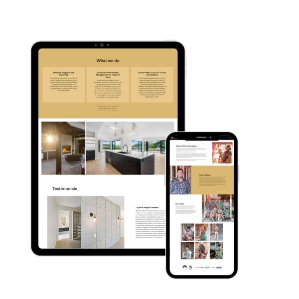
Shaun Jenkins is the owner of KNS, a successful, Auckland-based building company who pride themselves on their bespoke approach to bring to life their clients dream home. After a number of changes within the company Shaun believed that now was a time to review his brand and take it in a new direction that aligned more closely with his ambitions. He renamed it to “Revive Residential”. 

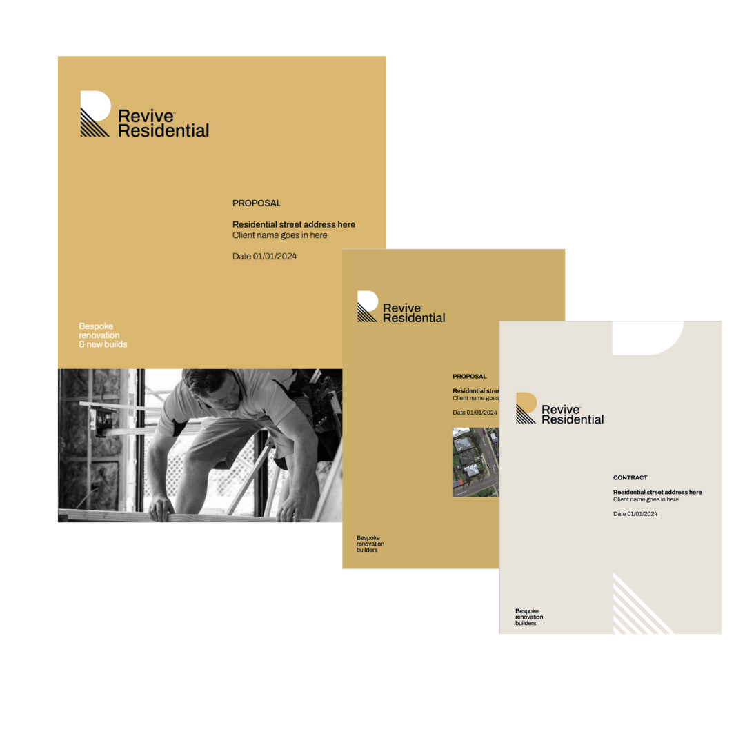
Although he was happy with this new name, he was unsure where to take it, especially visually. Furthermore, as he was using this time to refine his offer and consolidate his approach, he needed guidance on how to position his services in the market and how to make them live accurately under his new brand name.

His ambition was to evolve his brand to a more meaningful and empowering one which would be much more recognisable and inspiring.

Before/after Revive Residential logo

Research and Strategy

We’re an evidence-led agency.

We conducted a workshop with him to fully understand his strategy and ambitions. We concurrently assessed competition, researching how the main other building and renovation companies in Auckland were positioning  themselves. We quickly understood that Revive Residential was not your typical building company.

Their bespoke and caring, very respectful approach that KNS/Revive Residential had, was absolutely essential to differentiate.

report covers

Shaun could have been described as your “next door master builder”, very competent, genuinely kind and remarkably approachable and easy to deal with. And these ways of working were incredible strengths to address their target market, mainly families having to deal with one of the biggest investments of their life, therefore often under pressure or needing gentle reassurance backed up with flawless expertise.

As we were crafting Revive Residential messaging and claims, we put a strong emphasis on this. We proposed “the builders who care” as a tagline for the new brand, to fully embrace their difference on their market.

Creative and Brand Design

Revive Residential needed to look like the go-to Auckland company that specialises in bespoke renovations and build, being architectural, challenging heritage or high standards demanding homes.

We wanted to deliver a simple and modern look, with a hint of sophistication to tell the “high-end/bespoke” element, but we knew it also had to be soft and friendly, to convey the “respect” and “caring” approach that was core to this business.

logo rationale

A few other elements drove our inspiration such as proposing a look that felt “solid”. It was about house building, home crafting, so it needed to look strong enough that the audience would think Revive Residential knew how to build something durable.

Our team also wanted to deliver a very sleek and styled identity, to highlight the high quality standards that Revive Residential was working by. Bespoke and architectural was somehow key to them and we didn’t want to lose this.

Conclusion

Shaun was delighted with the stylised “R” which truly represented Revive Residential’s ability to combine innovative building techniques to achieve a beautiful, architectural result. This new logo and lock up positively look different from competition, supporting the company’s uniqueness better than ever. Revive Residential is now looking both premium and caring, stylish and solid, and Shaun told us he couldn’t have been more pleased with his new brand.


collateral revive residential

Revive residential website


Return to our Work page

Log in with your credentials

Forgot your details?