A brand that is underground
Brand workshops | Brand Positioning |Brand Messaging | Brand Design
Project overview
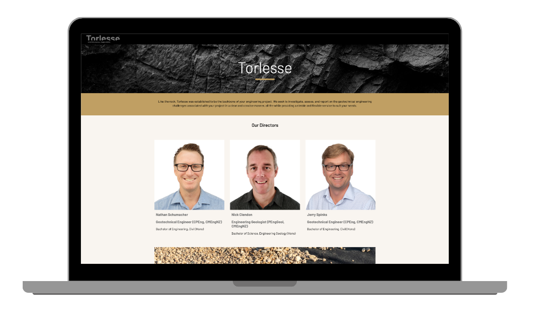
Torlesse is a professional services firm specialising in geotechnical and civil engineering solutions, based in the wider Wellington Region.
The three founding Directors – Nathan, Nick and Jerry- came to us soon after launching their company, as they needed help to accurately and relevantly position their offer. They also wanted to create a brand visual identity which would reflect this positioning and efficiently address their specific target audience.
Research and Strategy
 Following our process, we first ran a workshop with the directors. We needed to understand the industry, but also their specificities, their uniqueness and what their business was standing for.
We identified a few interesting aspects of the business, such as its ability to be nimble and accurate in a very demanding industry, relying on extremely reliable precision.
Torlesse’s modern and easy approach to their work stands out in their environment. Consistently delivering on time and on budget, they were recognised for a personable and honest attitude towards the projects they were working on.
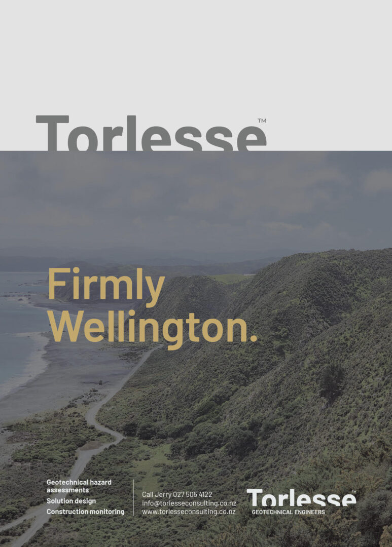
Their highly localised expertise, within the Wellington area, was also a strong part of their identity that we knew needed to be visible in their branding.
From there, we helped them clarify their positioning around a few ideas, playing on their name (Torlesse greywacke which is the predominant type of rock found in New Zealand.) and their uniqueness.
We developed the concept of “underground certainty”, which was all about clearly knowing what lies underneath, to help you know what to build above it. This led us to the simplified “under/above” relationship that was going to feed the overall brand identity.
Creative and Brand Design
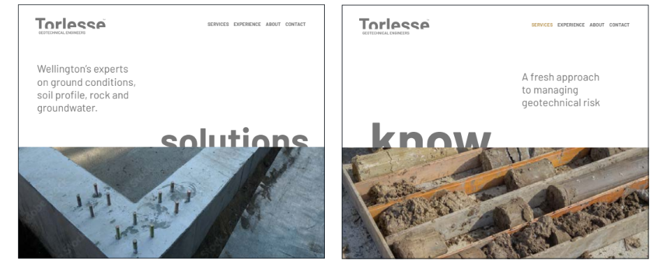
We first focused on the logo creation that we wanted to be strong and able to symbolise the underground aspect of Torlesse work.
The creative team decided to explore variations on the brand’s name typography and landed on cropped letters to convey an underground feeling in a subtle way.
With “Torlesse” cropped letters overhanging the “geotechnical engineers” tagline, we managed to bring up the company’s expertise and knowledge about “underground certainty”
Inspired by Wellington’s region soil and rock palette, we suggested grey (based on NZ’s most common rock type, Greywacke), sand, and clay colours to bear the new brand visual identity. These colours allowed the Torlesse team to simply convey their expertise and seriousness while being able to anchor themselves in their industry.
Conclusion
Armed with a clear positioning, a strong messaging and a visually appealing new brand, Nathan, Nick and Jerry felt very confident in building their website and writing the next chapter of their company.