Harrowfield People Development

A brand that shapes people.

Harrowfield – What did we do:

Brand workshops | Competitive Assessment | Positioning | Brand Strategy | Messaging | Brand Design 


Project overview

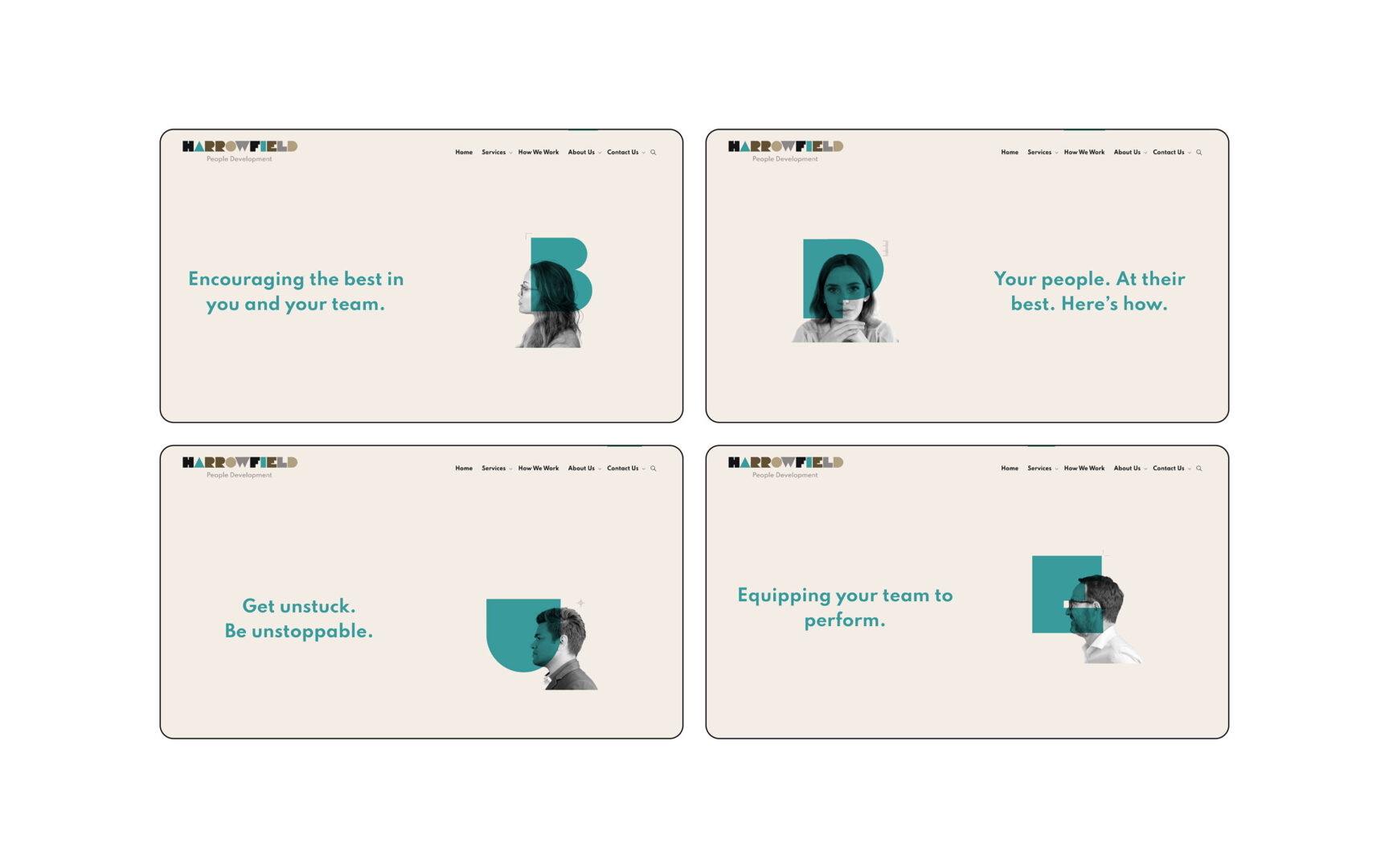
Harrowfield People Development operates in the training & development industry in New Zealand. They viewed the market as being fairly ‘male, pale and stale’, stuck in an industrial ‘mass’ mindset and approach to training.

Harrowfield was already delivering a unique service to the market and had been seeing great results – but their branding wasn’t telling this same story. There was a brand-service disconnect. They knew to reach the next stage they needed to ensure the brand was aligned with what they were putting out there. The challenge was to tell their authentic story.

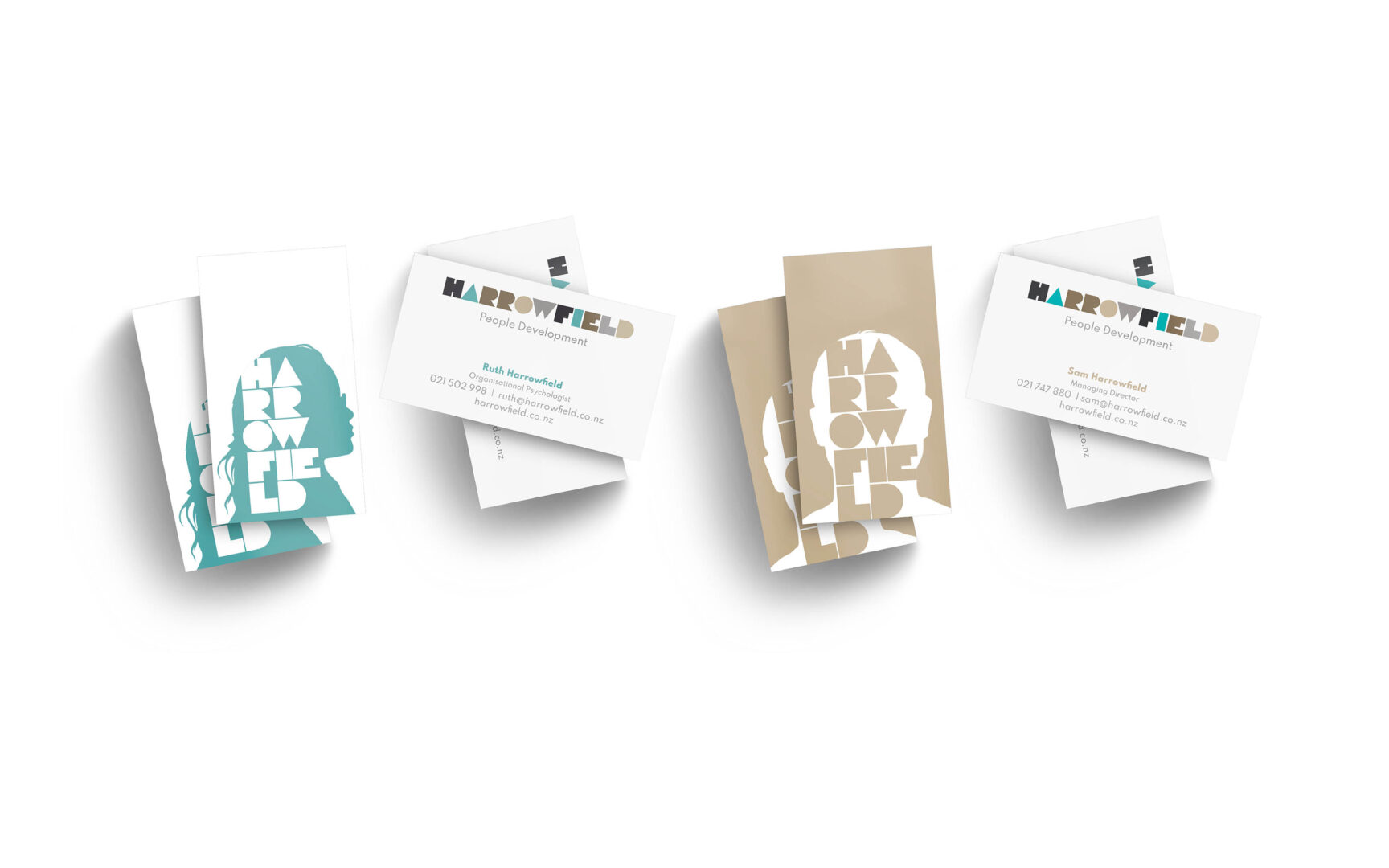
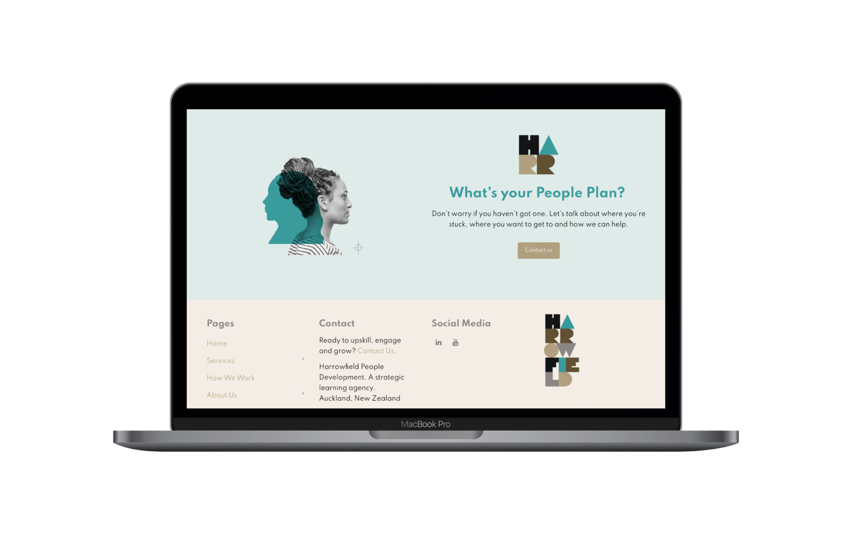
Rounds of deep thinking and pushing each other gave a brand personality, position, messaging and an identity that challenged the industry – challenged clients – to view how they engage with staff and critically positioned them above traditional training companies.


Harrowfield logo transformation

Research and Strategy

We’re an evidence-led agency.

We focused our attention on competition and how competitors were positioning themselves. We assessed their strategy, positioning (words), identities and formulated a map of the market for Harrowfield.

Naturally we also did a deep-dive into Harrowfield – the company, the people, the approach. Strategy From here we moved to discussing and defining their position and how to articulate this.

We had numerous rounds and discussions – pushing each other, challenging each other to dig deeper and define the What, How, Why of their business. We pushed and pushed to get that perfect answer.


Creative and Brand Design

Moving positioning from ‘Training’ to ‘People Development’ required a completely different design from all the incumbent Training companies.

To present Harrowfield as experts in identifying personality types and team interaction, we defined their brand Archetype and personality traits. This also established a unique creative brief focused on people diversity.

Every person is unique. We wanted an identity that encapsulated this to convey Harrowfields approach was tailored to this. The hand crafted typeface was created to give a human feel. Each letter with a distinct personality. The simple letterforms could be overlaid on headshots to represent the unseen thoughts and emotions of individuals.

We avoided rainbow colours to represent diversity, and instead let the letterforms do that work. The muted colour palette indicates subtly and discernment. We also wanted to use real people with normal expressions, with no fake smiles typically seen in other brands.


The brand messaging was another critical juncture where we could easily demonstrate a point-of-difference. Harrowfield really wanted to ‘push the boat out’ and so we matched this brand personality with strong messages that would capture attention, clearly differentiate them but also reflect a truism about the brand. Such statements were:

Everyone’s unique

This is not training

No boring slides

No stale presenters

No dumb exercises

Harrowfield Testimonial

Return to our Work page

Log in with your credentials

Forgot your details?