BRANDING THAT CARES WITHIN
A full rebrand, including name change, for New Zealand’s leading image-guided healthcare company.
Renaming | Strategy | Positioning | Personality | Design | Roll out
 Project Outline
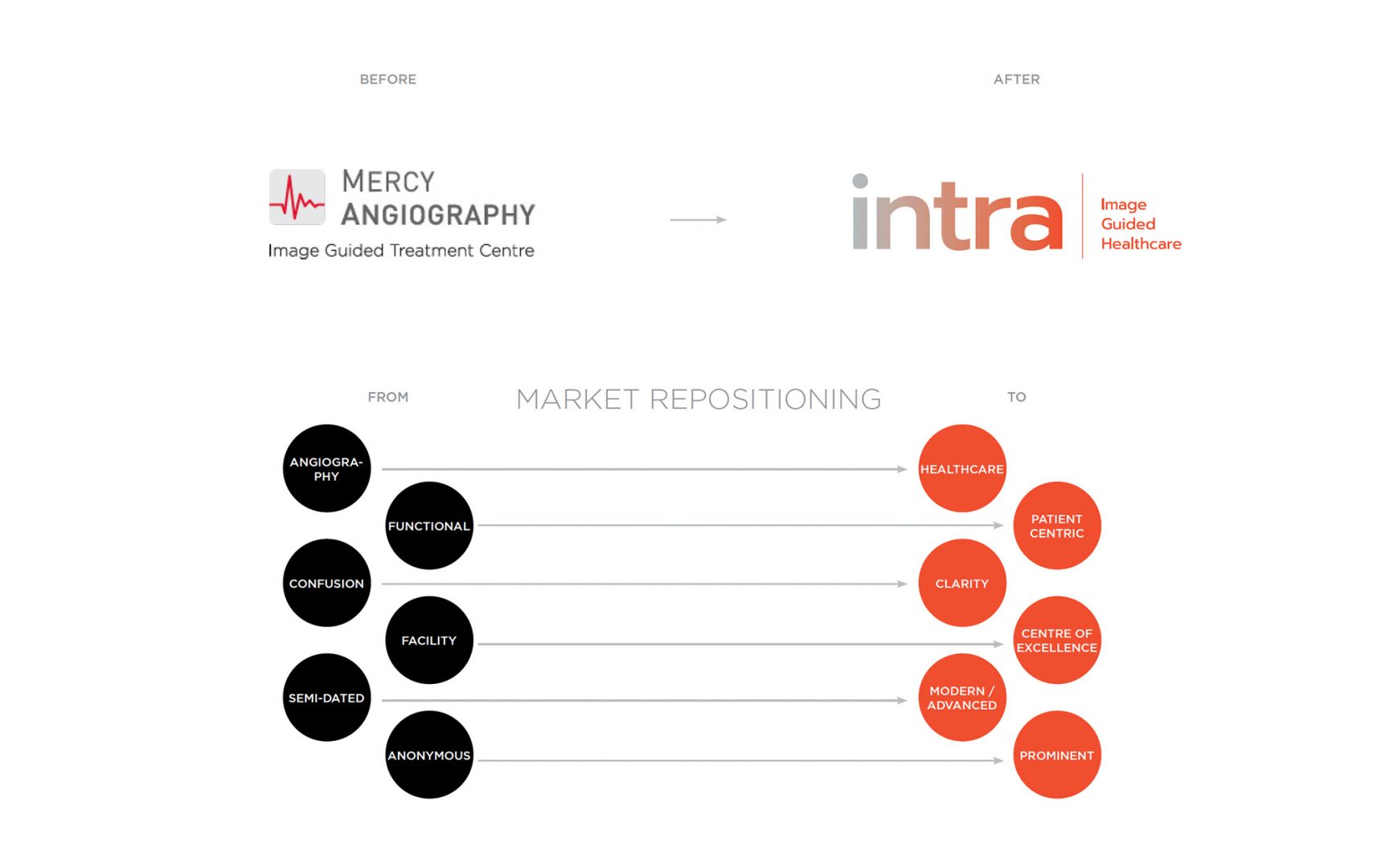
Mercy Angiography (now named Intra) faced a problem. Their name only focused on Angiography which is x-ray examination of blood vessels following injection of a radiopaque substance. But the truth was that they offered much broader services and some world-leading services. Equally, they suspected their residence in the Mercy Hospital and having ‘Mercy’ in their name just confused patients and restricted their growth to future locations.
Our journey began with a brand assessment and speaking extensively with referrers, specialists, GP’s and patients which revealed some stark insights around the confusion about who they were and the services they offered. Staff also couldn’t articulate who the organisation was or how they were unique. The patient care was world-class but no one knew about it.
From here we established the project objectives, being:
– resolve the name issue, which would required renaming
– clearly convey the breadth and depth of their image-guided healthcare
– convey the strength and pedigree of the brand
We started by distilling exactly what they do, how they do it and why they do it – moving the vernacular from “Angiography” to “Healthcare” being a major shift.
We knew we had to drop name completely. The brief was to develop a name that was short, memorable, not aligned to the Sisters of Mercy and didn’t restrict future service expansion. Through extensive research and systematic approach to naming we developed, presented and tested a range of naming routes. One name worked perfectly – Intra.
In the medical world intra means ‘within’ or ‘inside’, Intravenous (within veins) or intranasal (inside the nasal passage) for example. This perfectly conveyed a key point of difference for Intra because they work inside the body using 3D real-time imaging and keyhole entry via catheter. This means no cuts, no open-chest surgery and improving recovery and pain of procedures. Intra encapsulated this whole area of healthcare.
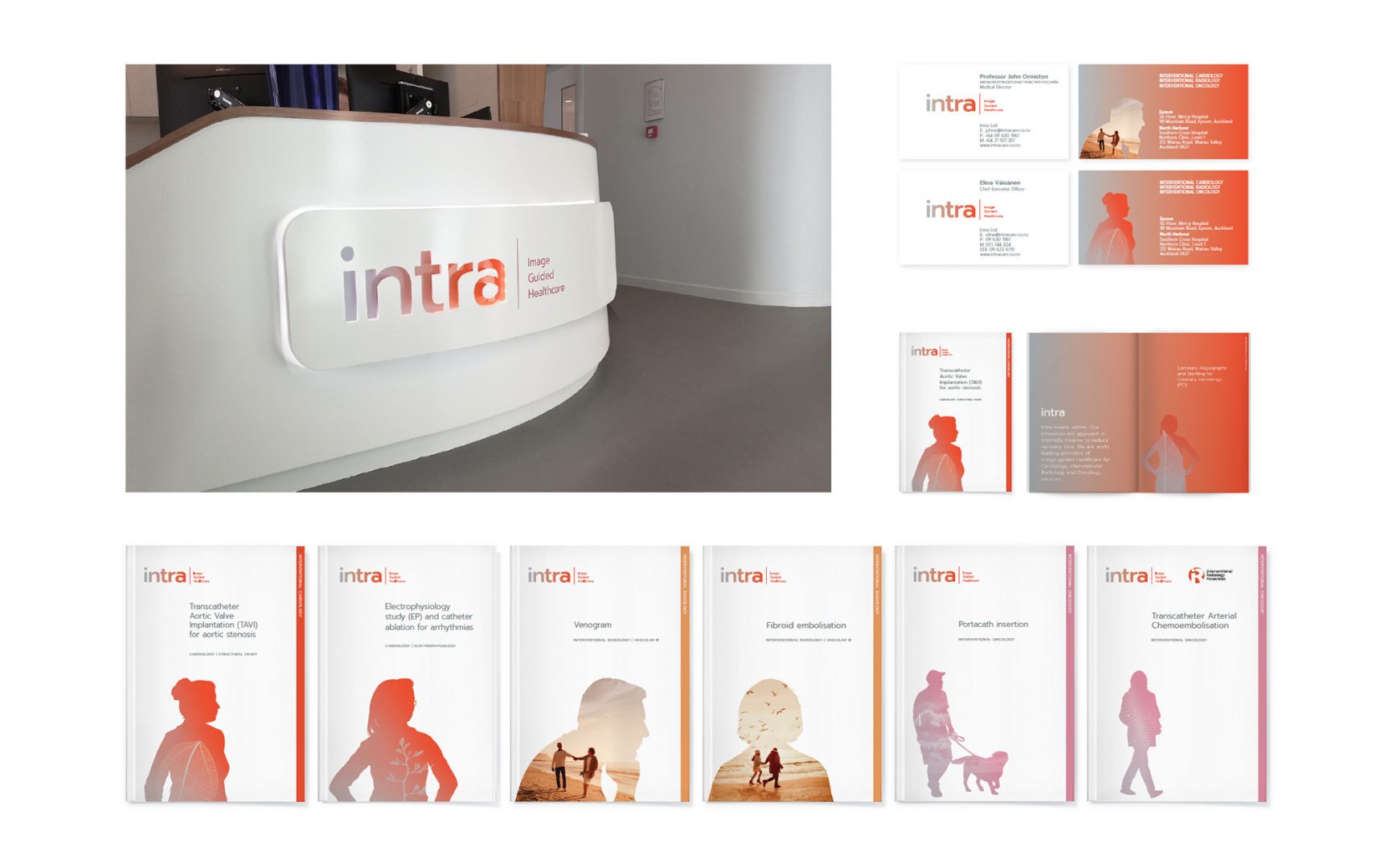
The positioning statement ‘Image Guided Healthcare’ reflects the new strategy to include all services in the Healthcare sector, not just angiography. The term healthcare was used to soften the technical words to make it more patient-centric.
The ‘within’ theme was then used across the brand look and feel. We did this by using a colour gradient of grey to red (representing sickness to wellbeing, ‘bad’ blood to ‘good’) within the letters of the logo. The photography is within silhouettes of people. This created a unique ‘within’ feel that differentiated from the competition.
The end result is a brand that cares within. Staff that are proud of the brand and referrers and specialists who now understand who they are and what they do.