
Social Services Branding
In social services, trust and connection matter. A strong name and brand identity builds credibility, communicates care and purpose, and helps your organisation connect meaningfully with the communities and people you support.
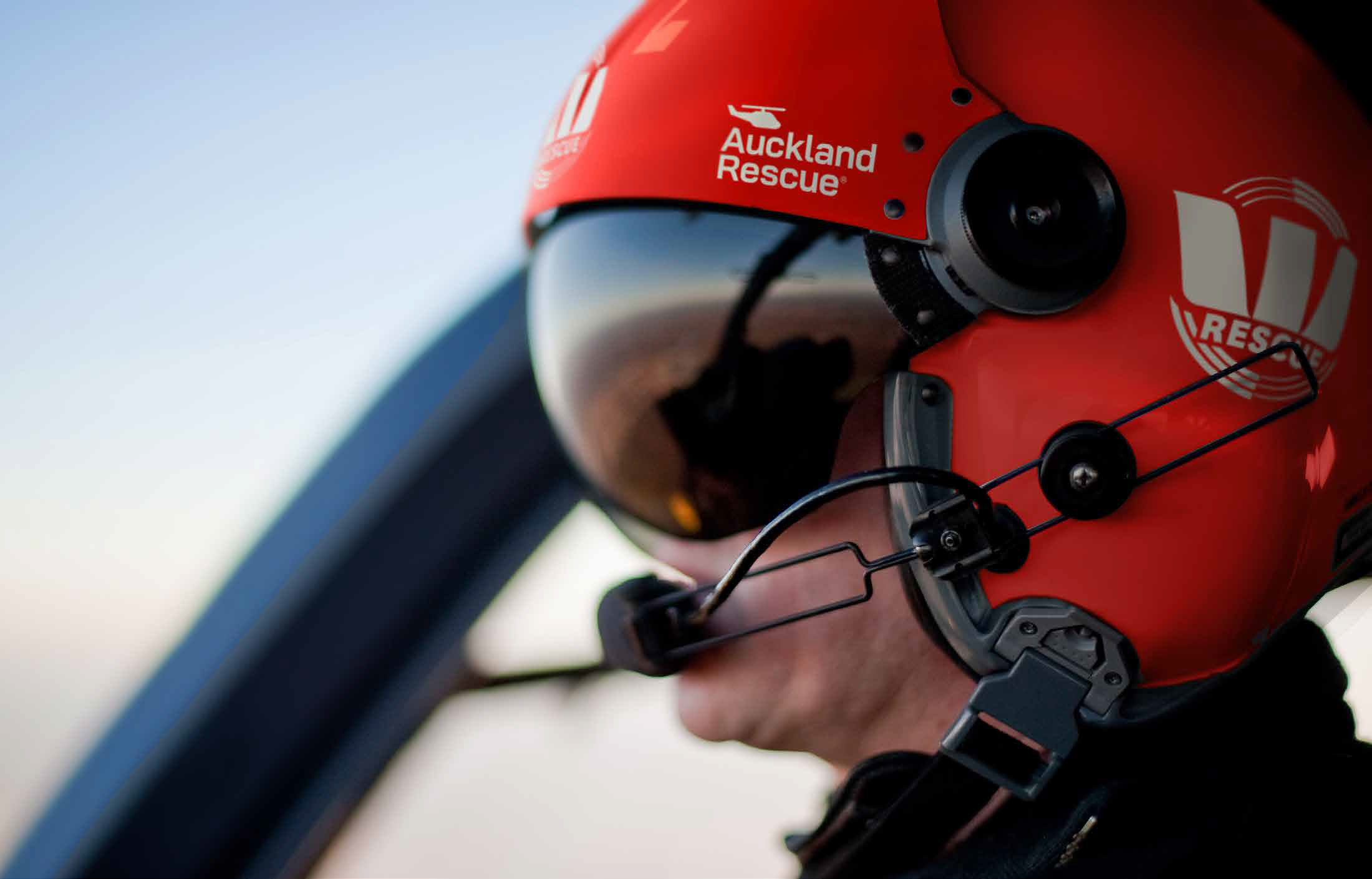
Social Services branding work
Social service organisations need to connect with a wide range of audiences, from the people and families they support to employees, funders, government agencies, community groups and other stakeholders. A clear and approachable brand helps people quickly understand who you are, what you offer and how you can help.
In the social services sector, trust, empathy and credibility are especially important. A strong brand needs to feel professional and dependable while also being welcoming, inclusive and human. The right name, visual identity and messaging can make services easier to understand, strengthen community recognition and build confidence among the people you support.
Whether you are establishing a new social service, repositioning an existing organisation, bringing several services together under one brand or responding to changing community needs, a well-considered brand can create clarity, strengthen engagement and support long-term impact.
We work with social service organisations to develop brands that reflect their purpose, values and communities. This can include brand research and strategy, naming, positioning, messaging, visual identity and the practical roll-out of the brand across digital, print and physical environments.
Take a look at some of the social service brands we have created below.

Cancer Support New Zealand
Rebranding Look Good Feel Better into Cancer Support New Zealand through brand strategy, naming, positioning, messaging, and identity design.
Mai Lighthouse
We transformed Franklin Family Support Services into Mai Lighthouse—a brand that empowers and guides whānau towards wellbeing.
Presbyterian Support Northern
Presbyterian Support Northern – A brand that empowers. The centennial charity brand needed a refresh, through cohesive and inclusive design.
Auckland Rescue
Auckland rescue – a brand that save lives. Read how we helped the Helicopter charity brand move to the forefront, boosting visibility.
Busy Bees
A brand with buzz! The leading global childcare centre brand Busy Bees needed a genuine NZ-inspired take on their brand to launch in Aotearoa.
Future Partners
A brand that’s future-focused. Kirsty Burnett needed a brand to embody her commitment to support development project services in the Pacific area.
Olé Football Academy
A brand that shows the way. Ole FA went through a full brand evolution including detailed brand research, strategy and brand design.
Wellington Community Fund
Rebrand was commissioned to undertake brand research with community and iwi partners for the Wellington Community Trust.
KRL
We created a new brand to launch the merger of the Kilbirnie Business Network with Rongotai and Lyall Bay – three distinctive areas in Wellington.

Te Kupenga
A brand that is Unified. Te Kupenga is a new ‘mother’ brand for an existing stable of Catholic organisations where we defined the brand architecture, identities, and designed the website.
Hospice New Zealand
Our services started with reviewing, redesigning, and rebuilding their website to allow a much more modern, functional and engaging members portal experience.
“The process that Re:brand took us through has been instrumental in the formation of our business. Helping us navigate the complex issues we faced – the closeness of the relationship to Qual IT, developing a unique position in the market and creating a culture out of nothing – has been fabulous.”
“Coming up with a new brand for any company or organisation can be challenging at the best of times but when you throw in needing to come up with a name for a Business District that is going to be decided by a Committee it has the potential to be a nightmare.
But this was not the case for the former Kilbirnie Business Network when faced with exactly this scenario – and that came down to our choice of using Rebrand to guide us through this project. Tim and his team were a pleasure to work with – thoroughly professional, delivered what they said they would, were prepared to go the extra mile for us and adapt ideas and concepts to meet our feedback.
In short, we were delighted with our final brand – Destination KRL and have received great feedback from our business members and the general public to our new name and imagery. We could not have asked for a better result.”“We have had lots of positive comments on our new name Envisory. People have commented that they love the colours and clarity of our logo.”