A brand that defines cancer support
Cancer Support New Zealand work – Brand workshops | Consumer research | Staff Engagement | Brand research | Competitive Analysis | Positioning | Brand Strategy | Brand Naming | Brand design | Collateral
Cancer Support New Zealand work – Brand workshops | Consumer research | Staff Engagement | Brand research | Competitive Analysis | Positioning | Brand Strategy | Brand Naming | Brand design | Collateral

Formerly known as Look Good Feel Better, Cancer Support New Zealand is a national charity providing free, non-medical support for people living with cancer. Over time, the organisation had evolved far beyond its original skincare and make-up roots, expanding into movement, mindfulness, confidence-building, expert Q&As, online support, podcasts, and community connection.
The challenge was no longer simply one of awareness. It was one of alignment. The existing brand no longer reflected the breadth, seriousness, or strategic value of the organisation’s work. Internally, staff and facilitators consistently described a much broader role in people’s lives than the public brand conveyed.
Re:brand was engaged to lead a full strategic repositioning and rebrand process, helping the organisation clarify its role, articulate its unique value within the cancer-support landscape, and create a more scalable national identity for future growth.
You can view their full website here.
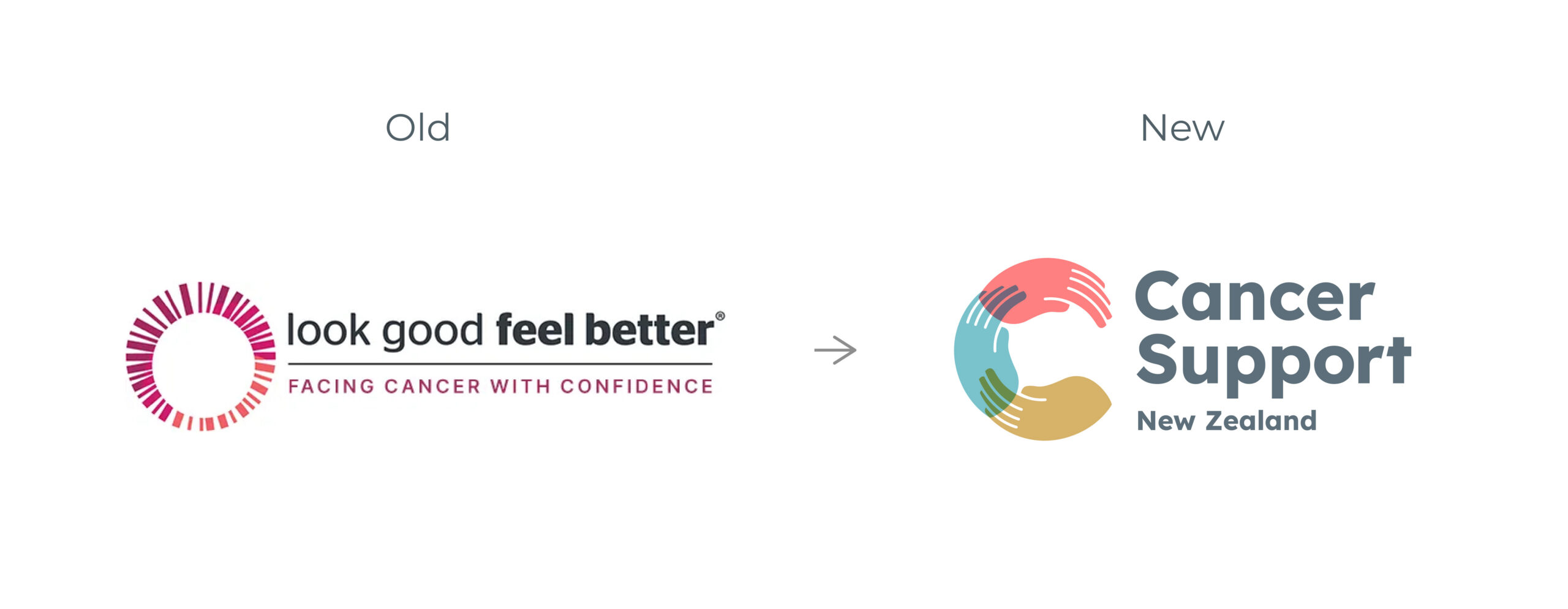
For many people, Look Good Feel Better was still associated primarily with skincare and make-up workshops.
Yet stakeholder research revealed something very different.
Participants consistently spoke about connection, confidence, belonging, resilience, and the ability to feel like themselves again. Facilitators described an organisation supporting the physical, emotional, and practical realities of cancer, not simply appearance.
The existing brand no longer reflected the breadth of services being delivered or the impact they were having.
The opportunity was to create a brand capable of owning a broader and more meaningful position within the cancer support sector.
We undertook an evidence-led strategy process involving leadership workshops, stakeholder engagement, facilitator surveys, audience analysis, category review, positioning development, and naming exploration.
Across every audience, the same themes emerged. People valued practical support, genuine connection, renewed confidence, and the reassurance that they were not facing cancer alone.
Most importantly, they valued support that helped them feel like themselves again. This insight became the foundation of the new strategy.
The repositioning shifted the organisation away from being perceived as an appearance-led charity toward a broader role supporting the whole person through cancer.
Research showed that while appearance support remained important, it was only one part of a much larger support ecosystem.
The strategic challenge was to create a name and positioning that reflected this broader role while retaining the warmth and humanity that had made the organisation so valued.
Following extensive evaluation, the organisation adopted the name Cancer Support New Zealand.
The new name brings clarity, authority, and scale, while creating space for future growth and service expansion.
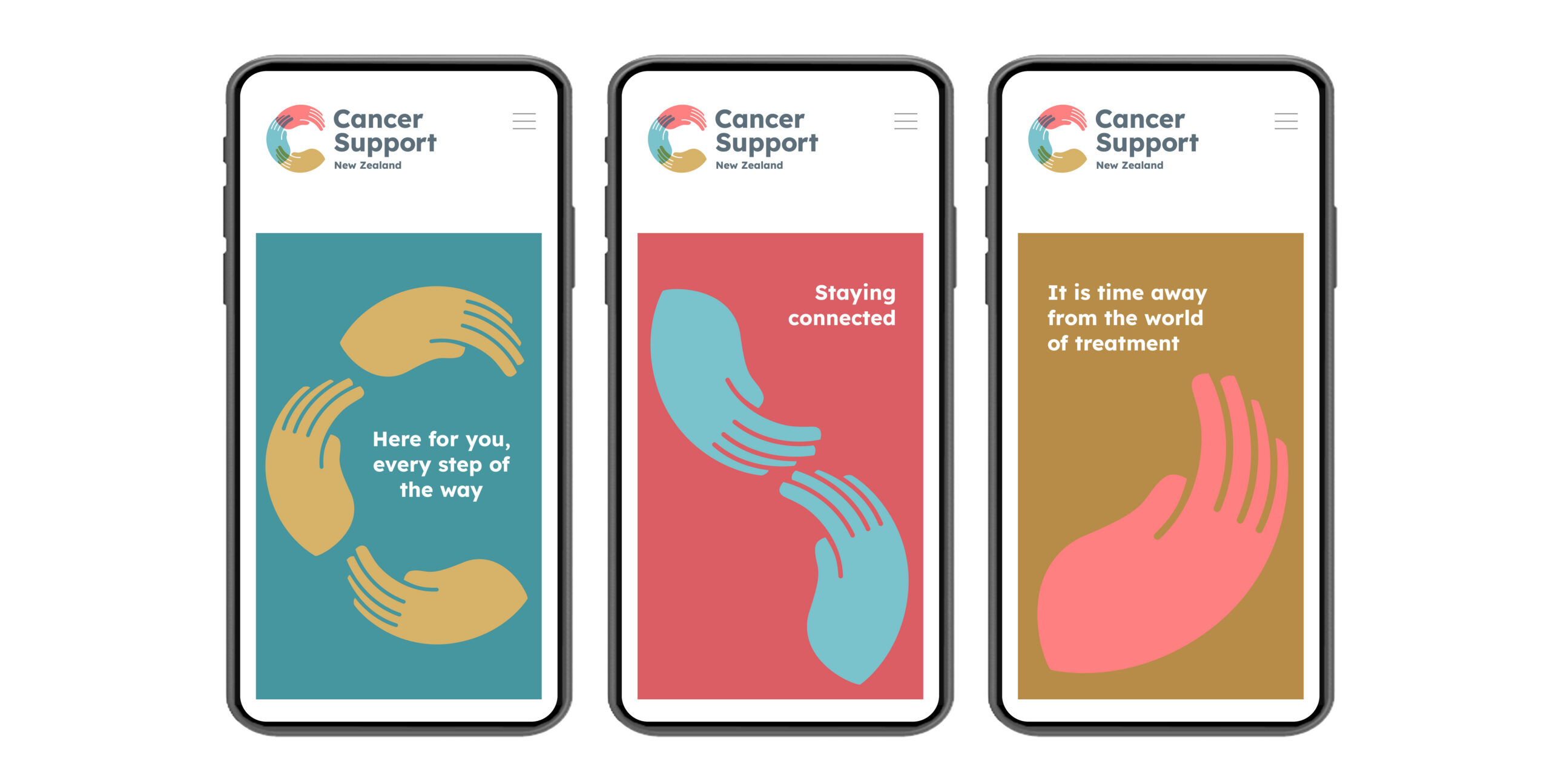
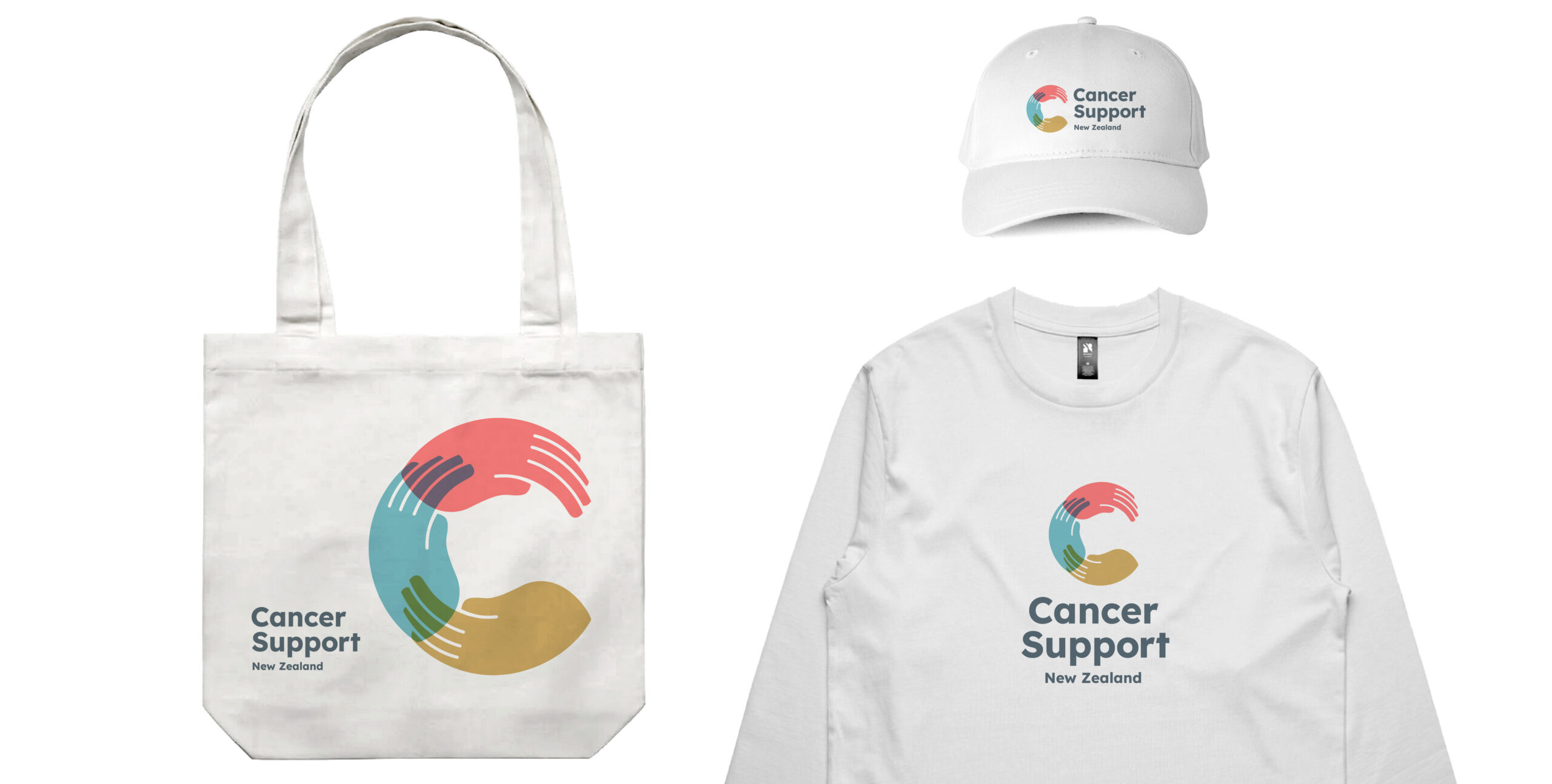
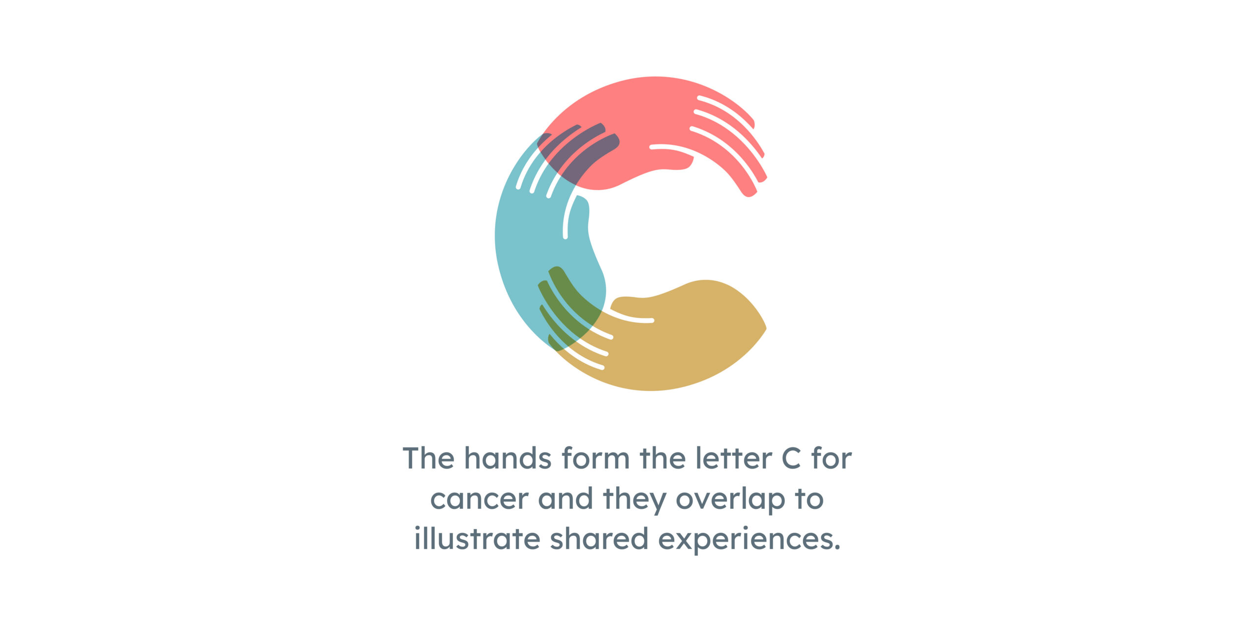 The identity was designed to balance credibility with compassion. A warm, accessible visual language supports the organisation’s role as a trusted national provider while remaining approachable and human.
Messaging was simplified around the themes that appeared most consistently throughout the research: support, confidence, connection, and helping people feel like themselves again.
The result is a brand that better reflects both the reality of the organisation and the needs of the people it serves.
The rebrand gave the organisation a clearer, more scalable strategic platform for future growth.
Internally, the new positioning better aligned with how staff, facilitators, and stakeholders already described the organisation’s role and impact.
Externally, the new identity broadened perception beyond cosmetic support and positioned the organisation more credibly within the wider cancer-support landscape.
The launch response from leadership reflected both strategic and emotional alignment:
“The logo looks beautiful, but more importantly has just the hug feel, warmth and energy we were looking for.”
“You have given us a wonderful brand guideline to go forth and increase the accessibility to the services.”
The project also established a stronger foundation for future service expansion, programme clarity, and national awareness.

Return to our Work page
![]()