BRANDING THAT IS FLUID
A brand refresh for Liquid IT who are experiencing rapid growth as a new leader in IT services.
Research | Strategy | Positioning | Internal Clarity | Tone of Voice | Design | Website | Signage
![]()
 Project Outline
A few years ago an IT start-up came to us wanting a new brand, and within no time at all they had settled on the name Liquid IT and a stronger vision for the personality of their business.
We only designed the logo and some basic guidelines due to their understandably modest start-up budget. But we asked if they could return to us if they became successful so we could help evolve the brand. And that happened within two years!
Strategy
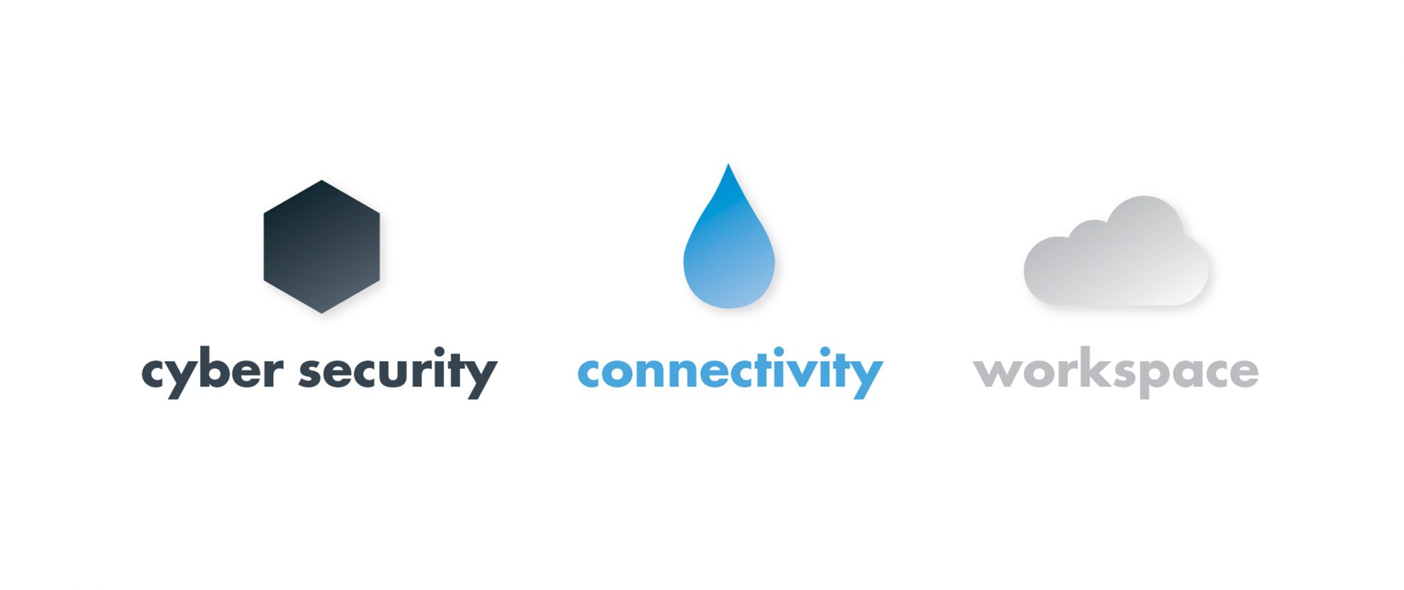
Liquid had gained good traction in the market but research revealed that the market struggled to clearly understand their offering and staff were equally unsure. They suffered from ‘doing things on the fly’ and the brand had become a bit disparate and not well understood. They knew the time had come to do things properly.
We set about working with the four directors to explore and clarify the business. We also interviewed employees to seek feedback and engage them in the process. We also spoke with clients around their perceptions of the brand and service. This work and distillation of the brand aligned the internal thinking and set the platform for who they are, what they do and why. This new positioning revolved around a ‘Security led IT’ offering. This was cutting edge in the market, yet naturally what Liquid were already doing.
Messaging
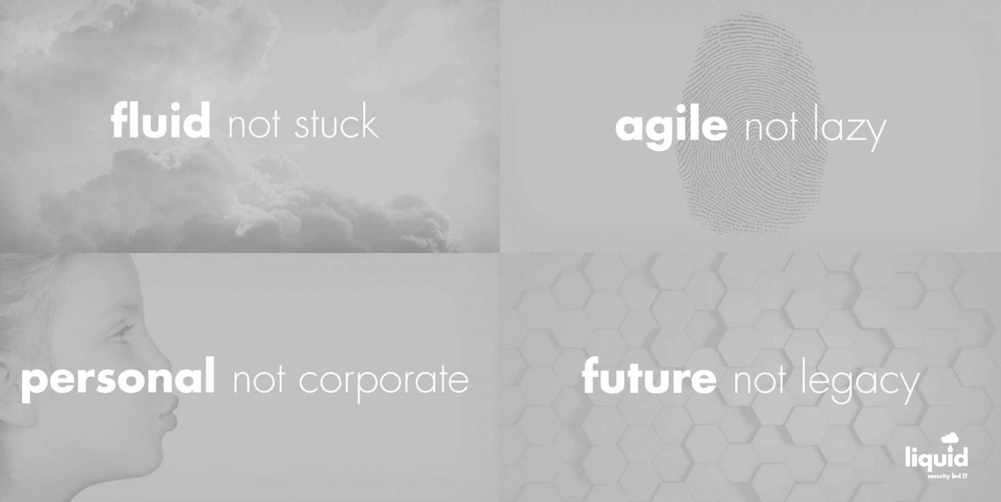
The analysis revealed that along with these cumbersome competitors the major players were very corporate, staid and boring in their messaging. We knew that to convey this market alternative we needed to be the fresh voice in the market. The breath of fresh air that had some personality that customers actually wanted to deal with.
Key messaging was developed:
- flowing not stuck
- flexible not rigid
- agile not lazy
- future not legacy
- clear not hazy
- personal not corporate
Rollout
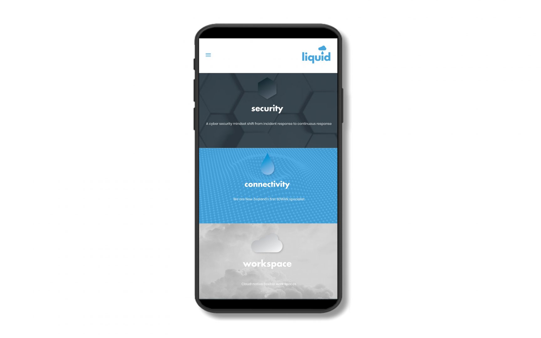
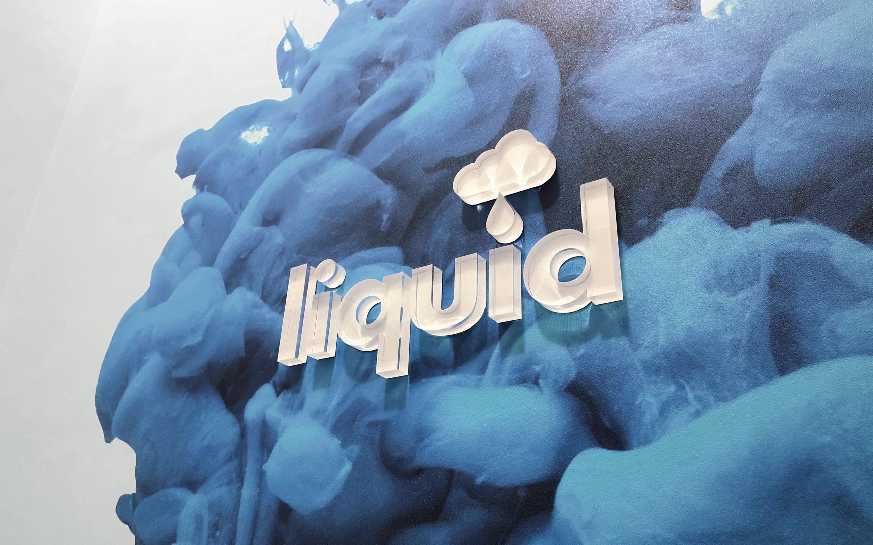
We evolved and modernised the identity to reflect the new offering. This was then expressed through a new website and office signage/décor to improve staff culture and customer experience.
“I do think the rebrand galvanised the culture and our identity. It is a modern, “fluid” and a ‘cool’ brand that people see as fresh, contemporary and trustworthy. It’s got a nice edge to it but it’s friendly and fun. It reflects who we are and we reflect it.”
Steven Whitehead – Director
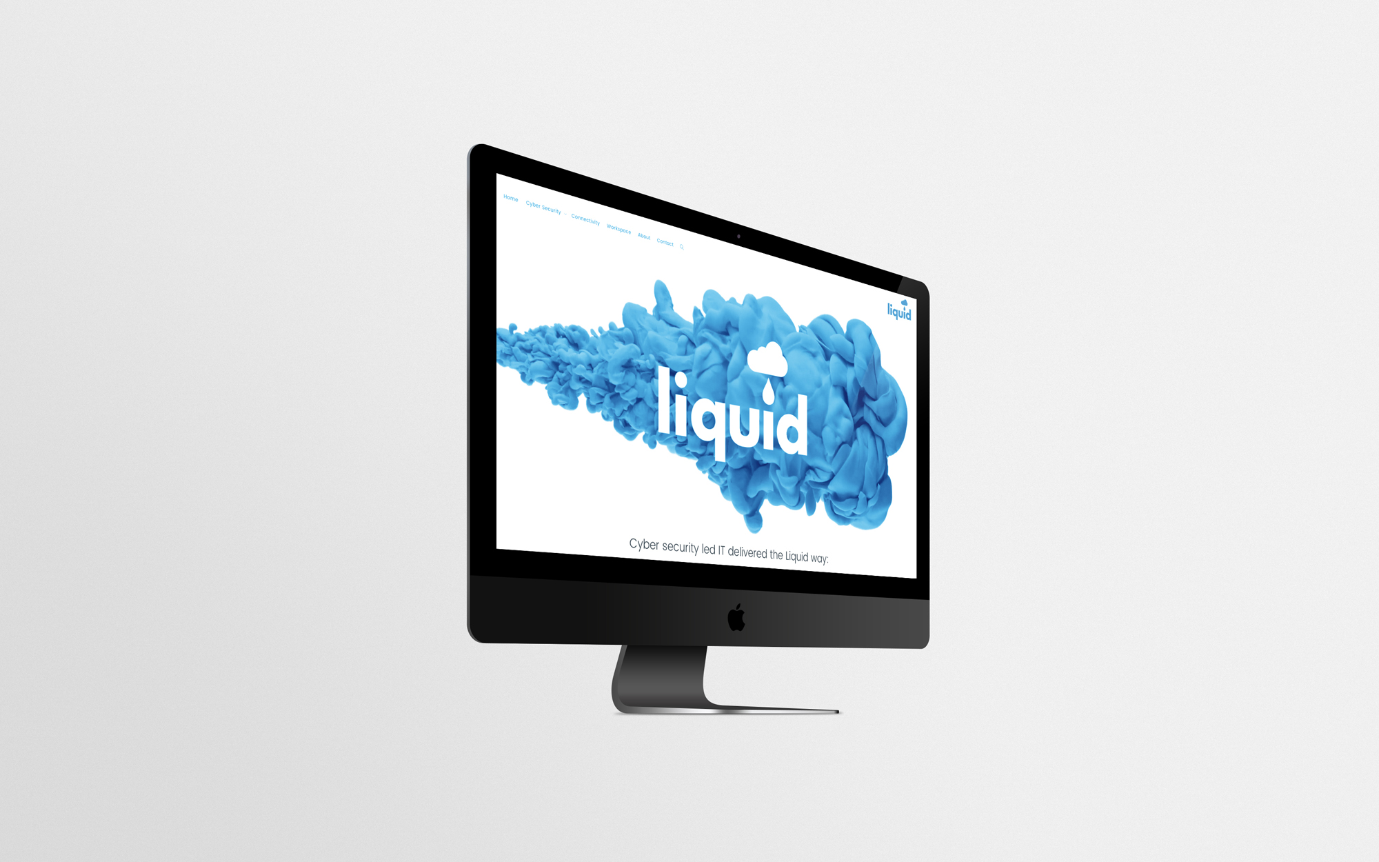
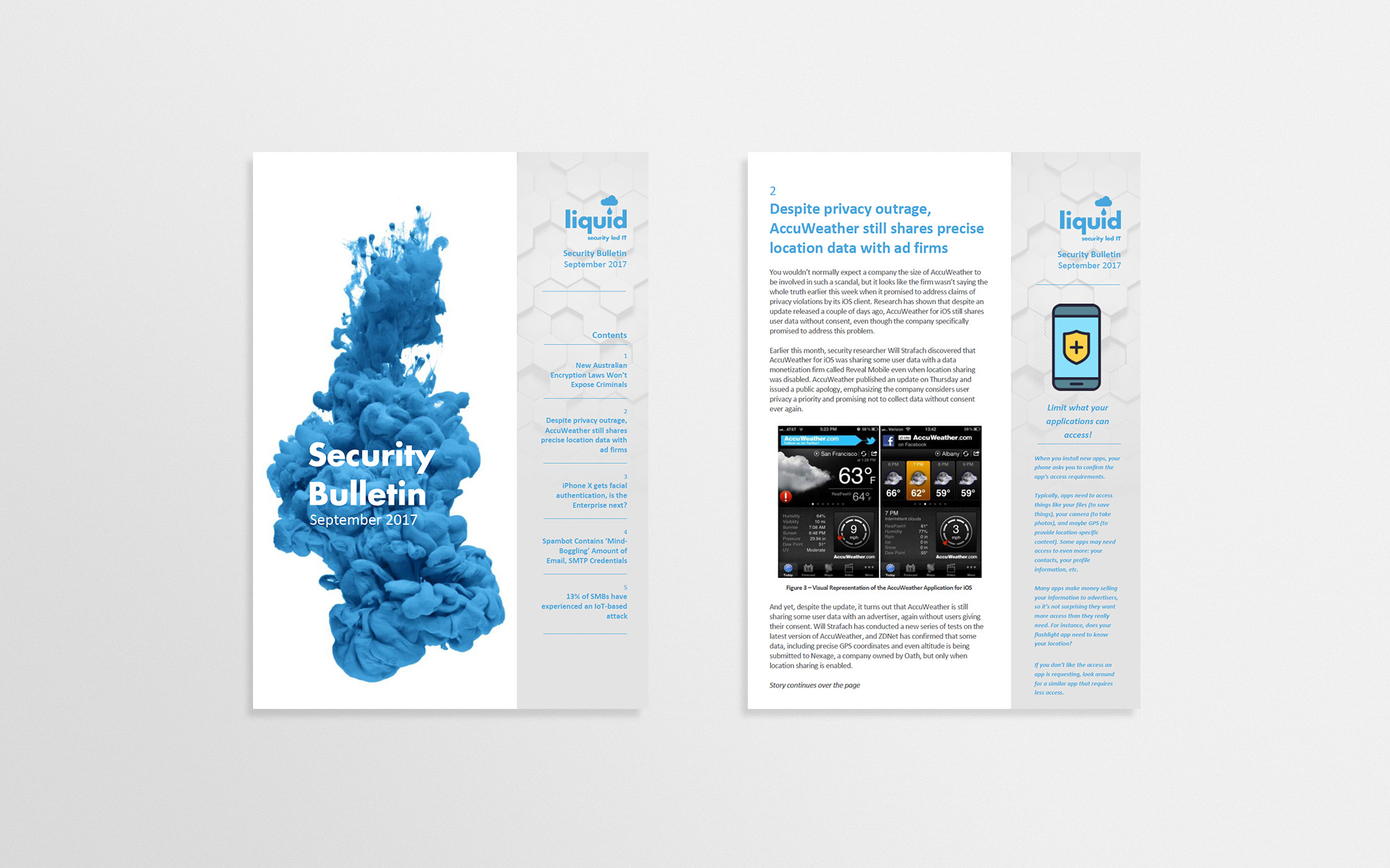
Liquid also launched their monthly Security Bulletin which has increased their market perception as market leaders.
Results
“The branding made us look and feel professional and sales have doubled year-on-year as a consequence.”
Steven Whitehead – Director