Naming
It was proposed a Te Reo translation that could convey the underlying meaning of this “growth” approach.
This drove us to “Whakatupu Ātea”, explaining that Whakatupu meant “to grow”, as in “raise”, “cultivate”, “produce” or even “farm”. This word was specifically bearing the connotation of “future”, which was decidedly key in Growing Spaces way of working.
“Ātea” was chosen to mean “space/area”. As it conveys the idea of being open, free from obstruction, it was perfectly adapted to the “external” aspect of Growing Spaces projects.

Creative and Brand Design
The research and naming phases naturally informed the brand design step. Our creative team built on this Te Reo name to visually express the company’s commitment to “spaces that matter”.
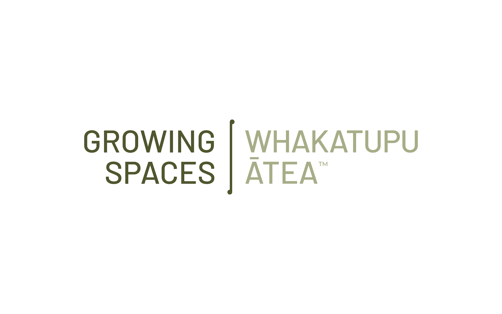
They reflected on the team’s will to elevate their Māori roots and decided to put both English and Māori names at the same level, simply separating them with an extended koru line.
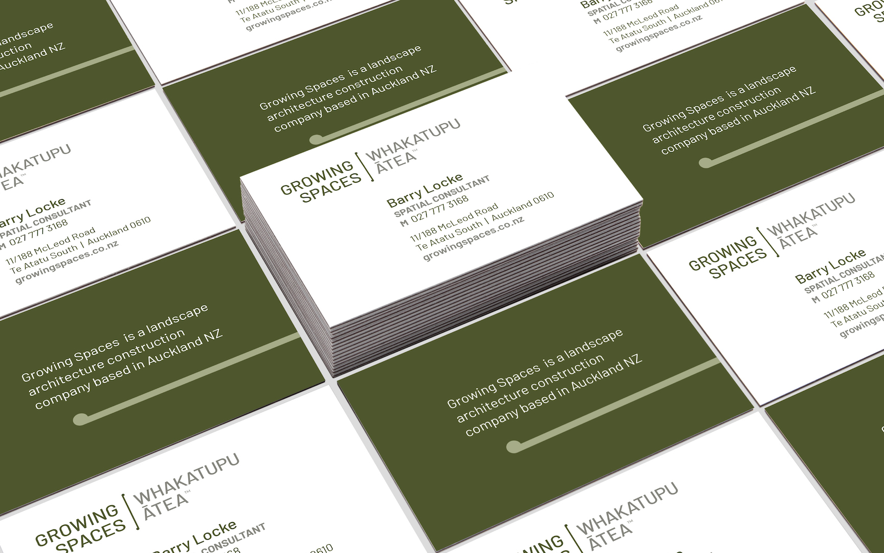
Colour palette was decided around greens, from a darker to to lighter option, in order to keep the brand rooted in the ground and refer to their “green walls” key offer.
Our creative team designed a logo representing this partnership aspect. The linking shape attaching the two words was inspired by a Māori koru to signify authentic partnerships that result in growth.
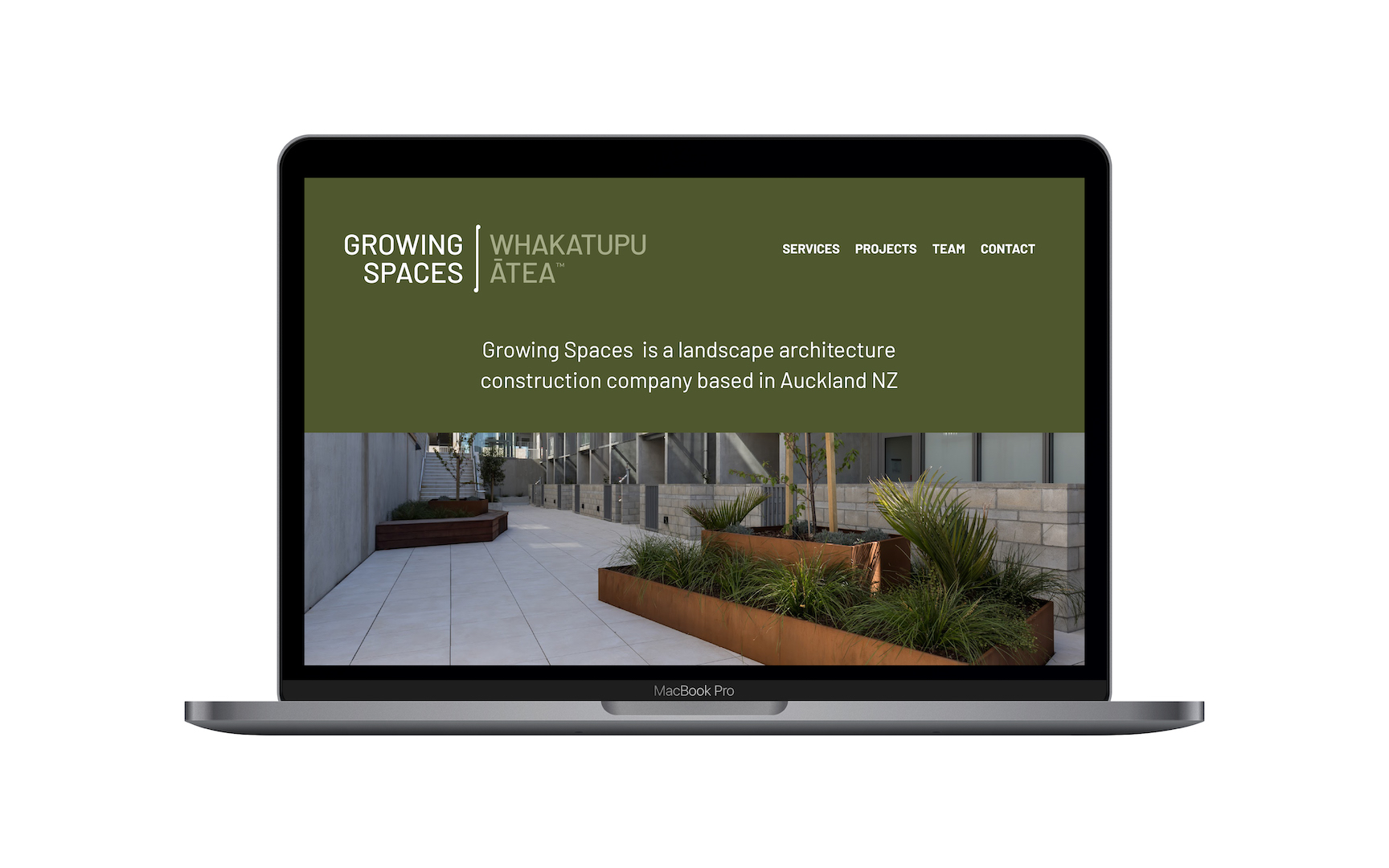
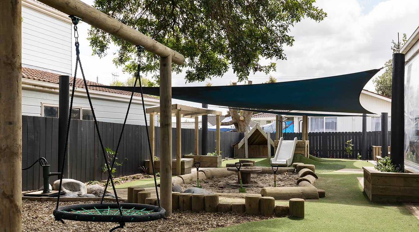
We picked the green colour and full size environment photo style to support the brand commitments to deliver projects that tackle and solve real social problems, make lasting changes, and improve lives and livelihoods.
 Conclusion
Having embraced their own identity and now conveying it through their brand, the Growing Spaces team felt more confident when competing in the critical tender space. Their unique approach and ways of working, perfectly expressed through their refreshed branding, helped them pitch more efficiently, ultimately increasing their appeal to clients.



 Conclusion