A BRAND THAT IS SECURE
Design and rollout of information-security company SEQA, pronounced “secure”. Brand work undertaken:
Brand Strategy | Naming | Internal Clarity | Market Positioning | Design | Website
Mark Keegan from SEQA Information Security talks about their new brand. He explains how their branding has positioned them as a modern leader in cyber security and how it has improved staff culture.
Project Outline
Our existing client Qual IT decided to start a new Cyber Security business in partnership with a leading security expert who had recently joined their team.
We thoroughly assessed the competitive landscape to understand clearly every company’s positioning, key messaging and their identity. This allowed us to facilitate a series of sessions with the client to strategically illustrate to them how different brand architectures could work. How could we create something unique and compelling? How could we create a new stand-alone Security brand but also convey a strong symbioses of the two companies?
Brand Strategy
Our strategic work identified key area of uniqueness – the embedding of Security (Sec) into the Quality Assurance (QA) lifecycle. This point of difference lead to the gradual invention of a unique name SEQA.
SEQA, pronounced “Secure”, is a new word, but it is a meaningful word that people in the industry can understand.
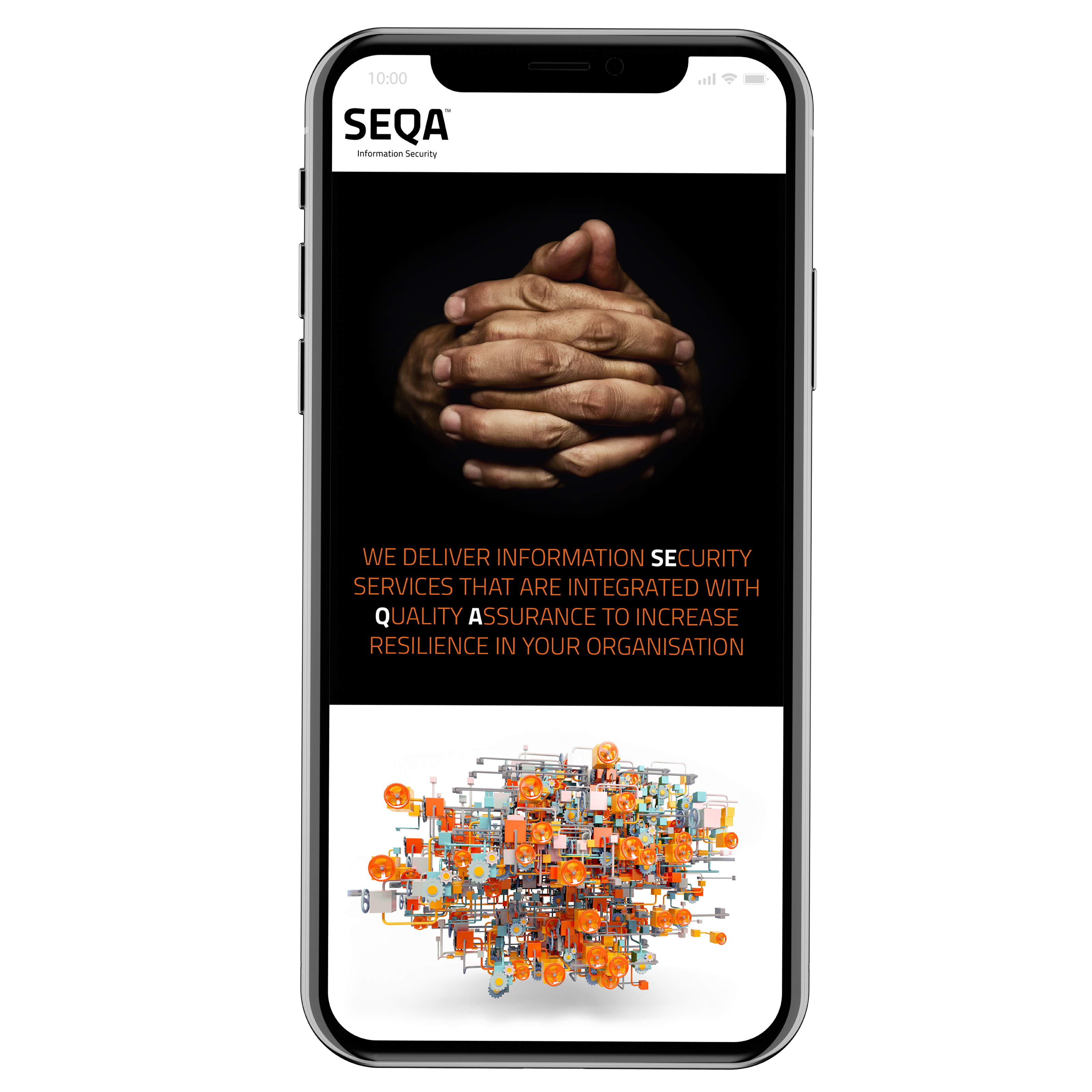
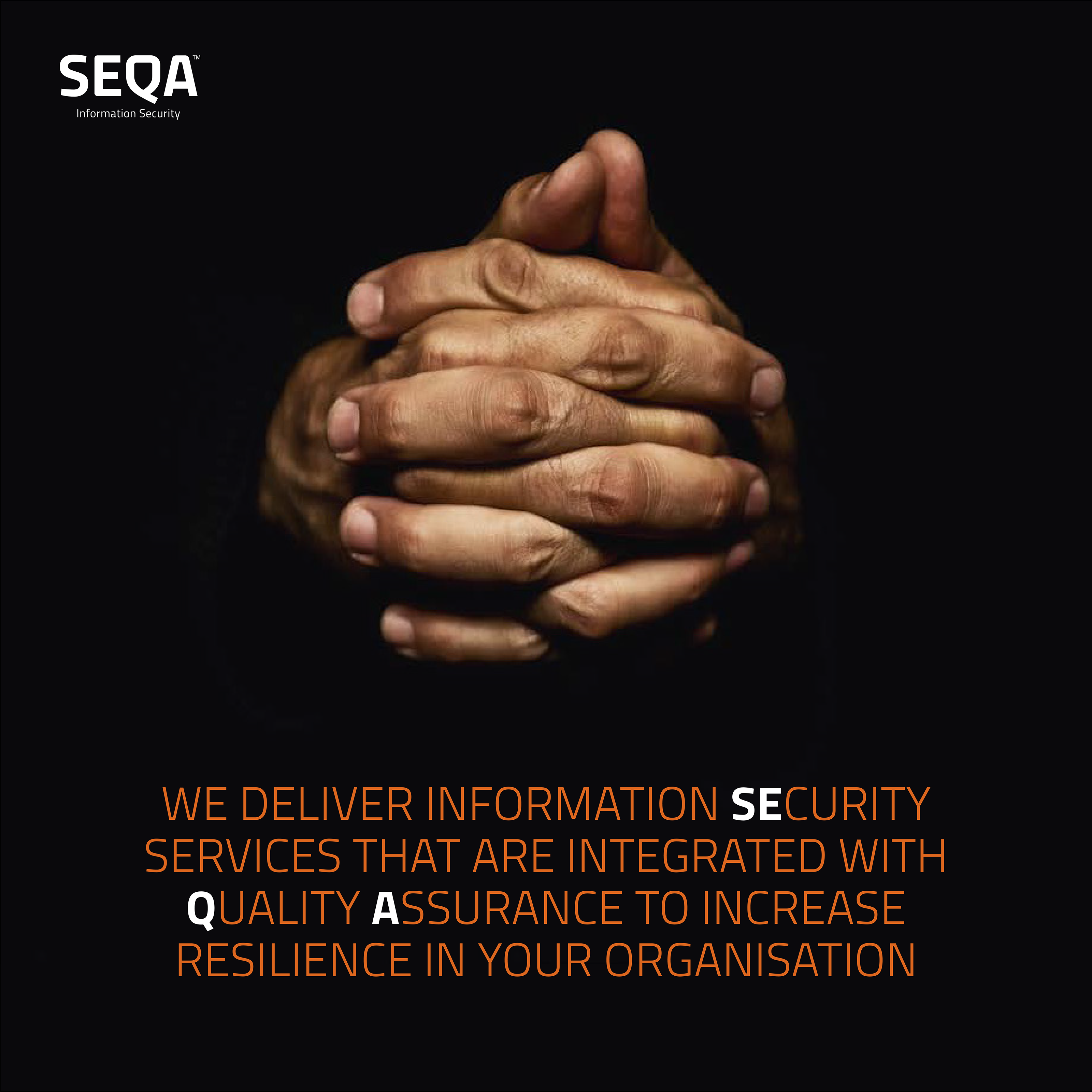
The clenched hands is the hero-image because it has strong protective feel while still being human. It also signals the integration of Security into QA.
“The process that Re:brand took us through has been instrumental in the formation of our business. Helping us navigate the complex issues we faced – the closeness of the relationship to Qual IT, developing a unique position in the market and creating a culture out of nothing – has been fabulous.”
Mark Keegan – Managing Director, SEQA
Logo
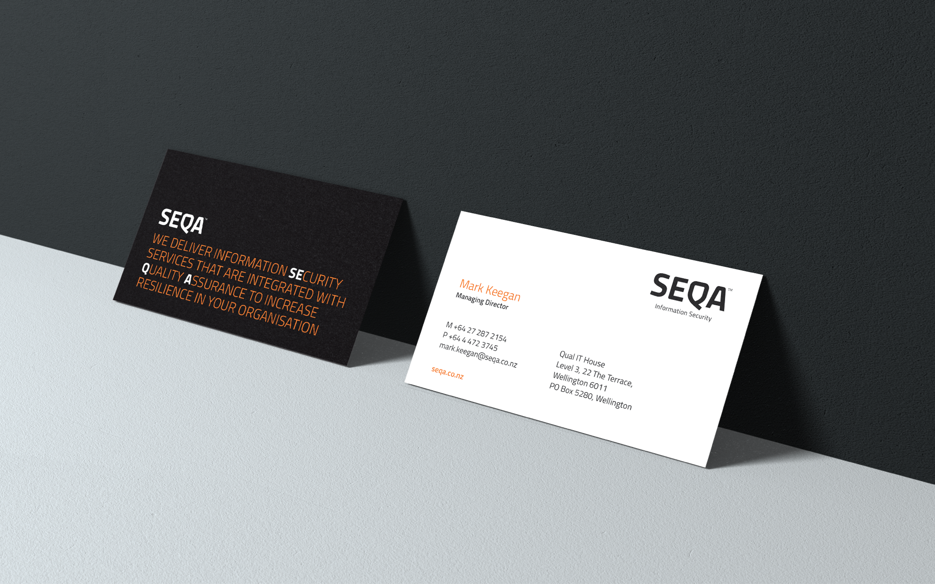
For the logo we wanted to avoid the cyber security cliché of using the symbol of a shield. However, after countless design explorations we realised the symbol of a shield could be employed in a new way — by subtly embedding a shield into the letter Q. This also illustrated the business strategy of embedding Security into QA.
Imagery
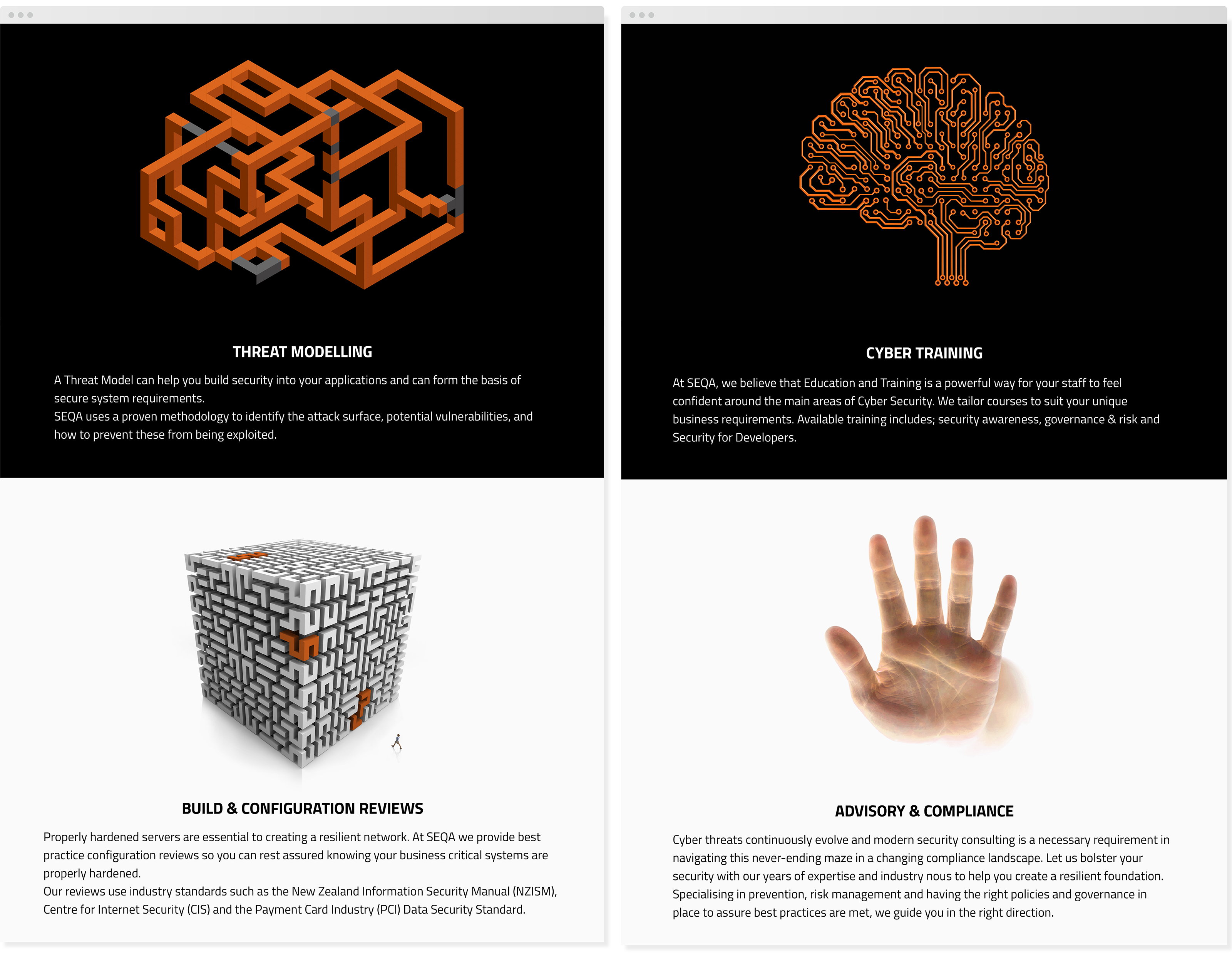
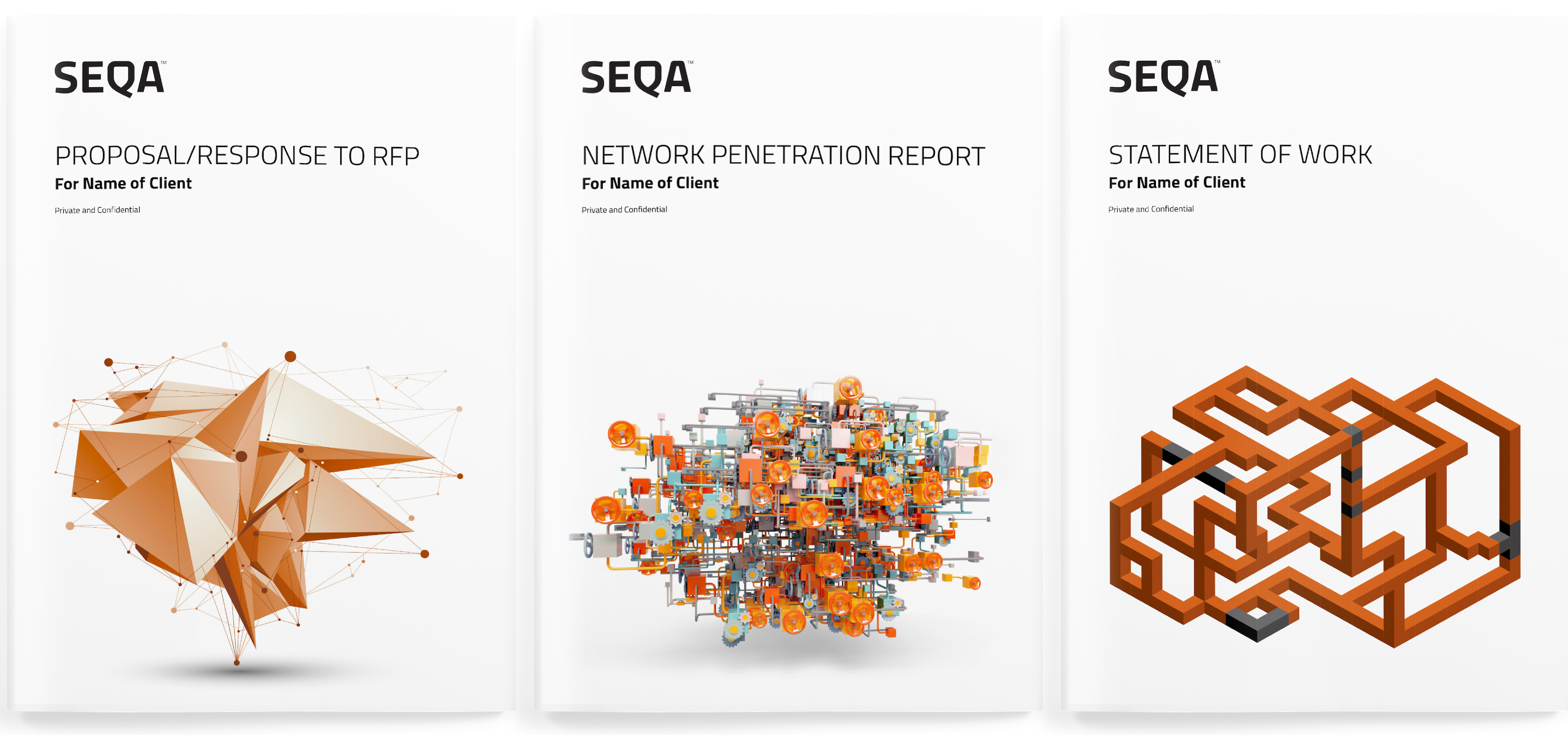
Based on the brand strategy we needed to create imagery that was unique and thought provoking. The competitive analysis discovered an industry full of poor metaphorical images or ‘full-on’ tech feeling graphics and devices such as padlocks, shields, code and hackers. It also showed an industry dominated by blue and grey tones. So we created new metaphorical ‘objects’ for each of the services and used orange to signify the relationship with Qual IT.
“I am normally highly critical of new brands but for what ever reason i like the look of this one. I think those involved nailed it!!”
James – Seqa client
Result
“We now have business clarity; we have a cool name; we have a culture to attract the best people and we have a story that resonates with every client I’ve spoken to. It’s the platform for success for our young business.”
Mark Keegan – Managing Director, SEQA
