Augmento
Project overview
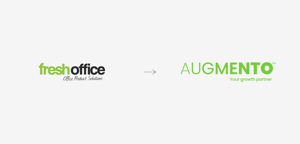
Fresh Office, a New Zealand-owned trade agent in office supplies, needed a rebrand to reflect its comprehensive services and growth ambitions. The new identity, Augmento, supports its evolution from a traditional supplier to a strategic growth partner.
Research and Strategy
Extensive research included market analysis, staff engagement, and client interviews.
A discovery workshop with directors helped establish business objectives and identify unique traits while staff surveys gathered insights into brand perceptions and areas for improvement. A detailed brand assessment also highlighted the valuable elements to retain, such as the existing green colour and a thorough competitor analysis helped us identify market opportunities, confirmed through client and partner interviews which provided a deep understanding of their needs and perceptions.
The research revealed some confusion around the ‘Fresh’ term and identified the company’s strength in fostering client growth. This insight led to the strategic focus on growth. The company aimed to transition from being a supplier to a partner, offering innovative solutions and a broad product range.
The rebranding aimed to elevate Fresh Office above competitors by emphasising its role as a category leader and growth enabler. And to do so, a name change was necessary.
Creative and Brand Design
Embracing this clear strategy meant that the new brand needed a modern and dynamic visual identity to relevantly convey its new positioning and it’s refreshed story.
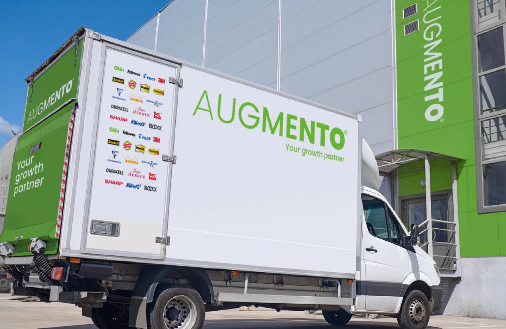
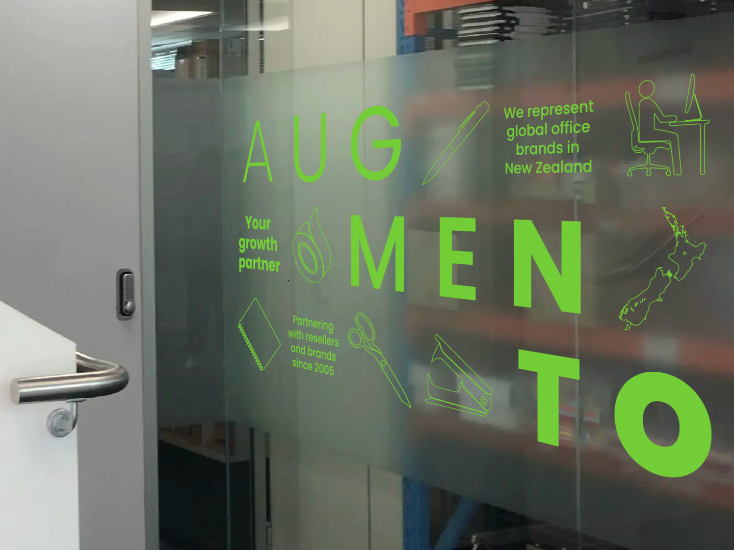
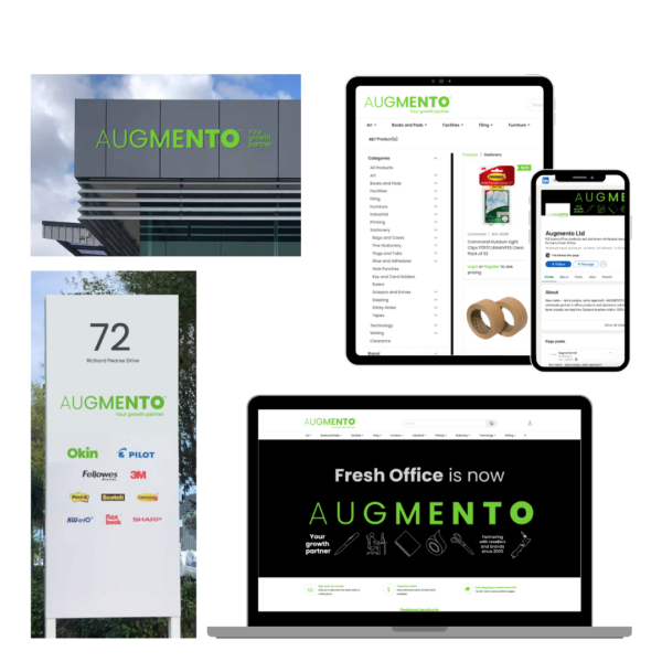
Visual Identity: To retain a sense of continuity, we kept the familiar green colour from Fresh Office, modernising it with sleek, streamlined design elements. The new dynamic logo symbolised growth and progress, reflecting Augmento’s forward-thinking ethos.
Each design choice was made to ensure the brand looked both elegant and bold, intriguing yet easy to understand. The resulting visual identity was not just a facelift but a visual narrative that conveyed reliability, quality, and a bold vision for the future.
It resonated with clients and staff alike, creating a sense of pride and excitement within the company.
Brand Messaging: Obviously, the main focus for the refreshed brand story was to convey the company’s commitment to driving growth and success for its clients.
Augmento’s story was built around the idea of personalised solutions and category growth, highlighting the transition from a mere office supplier to a comprehensive growth partner. This narrative not only reinforced the brand’s core values but also set it apart as a leader and innovator in the market.
It communicated a promise of partnership and excellence, ensuring that every client felt valued and understood.
Conclusion
The rebranding to Augmento marked a significant evolution for the company and the collaborative process we followed truly ensured acceptance and excitement within the company, making this critical moment an enjoyable step in the business’ life.
Augmento’s new identity not only reaffirms its values, culture, and core ambitions, but also positions it for future growth. The positive feedback the organisation received since the launch in July, validates the strategic and creative efforts, laying a strong foundation for continued success.
We couldn’t be prouder and happier for our friends at Augmento and can’t wait to see them grow even more.