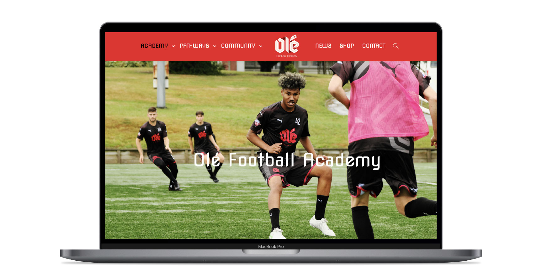
Olé Football Academy work – Brand workshops | Consumer research | Brand research | Competitive Analysis | Positioning | Brand Strategy | Brand design | Website design and build | Signage | Player outfits | Collateral | Social Media
Olé is a full-time ‘high performance’ sporting institution based in Porirua, New Zealand. The brand has become one of the most well-known sports organisations in the country, and they are known across Scandinavia and the United States, as a leader in New Zealand Football.
As a brand that lives by CANI (Constant And Never-ending Improvement) in it’s players they knew they needed to take their own advice. And this is where Re:brand came in.
“From day-1 they were brutally honest. They asked us questions that we did not have answers to. They challenged us. They made us better as an organisation.”
BLAKE JONES, CEO, OLÉ FA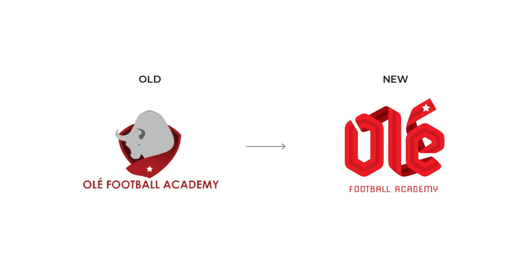
Brand Research
We conducted an organisation wide review covering; Leadership team workshops; surveying 300 current and former players worldwide; 12 key partner depth interviews; a current brand assessment and competitive analysis.
It became evident that their external communication, and how they positioned themselves to the players, families and the greater community was outdated. Yet Olé was still respected for the work it does. This indicated a service- brand disconnect.
The Challenge
Research identified the following brand challenges that required attention:
- The brand was dated and misunderstood
- A disconnect between what they were actually doing, and saying, in 2021
- What their logo, website, and brand were communicating
- There was a huge love for the organisation that wasn’t being translated to the brand
Strategic project objectives were:
- Distil and clearly communicate how Olé is unique – the Olé way
- Challenge, review & modernise every part of the brand
- Galvanise staff, students, families and partners/sponsors around the brand.
Branding
We resolved the brand to one concept – the Olé way.
The Olé way is a philosophy. But the Olé way is also a non-linear path with twists and turns – hence the shape of the new logo.
This path finally ends with an achievement – denoted by the star at the end.
Now the resulting brand encapsulates and tells a new authentic story that has resonated deeply with staff, players, family and key sponsors. This has galvanised the organisation at every level and paves the way for success for decades to come.
“It’s incredible. It’s brought to life visually what the organisation stands for. It freshened everything up and given the organisation more pride in our look and feel, while relating to the academy philosophy and our way of doing things.”
BLAKE JONES, CEO, OLÉ FA
“I think the new branding is simple to view, yet is highly detailed and I think that sums up a lot of what we’re about here. As a player who has been here for nearly 8 years, I think this rebrand makes so much sense to who we are and really represents Olé well!”
OLÉ ACADEMY PLAYER
“We’ve seen significant growth in external partnerships, being approached by 3-4 different organisations/businesses in the last 5 months who want to partner with, or sponsor us. Nothing like this was happening previously – we were having to approach people!”
SIMONE SIPPOLA, MEDIA & COMMUNICATION, OLÉ FA
 Creativity
Our research indicated that the old ‘bull’ logo had little relevance to the players and organisation. Instead, it was “the Olé way” that was central to their philosophy and the desires of young players.
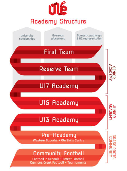
So, that ‘pathway’ is what we visually expressed with the ribbon shape. It represents a non-linear pathway that finally ends with an achievement (denoted by the star at the end).
The letter forms are hexagonal to hint at the hex shape in a soccer ball and goal net.
Colours of Burgundy and Red on Black were up-cycled from the old brand because the research said the colours already had good brand recall.
CLOTHING, SIGNAGE, MEDIA
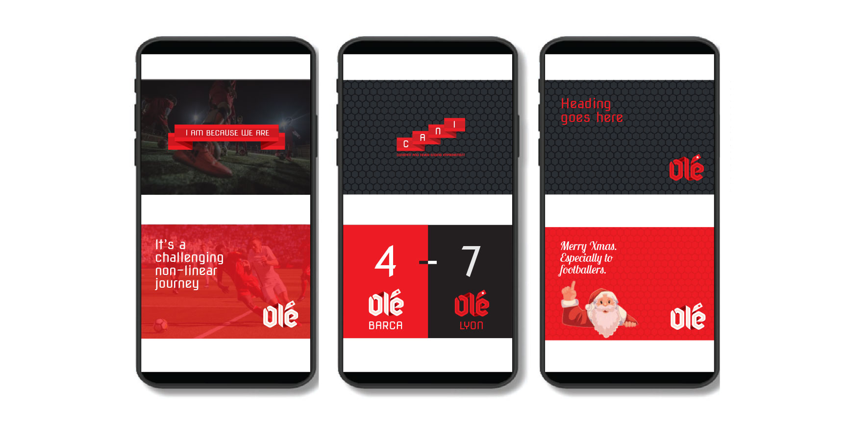
The clothing had to look ‘cool as’ to appeal to the youth audience. The signage had to be awesome and the social media graphics had to look mean. So that’s what we did.
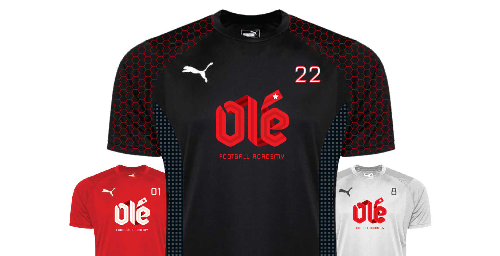
THE STRIP (UNIFORM)
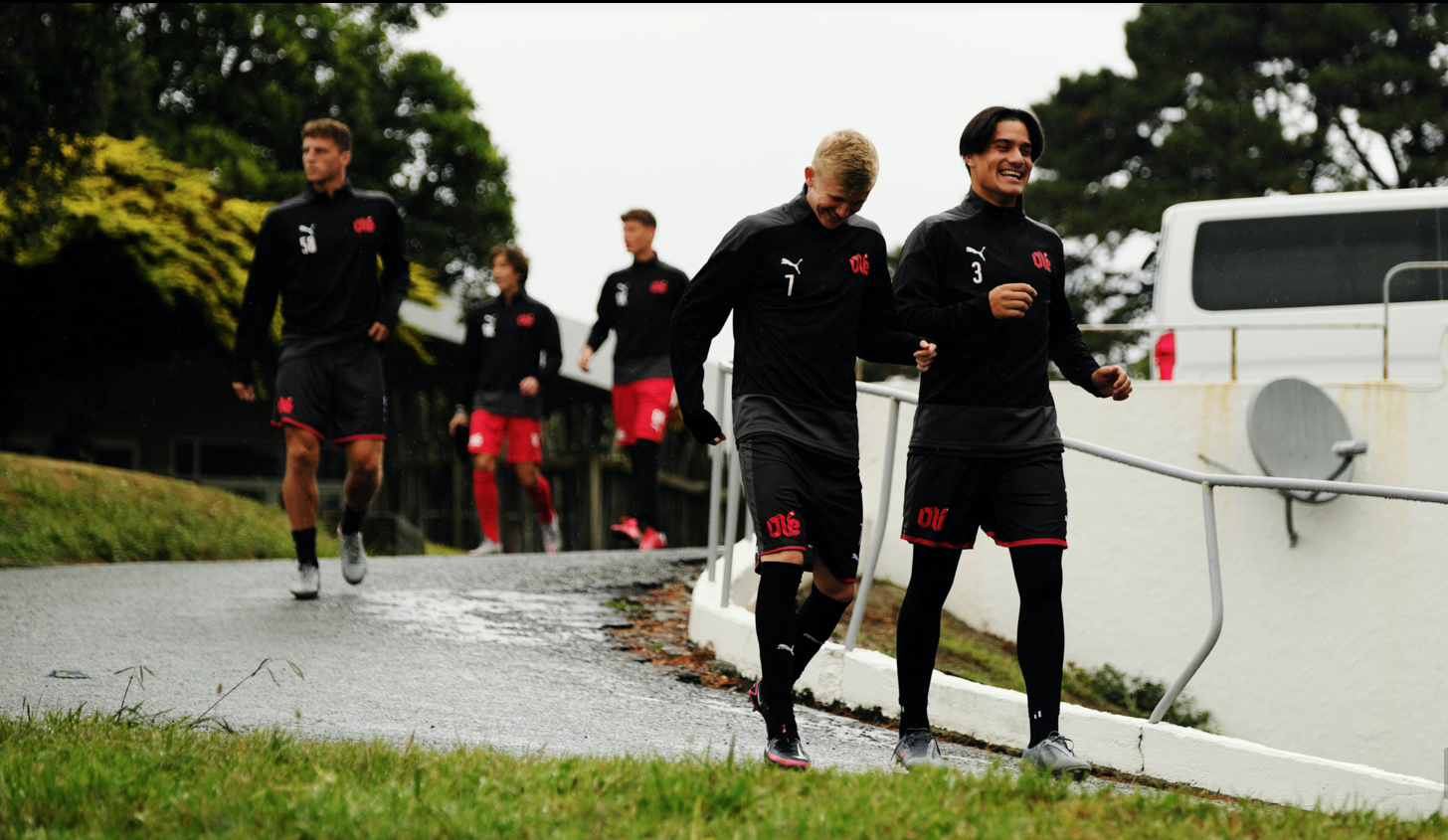
“The players are buzzing about the new brand. They love the new look and the tangible things, like their slick new training kits
and the new signs around the building and the pitch. But many of them were also quite thoughtful about the ‘why’ commenting that they “like the story behind the new logo” and that “it’s cool that there is actually a meaning we can understand now.” It’s Training Jersey difficult to get too many actual words out of teenagers – but things like “it’s sick,” “it’s dope,” and “it’s fresh as” are used. I think the smiles on their faces tell us what we need to know”
SIMONE SIPPOLA, MEDIA & COMMUNICATION, OLÉ FA
Results
The results of this branding have been more tangible than most other brands we’ve done. Partly because they wear it on their chest every day of the week.
Feedback from Olé
“Post launch our rate of growth in followers on social media, Instagram in particular, has increased. But more importantly, we’ve seen a big increase in the engagement followers are having with Instagram content – likes, comments, shares and saves. This is continuing to grow.”
The new brand has helped the business in so many ways in such a short time. Right from the first step in the process, we’ve been forced to really look at ourselves as an organisation, ask difficult questions and reflect. The power of this in itself cannot be underestimated. Rebranding has helped us to more deeply understand and solidify our unique position in the market, who we are, and more importantly who we are not. We have a clear what, how and why, which we know is grounded in research and evidence, to guide us in our decision making processes on a day-to-day basis and on a strategic level.”
BEN SIPPOLA, TECHNICAL DIRECTOR OLÉ FA
 CEO’s opinion on the branding
My name is Blake Jones and I am CEO of the Olé Football Academy.
In short, the Olé Football Academy is a full-time ‘high performance’ sporting institution based in Porirua. Over the past 20-years we have established a proven ‘track record’ of youth development. Our educational approach is long-term focused, relationship first, with the player at the center.
This approach has produced many professional footballers, New Zealand youth and full internationals, and many leaders inside of communities across the country.
Since 2018, our organisation has grown substantially. Internally, we say we have ‘become a victim of our own success’. We have more students and staff than ever. The standards of service are demanding. The day-to-day can be a grind. This forced us to turn every stone to ensure we handled the growth responsibly, and that we could remain at the forefront of our industry for the next 20-years and beyond.
As part of this internal review, it became evident that our external communication, and how we portray ourselves to our players, families, and the greater community was outdated. There was a disconnect between what we were actually doing in 2021 and what our logo, website, and brand said we did.
Our brand has become one of the most well-known sports organisations in the country, and we are known across Scandinavia and the United States, as a leader in New Zealand Football. We needed to act like it! This is where Re:brand came into the picture.
From day-1 they were brutally honest: they asked us questions that we did not have answers to; they challenged us; they made us better as an organisation.
Blake continues
Through this process we realised where we wanted to go and how we wanted to get there. ‘reBrand:’ then helped us separate the wheat from the chaff. They built a practical plan forward and told us what we needed to get done, how to do it, and walked with us (sometimes crawled) through the entire process.
With their experience and leadership, they understand in their soul how difficult a rebrand can be. It’s long, not efficient, and sometimes circular. CEOs and other executives of organisations have egos, we love the past, and can be hard- headed.
There were probably times where we weren’t doing our part, but they stuck with us. Because of this, the final product has revolutionized a part of our organisation that needed help. We accomplished what we set out to do, by providing clarity to our stakeholders. Additionally, it’s given us a new fresh look that fully encapsulates everything that we do best as an organisation to prospective clients.
In the 21st century, being able to connect with all your different stakeholders in the way you want is an art. An art, that if you can get right, will help assist your organisation in flywheel gains to your mission.
Don’t get me wrong, branding is not everything. It is just one thing. But where our organisation was, it was exactly what we needed. We have Re:brand to thank for this.
BLAKE JONES, CEO OLÉ FOOTBALL ACADEMY
