Okin
Project overview
When Icon was launched in 2017, it quickly became a trusted brand, providing high-quality, affordable office, home, and school supplies tailored for the Kiwi market. However, by 2024, it was clear that the brand needed a refresh to stay relevant and competitive. Not only did the brand need to appeal more directly to end-users and improve its visibility on shelves, but a trademark conflict with another paper company named Icon also emerged, necessitating a rebranding. This challenge set the stage for the transformation from Icon to a new identity, with the goal of modernising the brand and rename it, while preserving its core values of affordability, reliability, and community connection.
Research and Strategy
Rebranding is a delicate process that requires a deep understanding of both the brand’s history and its future potential. To ensure that the transition from Icon to its new identity would be smooth and successful, we embarked on an extensive research phase.
We started by conducting a thorough analysis of the market and the target audience. This included studying competitors, identifying market trends, and understanding the shifting preferences of end-users. Through surveys and one-on-one interviews, we gathered insights directly from those who mattered most: the stakeholder who interacted with the brand daily.
Next, we assessed the current perception of the Icon brand. While the brand was respected for its reliability and affordability, there was a clear opportunity to enhance its appeal to end-users and improve its recognisability on shelves. This study provided the foundation for a strengthened brand positioning, helping us identify what needed to change and what needed to be preserved.
This strategic positioning was built around three core pillars:
- Familiarity with Evolution: Maintaining a link to the trusted Icon name while signalling a new direction
- Proximity and Simplicity: Making the brand more relatable and easily recognisable, both on the shelf and in the minds of consumers.
- Kiwi Roots: Emphasising the brand’s New Zealand focus to strengthen its connection with local consumers.
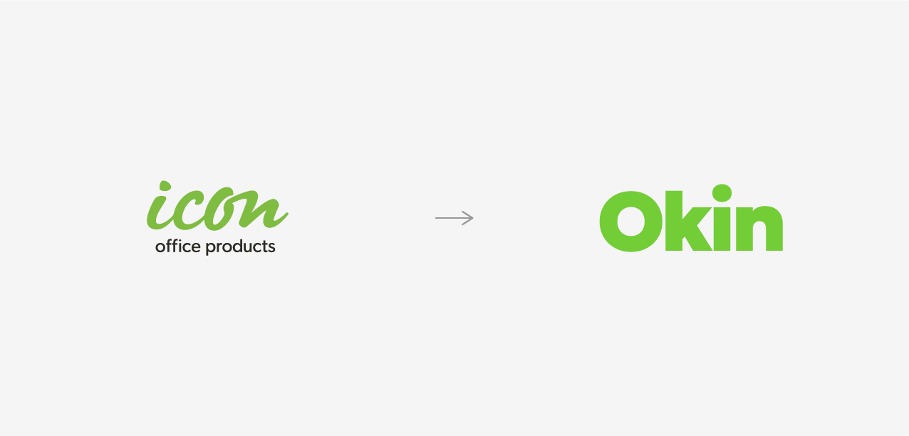
The name change was a pivotal part of this strategy. We needed a name that was modern, approachable, and community-oriented, while ticking the strategic positioning boxes. Okin was chosen for its simplicity and meaningful connections: “O” for Office, and “Kin” to evoke a sense of community.

Creative and Brand Design
Once the strategic foundation was laid, the next step was to translate this into a visual identity and messaging that would convey Okin’s updated positioning.
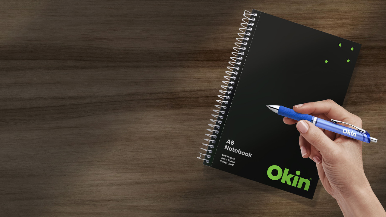
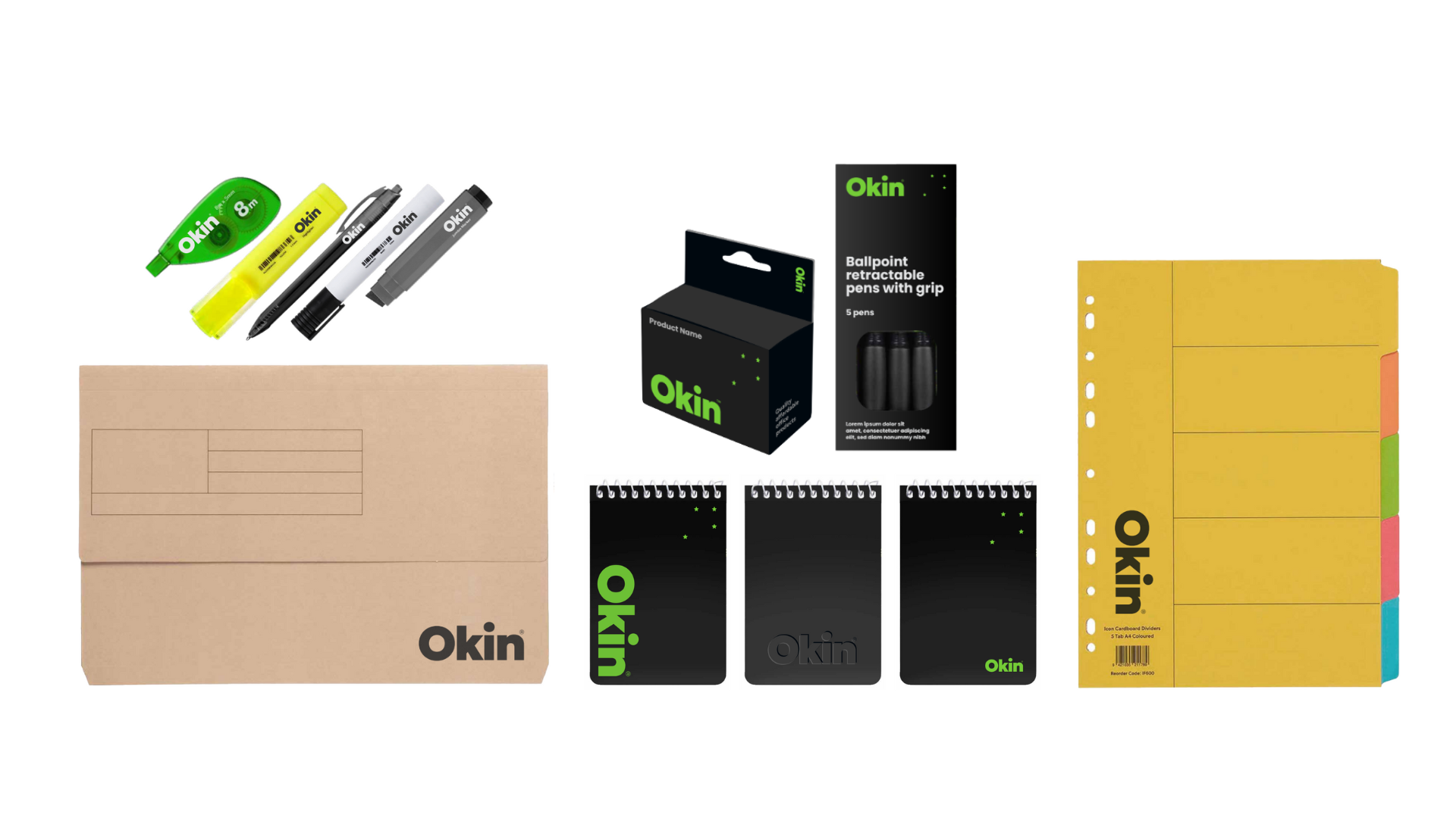
Visual Identity: To embody the essence of Okin—modern, trustworthy, and distinctly Kiwi, the logo was designed to be clean and contemporary. A stylised Southern Cross was also subtly integrated into the design, not only highlighted the brand’s Kiwi roots but also to conveyed the brand commitment to align with its audience needs.
The colour palette was purposefully chosen to include the parent brand Augmento’s green, evoking the relationship between the two brands and leveraging the trust and heritage of the parent brand. Black and white were also selected to ensure continuity with the previous identity while adding a sense of elegance that aligns with Okin’s refreshed strategic positioning. The overall design is both functional and approachable, reflecting the core values of affordability and dependability that Okin stands for.
 Brand Messaging: With the visual identity in place, we turned our attention to the brand’s messaging. The tone of voice was refined to be more engaging and relatable, without losing the authoritative edge that Icon was known for. We developed key messages that emphasised the brand’s evolution, its commitment to the community, and its promise of delivering high-quality, affordable products.
Taglines and supporting copy were crafted to reinforce the brand’s new positioning, ensuring consistency across all touchpoints—from packaging and in-store displays to digital communications and advertising.
Conclusion
The transformation from Icon to Okin was a carefully orchestrated process that balanced respect for the brand’s legacy with a clear vision for its future. By grounding our work in evidence-based research and strategic thinking, we were able to create a brand that not only meets the current needs of the market but is also positioned for long-term success.
The launch of Okin has been met with positive feedback from both consumers and distributors, confirming that our approach resonated with the target audience. The new brand identity has made Okin more recognisable on shelves, helping it to stand out in a competitive market and paving the way for its expansion into new product categories.
As we look back on this project, we’re proud of the role we played in evolving a trusted brand to meet the challenges of a new era. Rebranding is never just about changing a name or a logo; it’s about strategically positioning a brand to thrive in the future. With Okin, we’ve done just that—ensuring that it continues what made Icon a success, while also embracing the opportunities that lie ahead.