Workshop | Industry assessment | Brand assessment | Positioning | Naming | Website
Project overview
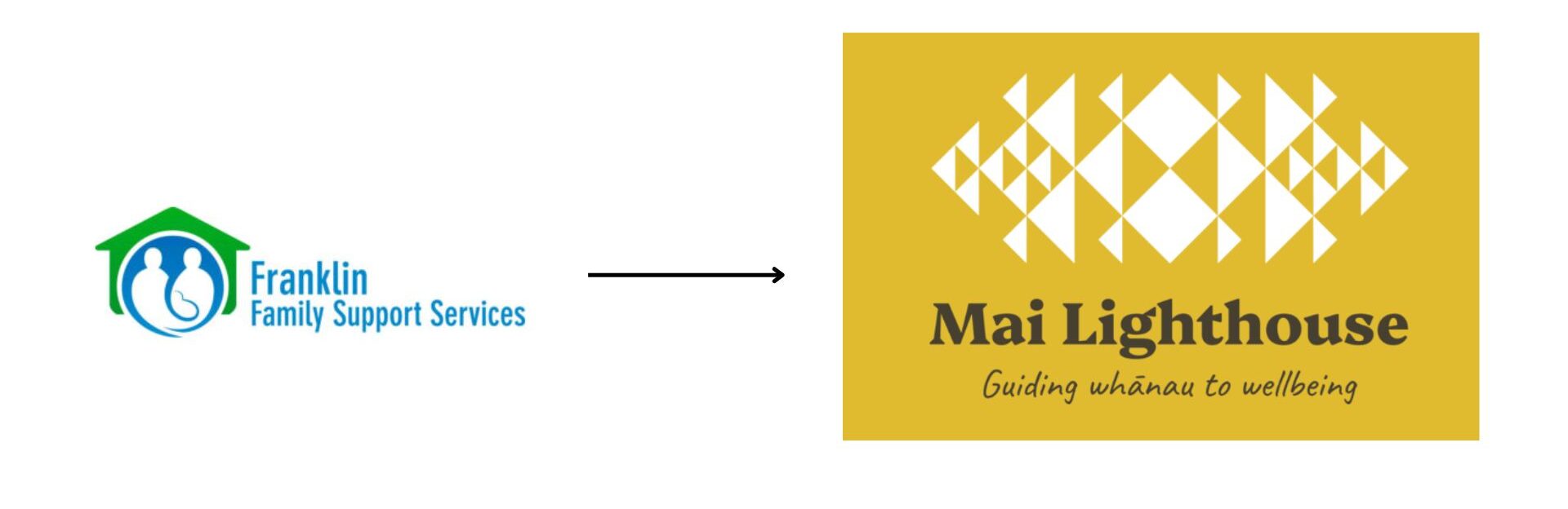
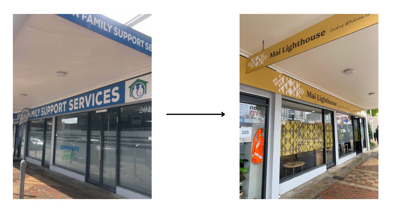
Franklin Family Support Services (FFSS) had been a cornerstone of community support for over 40 years, providing essential services to families and individuals in the area of Franklin. However, the organisation faced a growing challenge: their brand no longer resonated with their evolving audience. The name and identity felt outdated and didn’t fully communicate the breadth of support available, making it harder to connect with those in need.
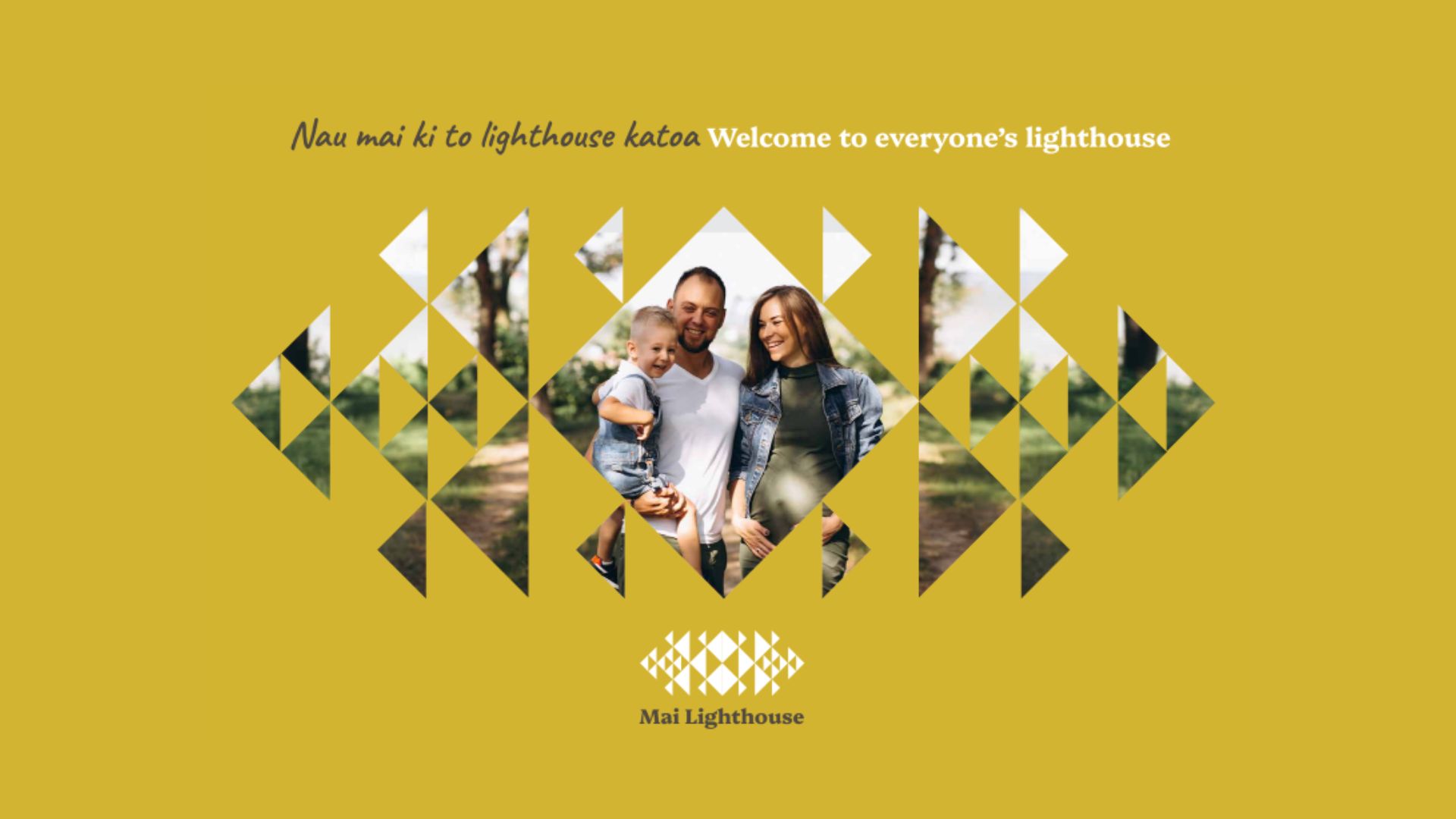
To address this, FFSS embarked on a strategic rebrand—to create a name and identity that would reflect their inclusive, future-focused mission while making their services more accessible and recognisable. The result? Mai Lighthouse—a brand that symbolises guidance, safety, and empowerment for the entire community.
Research and Strategy
So, before defining the new identity, we conducted an in-depth research phase to understand FFSS’s current challenges, opportunities, and long-term vision. This included:
- Stakeholder workshops with leadership, staff, and volunteers to uncover key insights about the brand’s existing perception and future ambitions.
- Community research to identify how the organisation was perceived and where clarity was lacking.
- Industry analysis to ensure differentiation while maintaining credibility within the sector.
The research revealed that while FFSS had built strong trust within the community, their name and brand presence no longer reflected the full scope of their services. People associated them primarily with local family support, missing the broader impact they had on individuals, whānau, and the wider community. This insight informed the need for a name that was more inclusive, aspirational, and reflective of their role as a guiding force.

Naming: Embodying The Organisation
The name Mai Lighthouse was chosen because it encapsulates the organisation’s mission and values:
- ‘Mai’ is a Māori word that conveys movement, direction, and connection. It signifies coming towards, from, or in the direction of something, reinforcing the organisation’s commitment to guiding and supporting individuals on their journey toward stability and empowerment.
- ‘Lighthouse’ symbolises safety, guidance, and hope, aligning with the organisation’s role in helping individuals and families navigate challenges.
By shifting from a geographically restrictive and institutional-sounding name to one that conveys warmth, inclusivity, and a sense of purpose, the organisation could better communicate its impact and reach a broader audience.
Creative Phase – Bringing the Brand to Life
With the name in place, the next step was to craft a visual identity that would reinforce the organisation’s mission while maintaining cultural relevance.
The Manukau Lighthouse, a well-known symbol of guidance in the region, served as a key inspiration for the brand’s creative direction. It represents protection, navigation, and resilience—all of which align with the organisation’s core purpose.
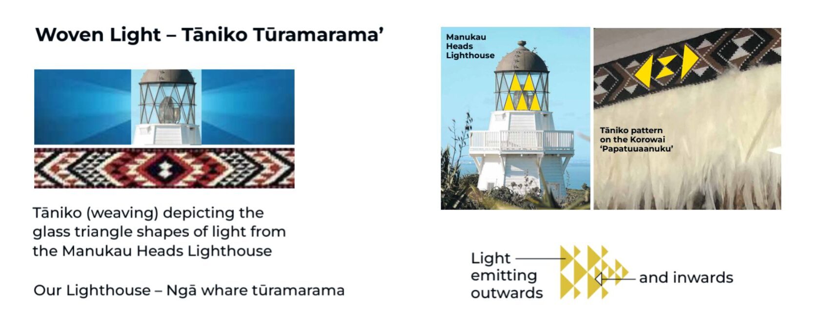
To ensure cultural authenticity and a deeper connection with the community, the brand incorporates Māori design elements that reflect:
- The Woven light: A visual metaphor for support and hope, with stylised rays symbolising the organisation’s reach and impact.
- Whānau and connection: The patterns convey togetherness and collective strength, reinforcing the idea of a wraparound support system.
- Stability and movement: A balance between firm foundations and progress, visually representing the support offered to those navigating life’s challenges.
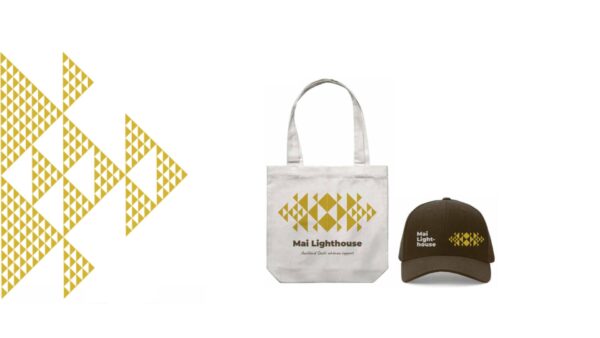
The final brand identity was designed to be warm, approachable, and modern, with a colour palette that evokes the geographical area and it’s deep attachment to the land, conveying safety, trust, and community support.
Messaging: Establishing the Brand’s Communication Pillars
A strong brand identity needs a clear and consistent messaging framework. For Mai Lighthouse, we developed core communication pillars to ensure the brand’s voice remains aligned with its mission and audience:
- Guidance & Empowerment – Reinforcing that Mai Lighthouse is a source of support and clarity for those facing life’s challenges.
- Inclusivity & Community – Emphasising the organisation’s role in supporting all individuals, whānau, and communities, regardless of background or circumstances.
- Stability & Trust – Communicating reliability, warmth, and the idea that Mai Lighthouse is a safe and dependable place for those in need.
- Growth & Transformation – Highlighting how the organisation helps people move forward, make progress, and regain control over their lives.
These pillars guide all brand messaging, ensuring that Mai Lighthouse communicates with consistency, authenticity, and impact.
Conclusion: A Brand Ready for the Future
The transition to Mai Lighthouse has created a stronger, clearer presence for the organisation. The new brand better reflects the breadth of services offered, allowing Mai Lighthouse to connect with more people in need while reinforcing its role as a trusted community pillar.
Since the launch, the response has been overwhelmingly positive—from staff, stakeholders, and most importantly, the people they support. By aligning the brand with its true purpose and vision, Mai Lighthouse is now positioned to continue growing its impact while ensuring that no one has to navigate life’s challenges alone.