A brand that saves lives
Workshop | Brand strategy | Positioning | Brand Naming | Design | Messaging | Guidelines | Collateral | Marketing
Project overview
The Auckland Rescue Helicopter Trust (ARHT), is a much-loved not-for-profit providing lifesaving helicopter rescue services in the Greater Auckland Area. They knocked on our door as they had been facing significant challenges with their positioning and brand presence, and needed to move on to secure their future.
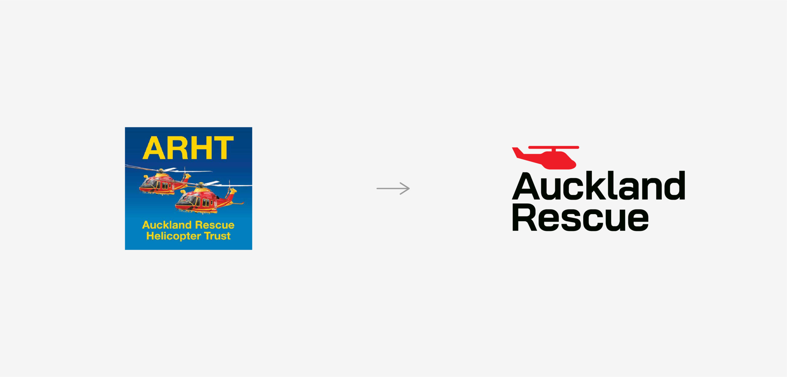
ARHT’s brand was complex and outdated, with the staff considering it almost detrimental to their comms. Additionally, the organisation’s major sponsor, Westpac, had overshadowed the Trusts identity with the development of their own logo, “Westpac Rescue,” to support their own marketing.
Adding to the challenge, we had to retain and leverage ARHT’s equity, voted “Most Trusted Charity Brand” in New Zealand in 2024.
Research and Strategy
Our task was really about helping ARHT stand up and take ownership of their brand – how it looked and how they dealt with sponsors. So, our strategy for Auckland Rescue aimed to create a clear, distinct identity that would strengthen its presence and highlight its essential services. This involved simplifying and modernising the brand while resolving confusion with their major sponsor, Westpac.
To do so, we conducted extensive market research, both locally and internationally, as well as consultations with staff and the senior leadership team. This research revealed that while ARHT’s branding had some strong cues, their use was too inconsistent, dated and unclear to be recognisable or relevant. Additionally, the Westpac sponsorship relationship weakened ARHT’s own branding, adding complexity and blurring the identity with Westpac branded elements.
We quickly understood that donors perceived “Westpac Rescue” as the brand responsible for the helicopter rescue services in Auckland, overshadowing ARHT. This heavily hindered ARHT’s ability to build its brand profile, attract donations and even posing a risk to future activities.
Creative and Brand Design
The rebranding of Auckland Rescue was driven by one main mantra: Simplification
Identity
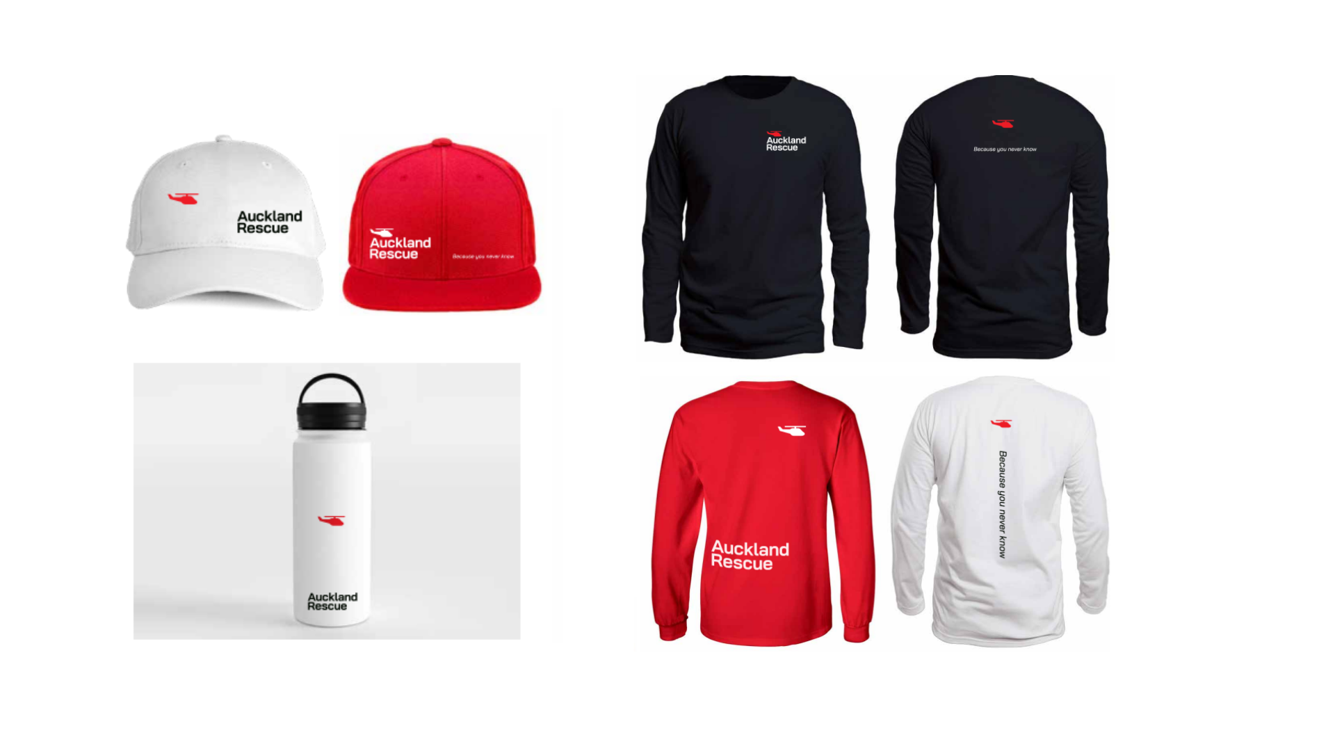
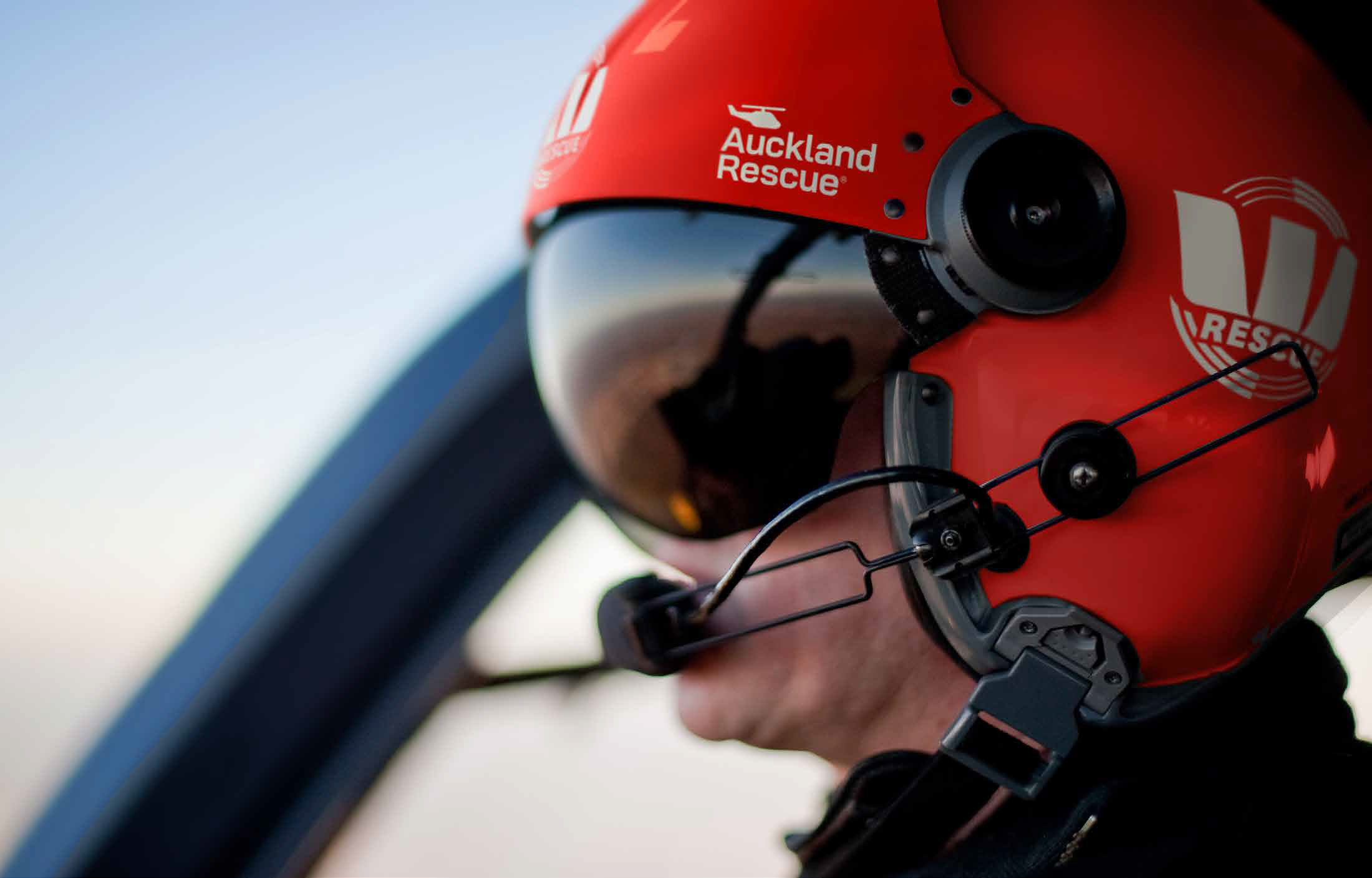
We introduced a modern, almost over-simplified identity to replace the outdated elements like the blue box and the two real-style helicopters, creating a clean, clear and cohesive design. This was purposefully done to be clearly readable and memorable in a confusing donor market. The simple helicopter icon provides just enough of a visual cue as to who the organisation is.
Name
The simplified new name, “Auckland Rescue” meant that the identity was much clearer and readable. And crucially it also gave them scope for growth into other ‘rescue’ services in the future if they desired.
Sponsors
The result was also designed to coexist harmoniously with the Westpac Rescue brand – acknowledging Westpac’s significant role in raising awareness and funds over the last 30 years – while taking more ownership of who they are.
We updated the colour palette for own recognition while differentiating from Westpac, and repositioned Westpac as a sponsor rather than the primary identity.