Creative and Brand Design
With this clear strategy in mind, we moved into the creative phase, focusing on developing a strong visual identity and compelling messaging that would resonate with Alliance’s objectives

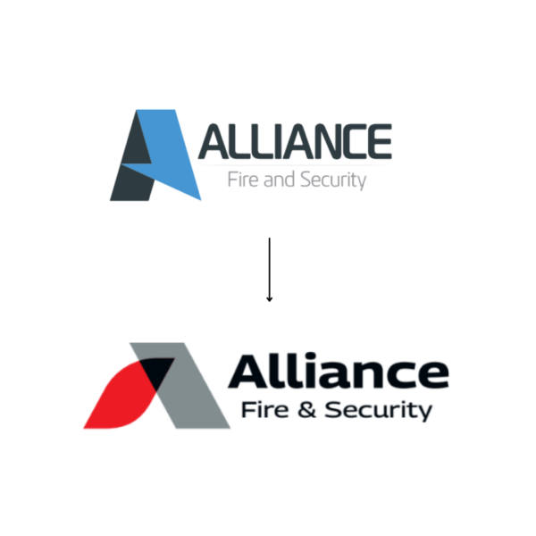
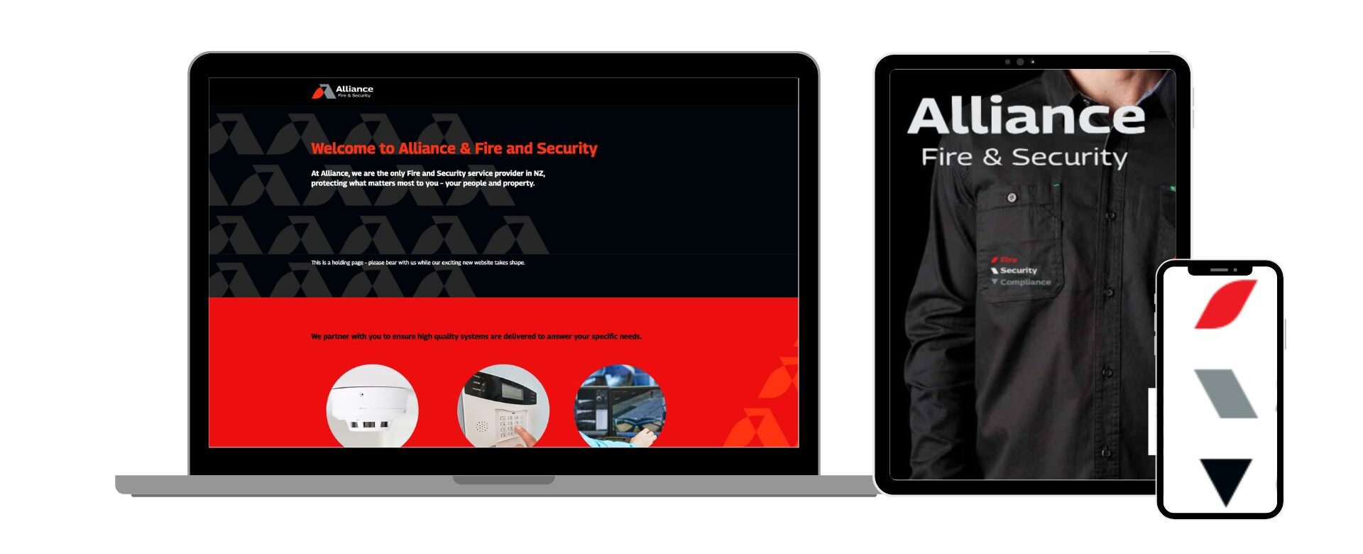
Visual Identity: The new logo, featuring bold typography, symbolises stability and trust, while the logo mark, inspired by fire and security elements, conveys protection and vigilance. The colour palette, a blend of grey, black, and red, echoes the security and fire protection industry colour code, exuding professionalism and reliability.
We also developed a pattern derived from the logo mark to be used as a branded background, adding another layer of consistency to the overall brand identity, especially when used on official documents and other materials.

Brand Messaging: Our brand messaging strategy for Alliance Fire & Security centred on the core message of “Safe Buildings, Safe People.” To us, this succinctly captured the core of their “why” — protecting people and assets through comprehensive protection and reliability.
To demonstrate and substantiate this safety promise, we decided to emphasise their extensive range of services, from fire protection and security solutions to general compliance, thus highlighting how unique this comprehensive offering is in their industry. This approach allowed us to clearly communicate their ability to deliver on their commitment to safety.
By communicating their tailored, integrated, and advanced solutions, we created claims and headlines illustrating their ability to meet the specific needs of buildings, whether commercial or government.
We consistently applied this unified messaging across the redesigned website, marketing materials, and client communications to reinforce their refreshed brand identity.


