Presbyterian Support Northern – A brand that empowers

A brand that empowers

Workshop | Brand strategy | Positioning | Brand Hierarchy | Design | Messaging | Guidelines  

Project overview

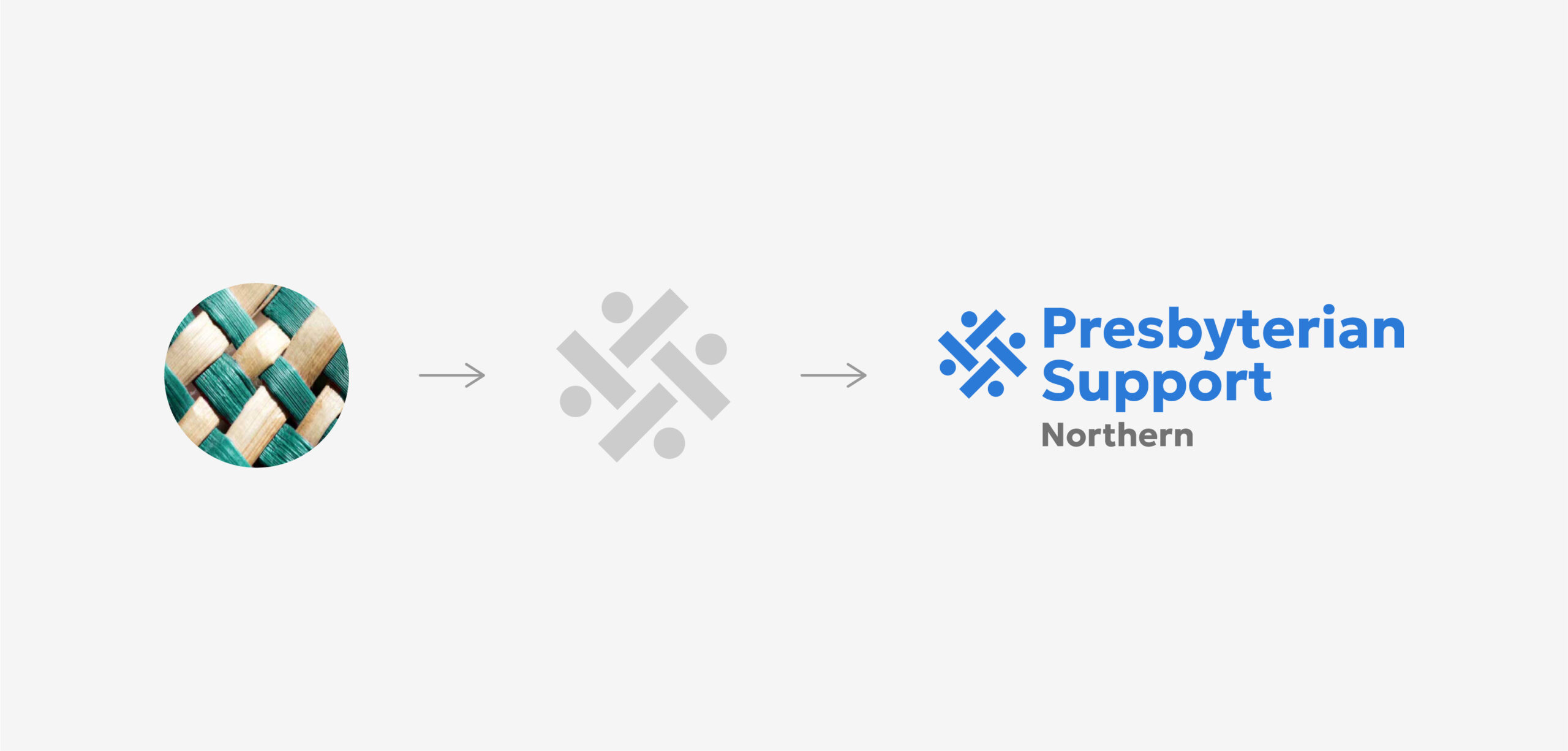
Presbyterian Support Northern (PSN) is a charitable organisation with over 100 years of history in New Zealand. While originally founded by the Presbyterian Church, PSN has evolved into an inclusive organisation, embracing people from all faiths or none. PSN’s mission is to provide social, health, and disability services to individuals and communities in need across New Zealand’s Northern region. Their purpose-driven approach focuses on fostering “better lives for everyone,” infusing inclusivity and care into every layer of their organisation.

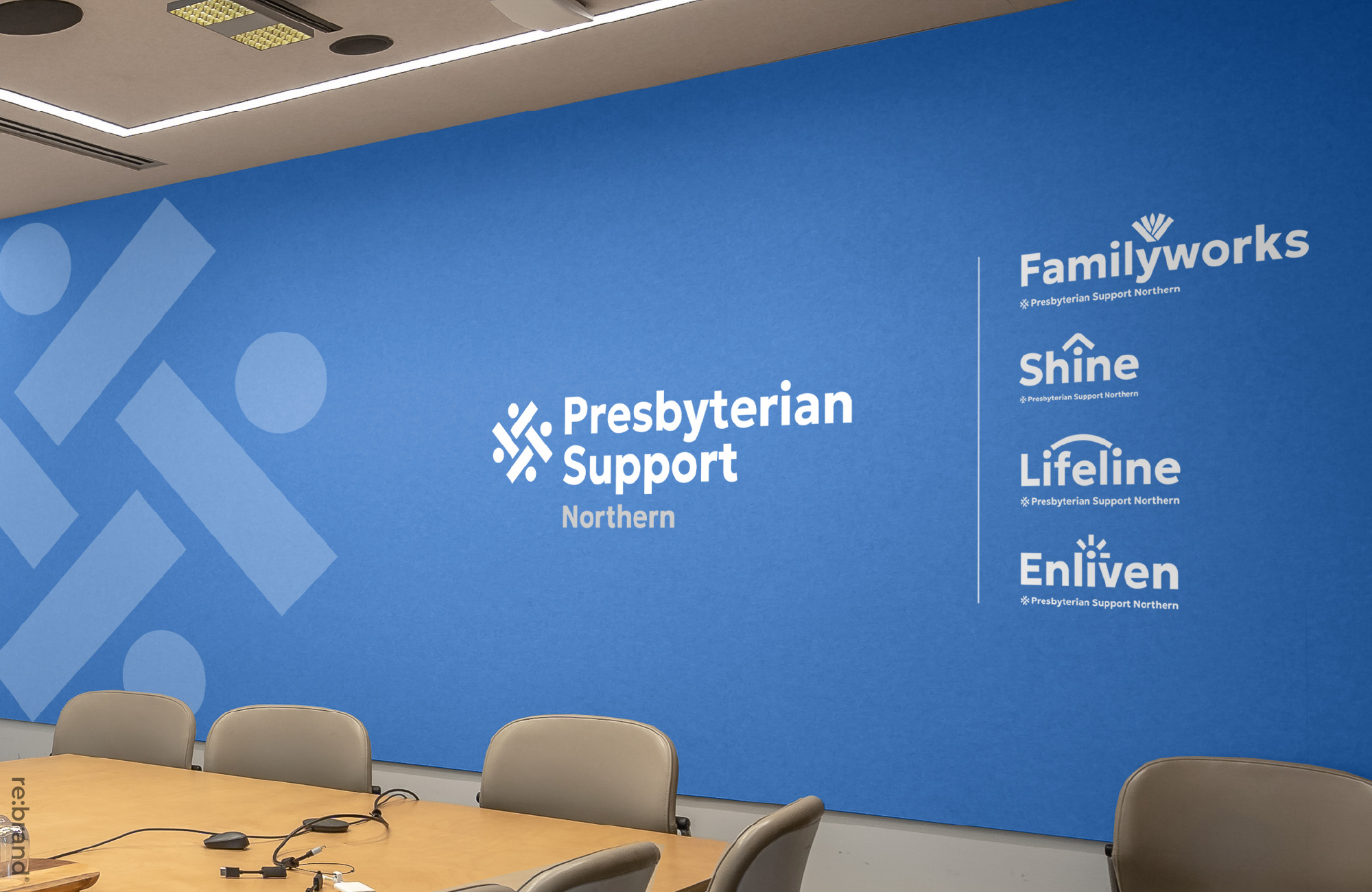
The Challenge PSN operates through four main service brands:

  • Family Works: Supporting Kiwi families to create positive environments for tamariki and parents.
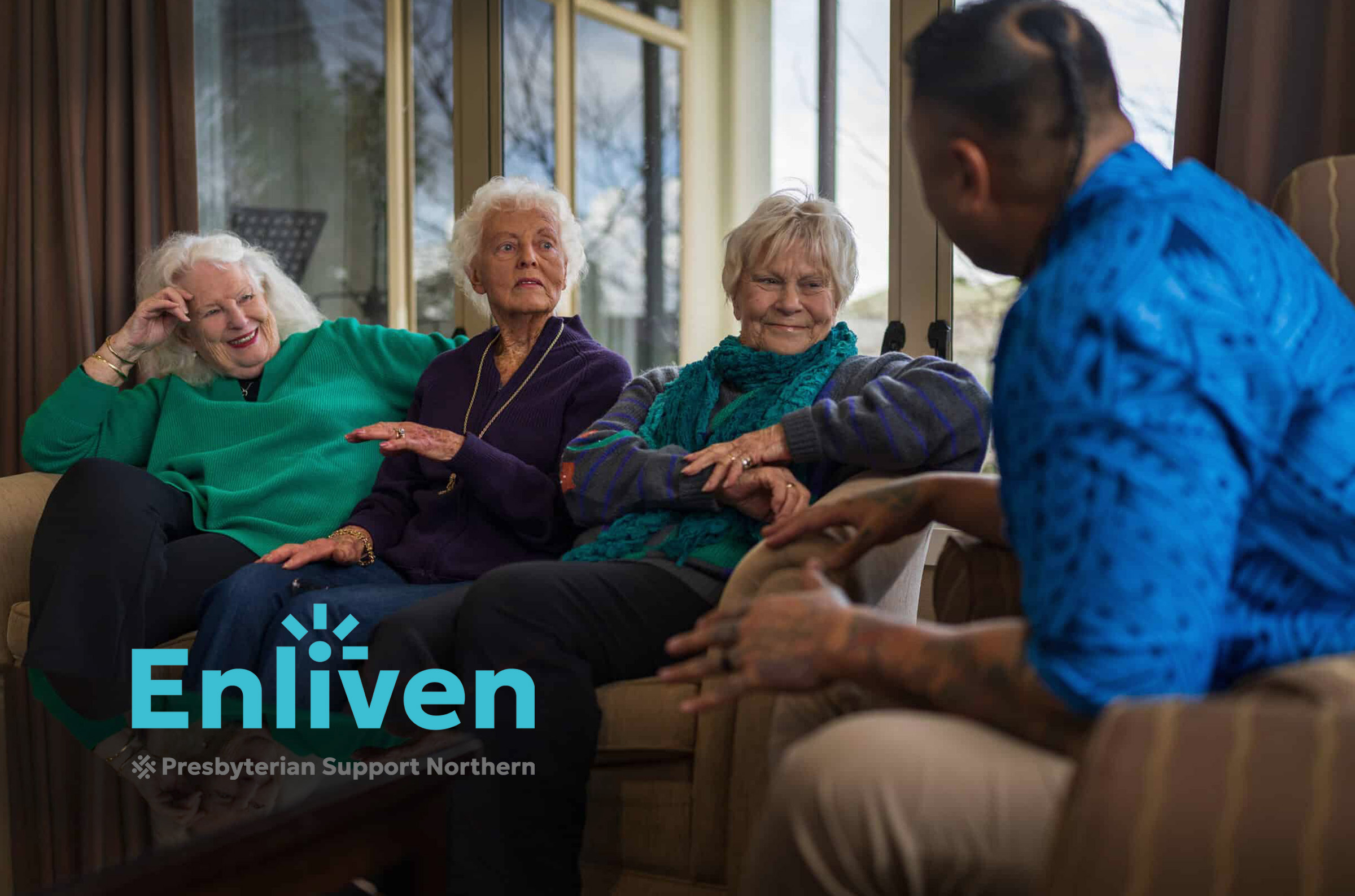
  • Enliven: Helping seniors maintain independence and quality of life.
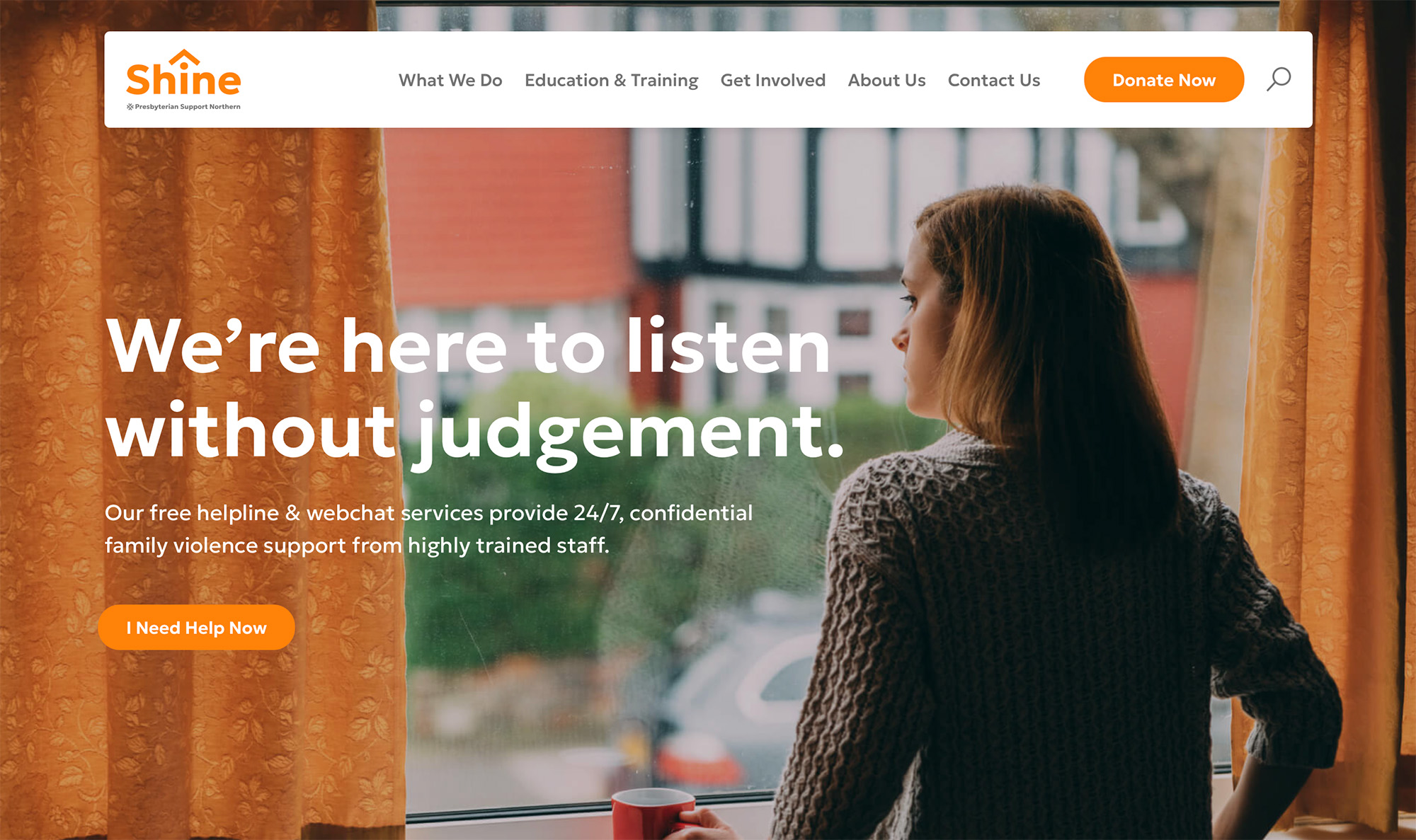
  • Shine: Educating to prevent domestic violence and supporting families to escape toxic environments.
  • Lifeline: Offering mental health support and relief to those in need.

While Family Works and Enliven are legacy PSN services, Shine and Lifeline were acquired, leading to a structural and visual disconnect. This fragmentation diluted PSN’s visibility and impact. To strengthen its identity and better serve its communities, PSN needed a unified brand ecosystem that reflects its inclusivity and breadth of services while embracing modernisation and multicultural symbolism.


Our Approach

The rebranding project followed our evidence-led process.

  1. Discovery Phase:
    • Conducted extensive research on PSN’s history, values, and services.
    • Engaged with stakeholders, staff, and service users to understand their needs and expectations.
    • Analysed market trends and best practices in the charity sector.
  2. Brand Strategy:
    • Developed a cohesive brand architecture that positioned PSN as the parent brand, visually endorsing Family Works, Enliven, Shine, and Lifeline.
    • Highlighted PSN’s breadth of services, touchpoints, and cultural inclusivity through messaging and design.
  3. Design Development:
    • Modernised the PSN logo, drawing inspiration from Māori symbolism to convey inclusivity and connection.
    • Updated the visual identities of the four service brands, creating a unified yet distinct look for each.
    • Incorporated a cohesive colour palette and ‘dot-person’ iconography to symbolise people and community.
    • Designed patterns inspired by Māori art to align each brand with PSN’s inclusive mission.
  4. Sub-Brand Integration:
    • Simplified Lifeline Connect into “Lifeline Training” and Shine Respond into “Shine Training” or “Shine Training and Education.”
    • Rebranded DV FREE as “Shine Certified.”
    • Created visual designs that harmonised with the main brands while preparing for their eventual phase-out.
  5. Implementation:
    • Rolled out the updated identities across digital platforms, print materials, and community touchpoints.
    • Provided brand guidelines to ensure consistent application across all communications.


Creative and Brand Design

The primary creative objective of the rebranding was to create a unified identity that visually endorsed all four service brands under the PSN umbrella. This required a careful balance of cohesion and individuality, ensuring that each brand retained its unique essence while clearly aligning with PSN.

Modernisation was another key priority, with a focus on updating and simplifying the visual identities to make them more relevant and appealing.

Additionally, inclusivity played a central role, with the incorporation of strong Māori symbolism to authentically reflect PSN’s commitment to multiculturalism and diversity.

Finally, strategic flexibility was essential to redesign sub-brands such as Lifeline Connect and Shine Respond (renamed during the project) to fit seamlessly within the ecosystem.

The intricate patterns woven into the designs help establish a sense of belonging and support, reinforcing the organisation’s role as a trusted provider of social, health, and disability services. The integration of sub-brands was executed seamlessly, with clear pathways for their potential phase-out, ensuring strategic flexibility for the organisation’s future growth.

Conclusion

The rebranding successfully unified PSN and its service brands under a cohesive identity, significantly enhancing their recognition and visibility while preserving the unique strengths of each brand. The modernised logos, colour schemes, and typography brought a fresh and contemporary appeal to PSN’s visual identity, establishing it as a forward-thinking organisation. By incorporating Māori-inspired design elements, the branding authentically conveyed PSN’s commitment to inclusivity and cultural respect, aligning with its purpose-driven mission.

Reflecting a harmonious blend of tradition and modernity, honouring its century-long legacy while positioning it for the future, the new brands family feel is now better equipping the PSN organisation to serve New Zealand’s diverse communities and achieve its mission of fostering better lives for everyone.

Return to our Work page

PSN website

Log in with your credentials

Forgot your details?