A brand for the community
Brand workshops | Brand research | Competitive Analysis | Positioning | Brand Strategy | Brand design
Background
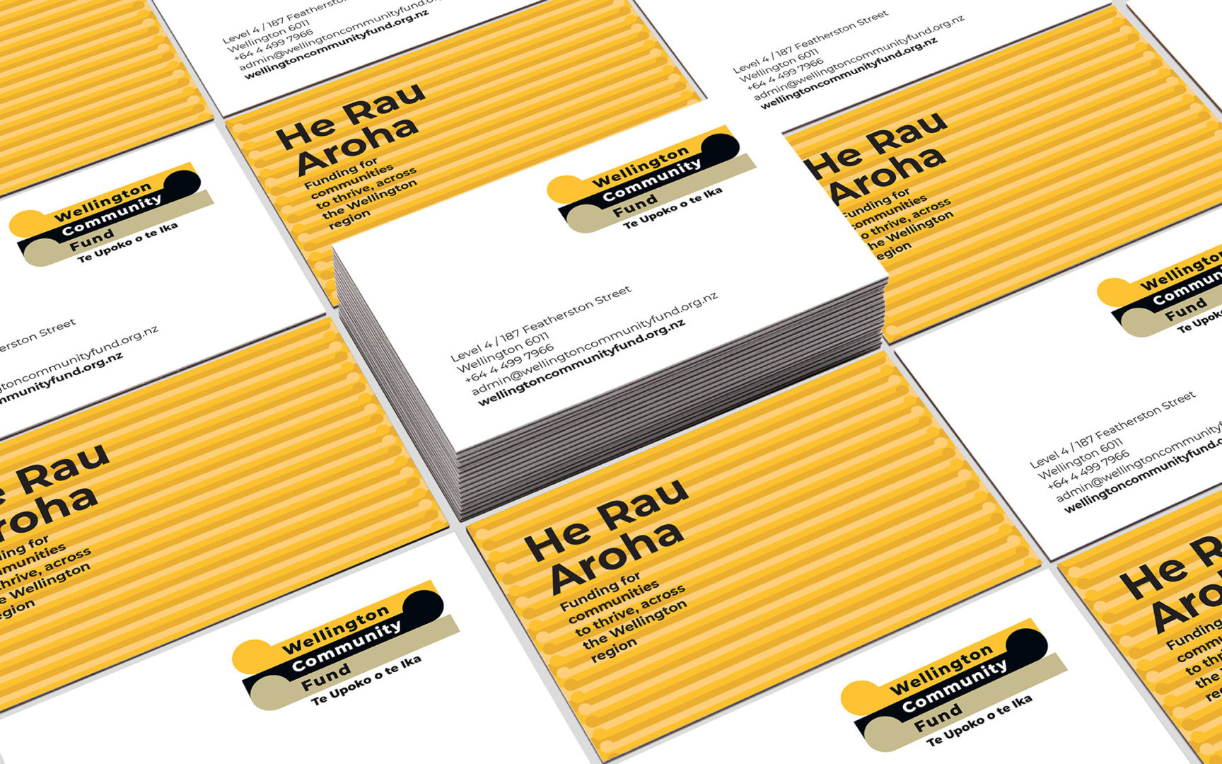
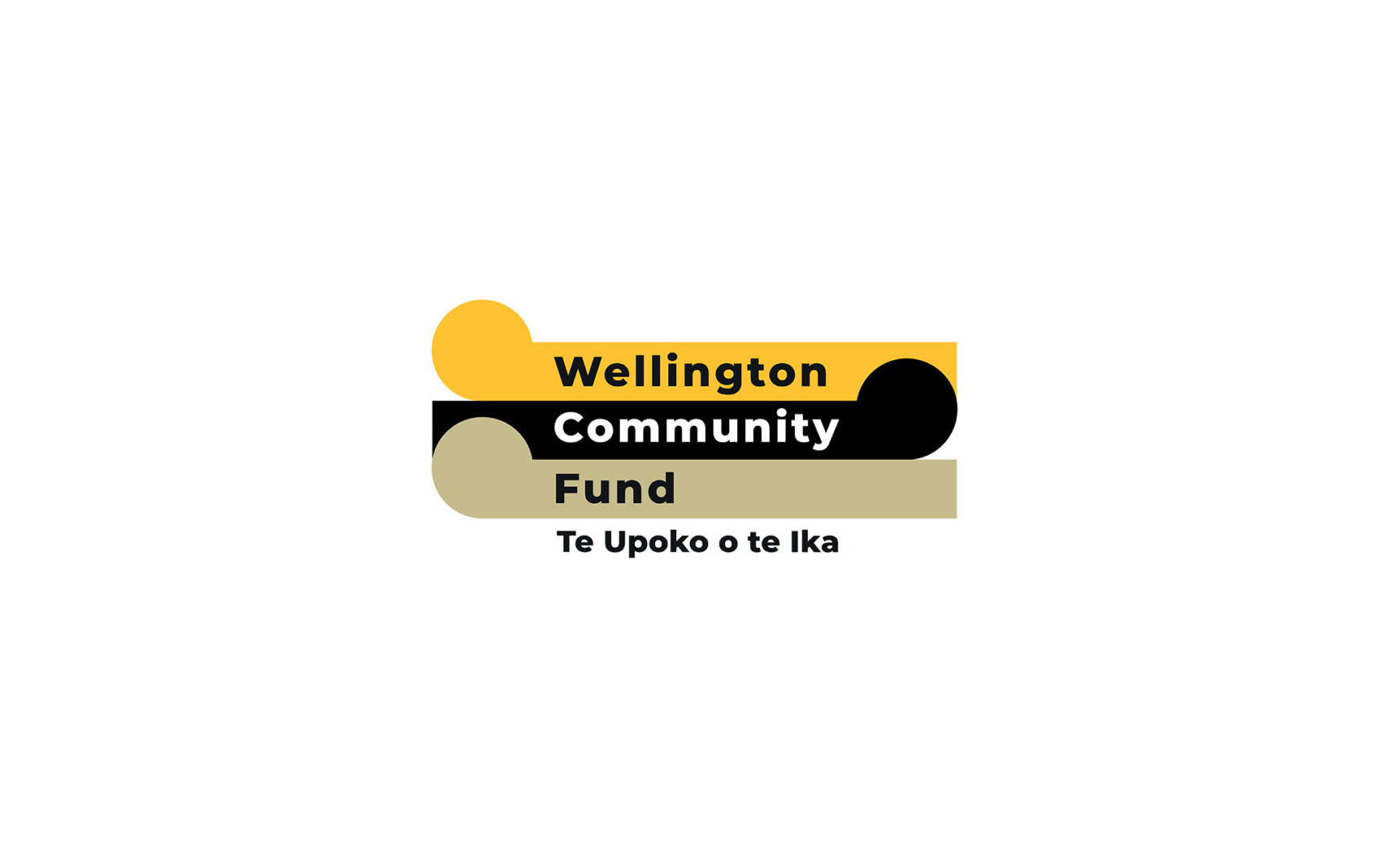
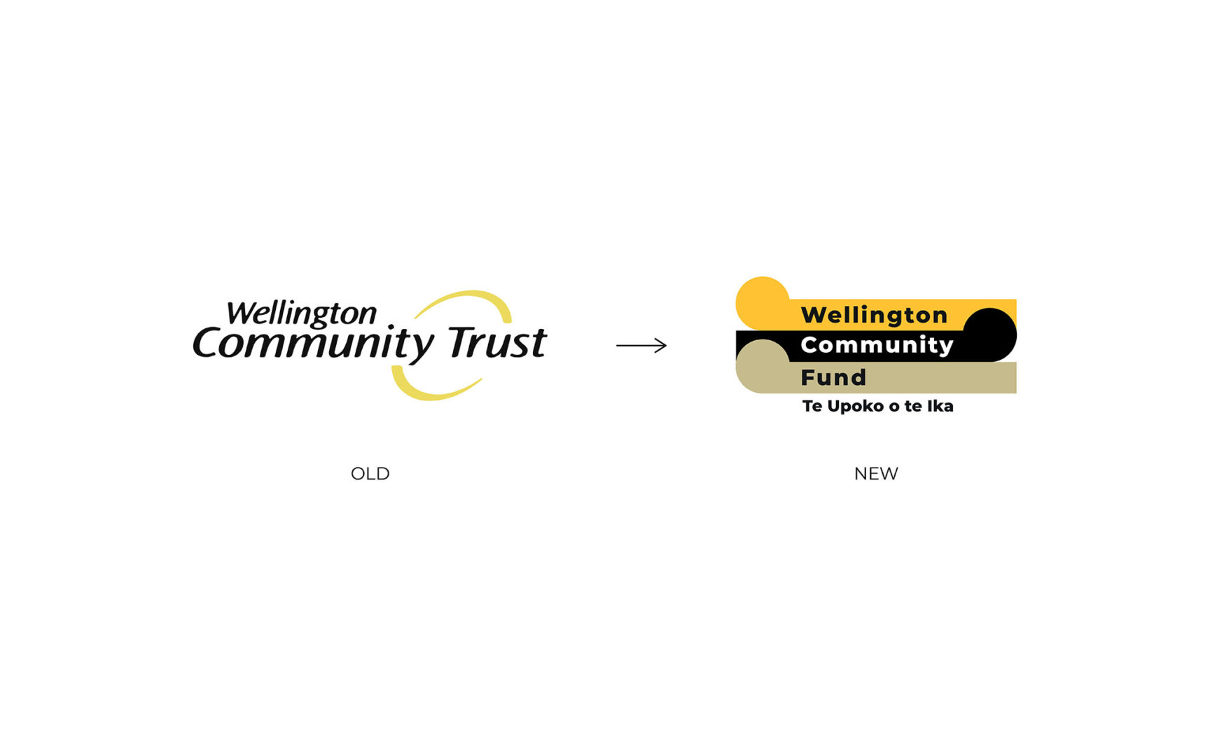
Rebrand was commissioned to undertake brand research with community and iwi partners and found that the Wellington Community Trust’s name and logo were no longer aligned with who they are today as a funder. Rebrand changed the name and redesigned the new logo incorporating a bi-line Te Upoko o Te Ika which is the Māori name for the Wellington region. The new logo design represents the ebb and flow of tides giving life to all communities of Te Upoko o te Ika.
The Challenge
Wellington Community Trust suspected that their name and logo were no longer aligned with who they are today as a funder. The name didn’t feel right and the branding felt outdated. Rebrand were selected as a brand agency best suited to help.
The Name
Rebrand conducted some research with community and iwi partners. We found the logo was visually not meeting current modern design standards. Furthermore, the name was not quite fit for purpose for two reasons:
- The word ‘Trust’ was not widely understood and caused confusion about what they do and where the money comes from.
- There had also been longstanding confusion between WCT and New Zealand Community Trust (a separate organisation which operates in a completely different way)
These key take outs from the research informed the decision to change our name to Wellington Community Fund. The words fund/funding/funder were consistently referenced when we asked our community partners to describe us; and therefore ‘fund’ came out as a better word than ’trust’.
In addition to this name change, we incorporated a bi-line Te Upoko o Te Ika which is the Māori name for the Wellington region. This helps to reinforce the fact that the funding is for the wider Wellington region all the way up to Ōtaki and it reflects the Wellington Community Fund’s commitment to assist and advance Māori aspirations for Mana Whenua and Taura Here in the region.
The Design
Several evolutions of the logo were explored by Rebrand and then agreed on by the leadership team and the board. The new logo design represents the ebb and flow of tides giving life to all communities of Wellington Te Upoko o te Ika.