A brand that clarifies
Capire work – Brand workshop | Consumer research | Brand research | Competitive Analysis | Positioning | Brand Strategy | Brand Naming | Brand design | Website design and build
![]()
Background
Helen came to us because she lacked a strong brand that resonated with the high-profile audiences she worked with. Her talents and experience were second to none and she was highly trusted by existing clients but there was a brand disconnect whereby her brand did not accurately position and portray her as such. In fact she didn’t really know even what word she should use to best describe ‘what’ she does as it’s a broad category.
She wanted a brand that authentically told her story and that she could be proud of – like the work she does for clients.
Evidence gathering
We conducted a detailed workshop to understand Helen and her business strategy and goals and also analysed the competition in this space. We conducted depth interviews with a handful of clients to gauge their perception of Helens services and brand but more importantly what they wanted from her and what words they use to define her.
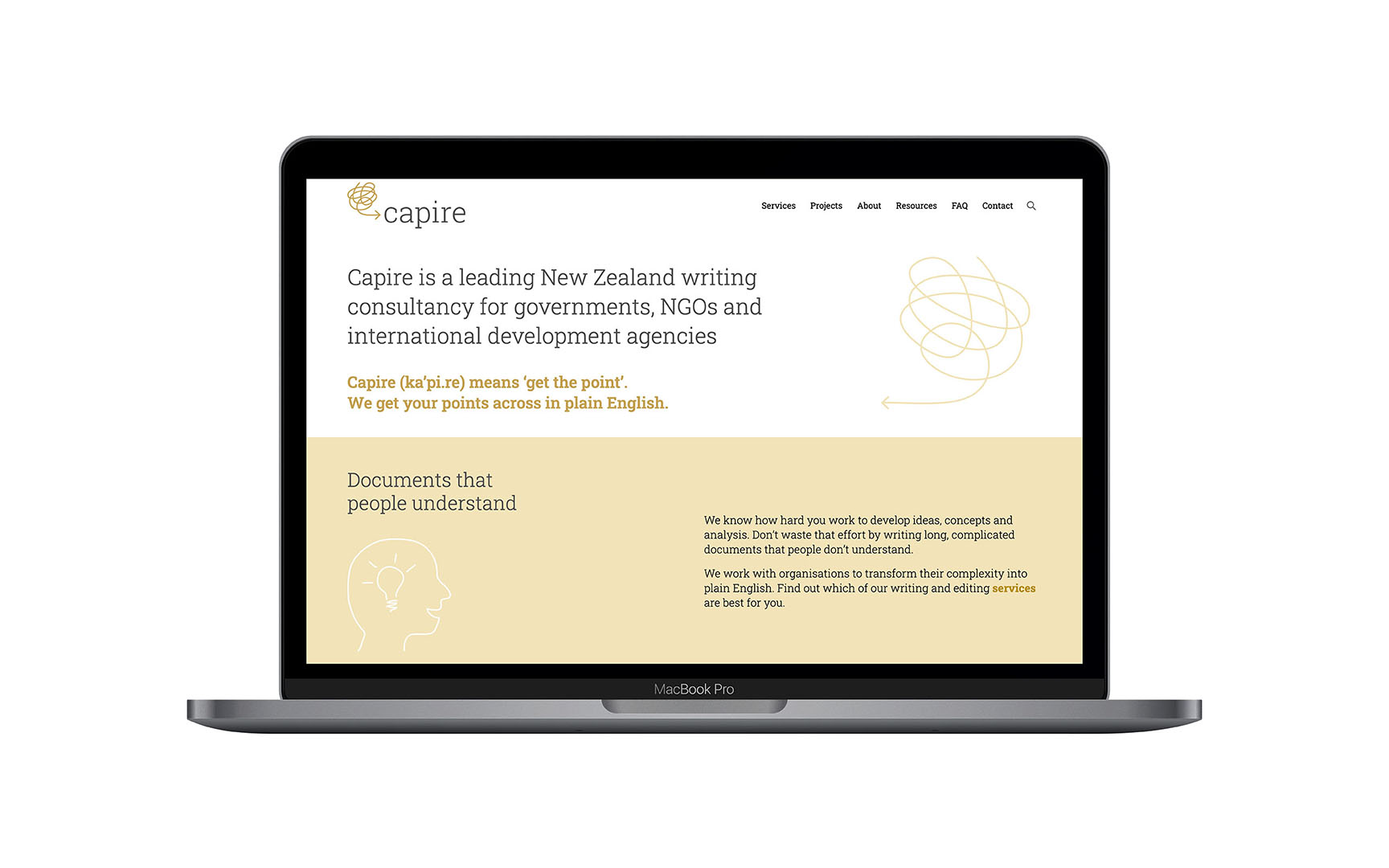
These valuable insights lead us to a core proposition of Complexity Simplified – providing clarity.
This then folded into naming options. A range of names around a variety of themes were explored to ensure we’d covered our bases. After so refinement and a lot of discussion we settled on a name that delivers clarity – Capire.
Capire (ka’pi.re) means ‘get the point’.
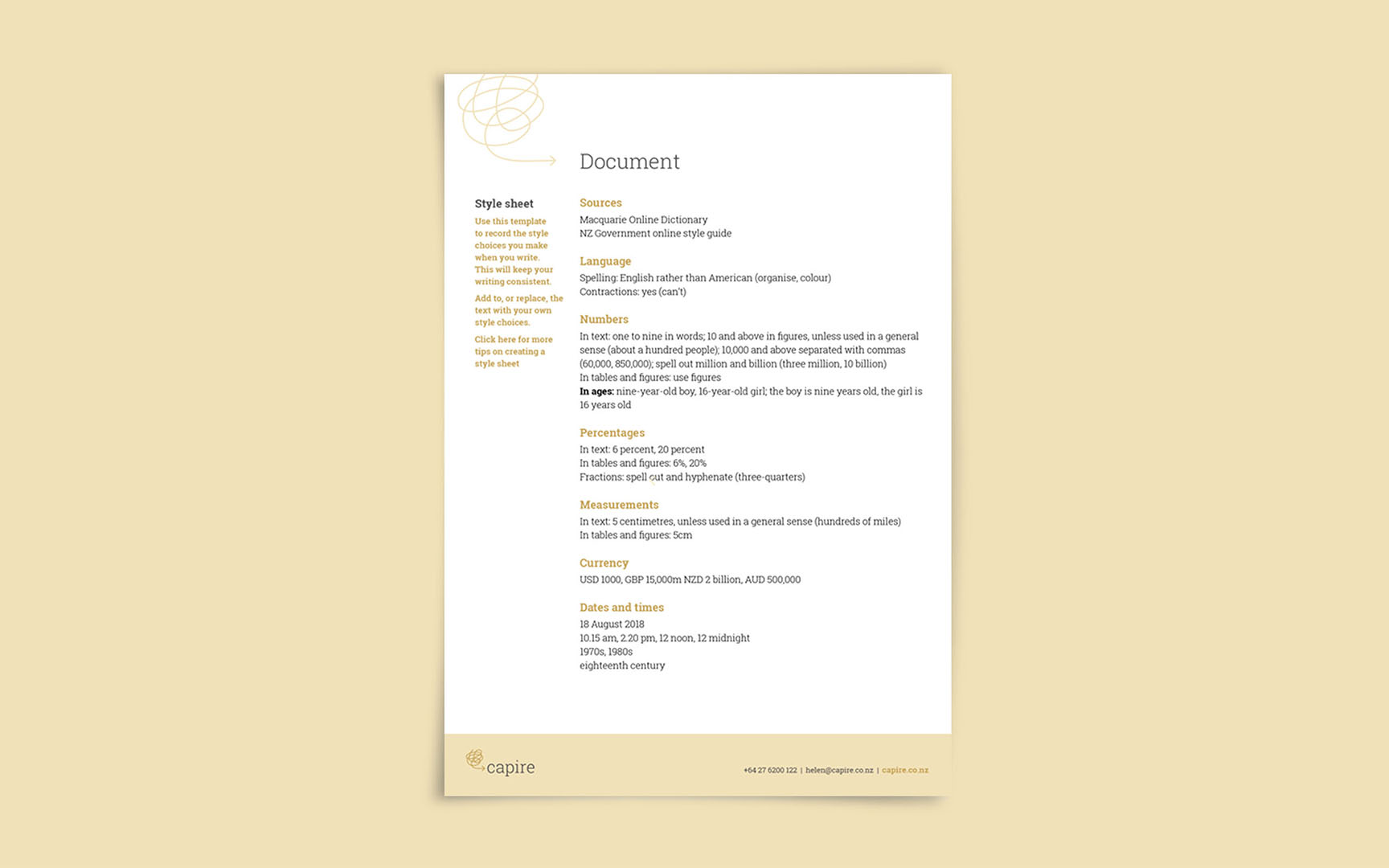
Helen is an expert at getting her clients point across in plain english but retaining mana and power in those documents and words.
Creative
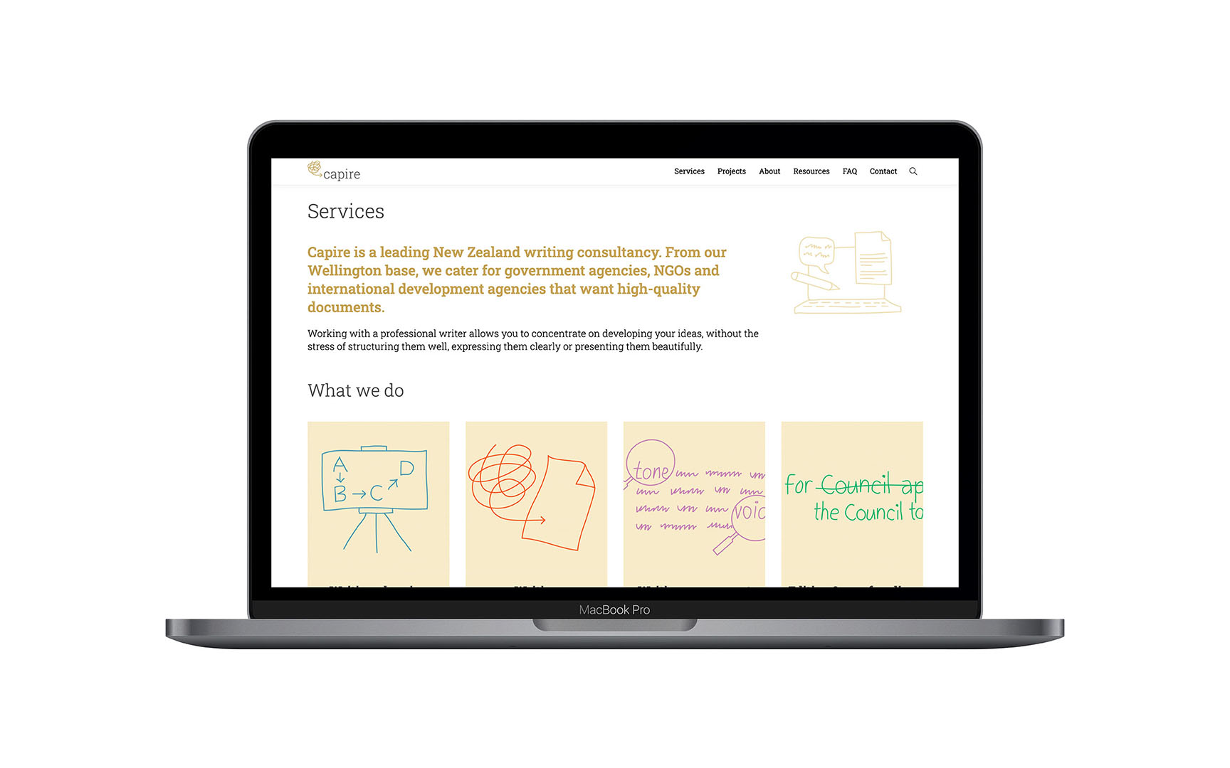
This direction shape the creative brief and allowed the creatives a theme to hang the brand upon. Demonstrating the muddle clients can find themselves in was done through a use of soft illustration that quickly conveyed her point of difference – a lot like how she wants her clients documents to perform!
These illustration and soft colour palette really help Capire stand out from the ‘writing/editor’ crowd and really seems to resonate with audiences.
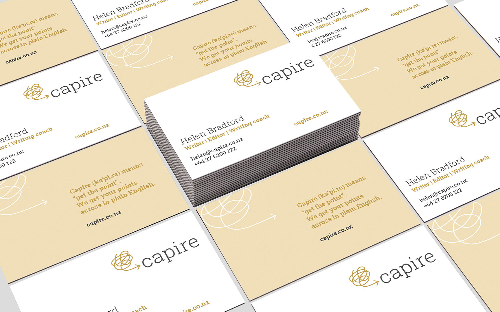
The brand symbol
The symbol is a scrumpled line that goes around and around in a jumble until it forms an arrow at the end – pointing to the word Capire which means ‘get the point’.
This symbol shape represents the brain and the ideas within it which ultimately have to come out clearly in order to communicate. It’s the process of copywriting.This line style flows into the other service illustrations. It gives the feeling of jotting down ideas and forming solutions. This portrays the abstract yet human nature of copywriting and editing.