BRAND UNITY
A brand amalgamation and sub branding project.
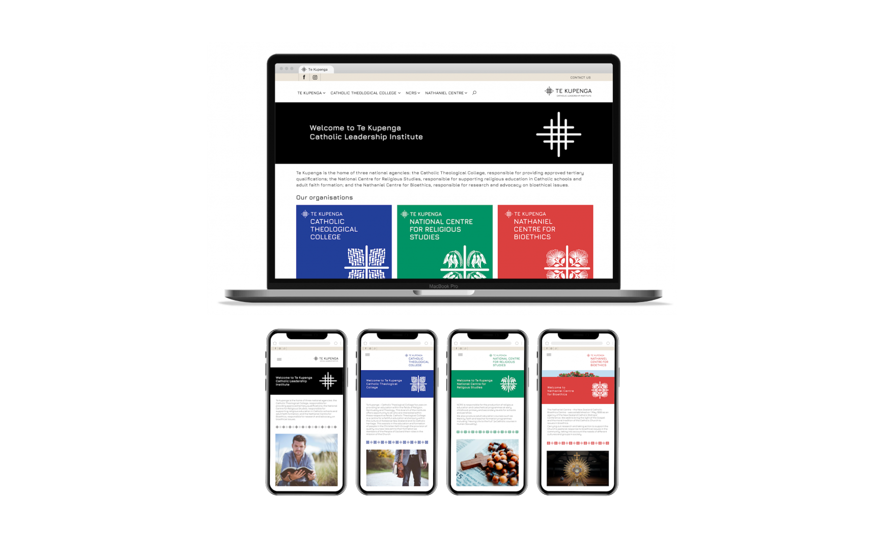
Brand Strategy | Naming | Internal Clarity | Market Positioning | Design | Website
“Staff have commented on their love for the brands.”
– Areti Metuamate, CEO
The New Zealand Catholic Bishops Conference has lead Catholicism in New Zealand for 150 years. However they faced a growing disparate group of organisations as they expanded. Customers had no idea they were connected, staff were confused and they lacked a main brand to act as a Government voice.
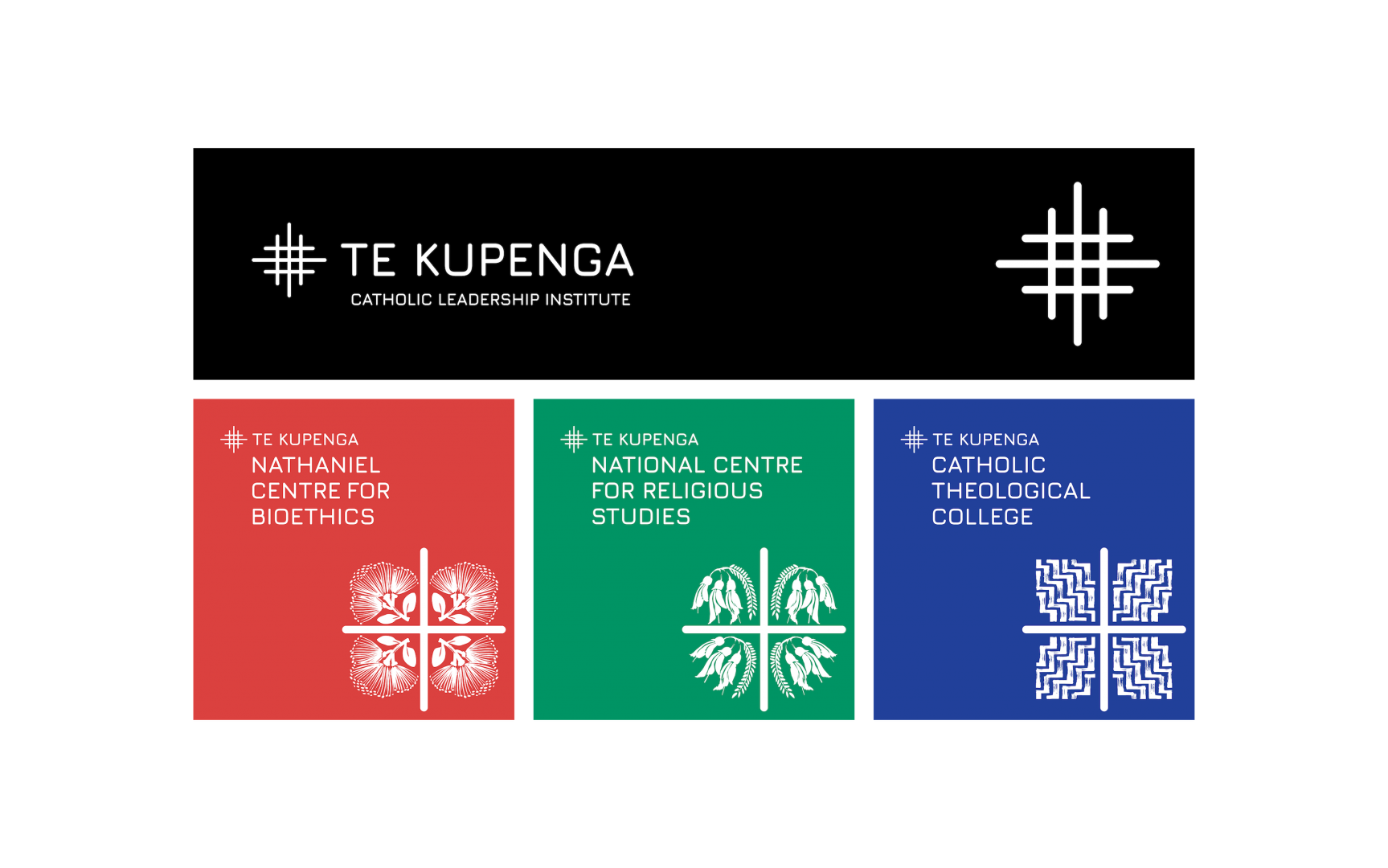
They wanted four main organisations to align more closely under a new name called Te Kupenga which comes from a Māori word meaning ‘the fishing net’.
The organisations to bring together were:
1. Te Kupenga Catholic Leadership Institute
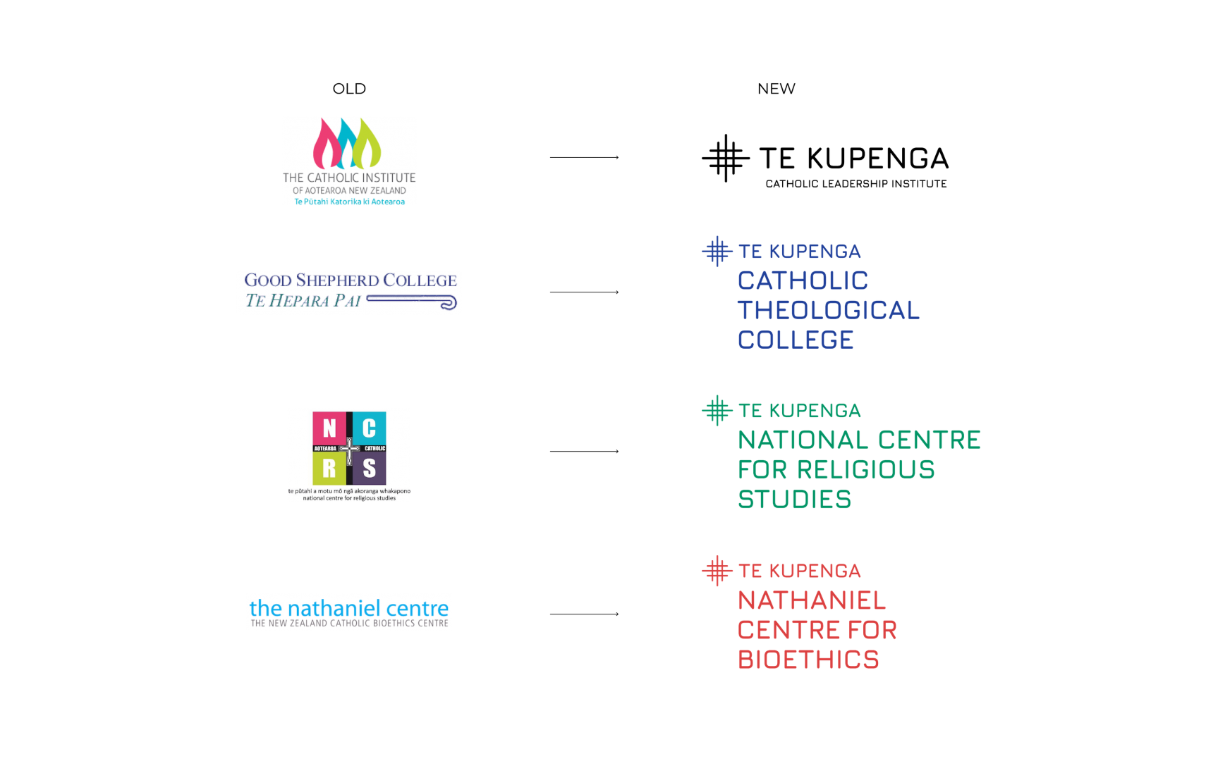
2. The Catholic Theological College [a merger of The Catholic Institute + Good Shepherd College]
3. National Centre for Religious Studies
4. The Nathaniel Centre for Catholic Bioethics.
The question they put to us was “Can branding help bring these closer together? To what extent should they be separate brands, or a singular brand?”.
We engaged with the project directors, Board, Bishops and various organisation leaders to understand their strategy and situation and facilitated a range of discussions on how best to align these organisations through brand architecture and the brand. This we resolved to one word – Unity.
This was our solution from old to new:
“Since the rebranding last we have had some serious uptake on the new brand.”
– Areti Metuamate, CEO
Industry Challenge
Catholicism has been in New Zealand for 150 years, under the guidance of the Bishops and the New Zealand Catholic Bishops Conference.
Over these decades there has been numerous organisations setup to help deliver the word of God across the country. A few years ago the Bishops realised they were becoming more disparate and disjointed in their delivery and perception for their education based organisation – they needed to amalgamate some key Catholic brands and create a figurehead organisation to help lead them into the future.
They knew it was time to challenge themselves, reimagine the how they appeal to Catholic, and non-religious, people and reinvigorate their brand to ensure they remained relevant for the decades ahead.
Strategy
The NZ Bishops had completed some strategic work to identify the ‘big-picture’ where they wanted to go but did not specify the ‘how’. We undertook a series of Director workshops to discuss, present and define how closely (or not) to align the brands – brand architecture. Staff workshops also revealed a lack of understanding on how the various organisation could come together and be united.
This was a very multifaceted and layered project with numerous key decision makers of different organisations that required managing and guiding to reach a strong solution.
Our approach to this project could be resolved to one word – Unity. Unifying these brands to demonstrate their leadership for Catholicism in New Zealand.
Tag Lines
We also developed key brand messaging to help the organisations more clearly communicate who they are, what they do and how they’re different. These tag lines have become invaluable to the business and help staff know the relationship between each.
TE KUPENGA Catholic Theological College – Explain your faith
TE KUPENGA National Centre for Religious Studies – Learn your faith
TE KUPENGA Nathaniel Centre for Bioethics – Research your faith
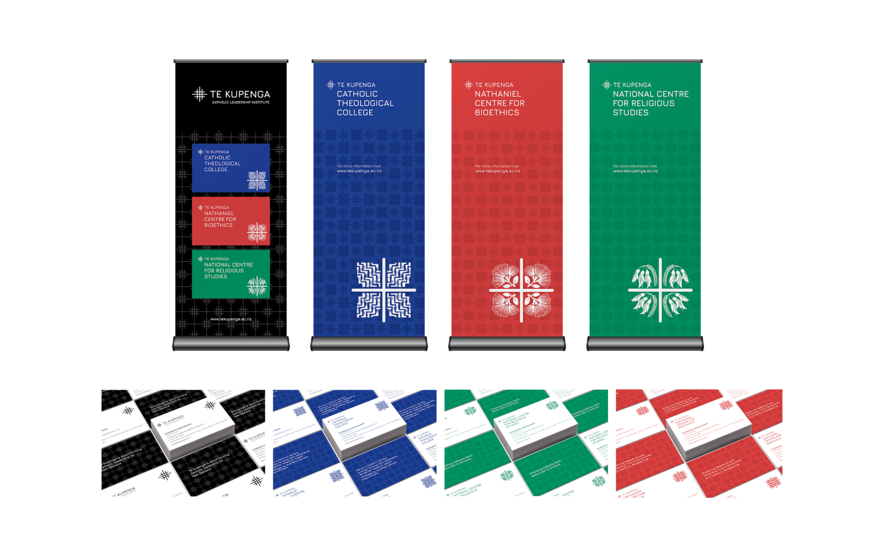
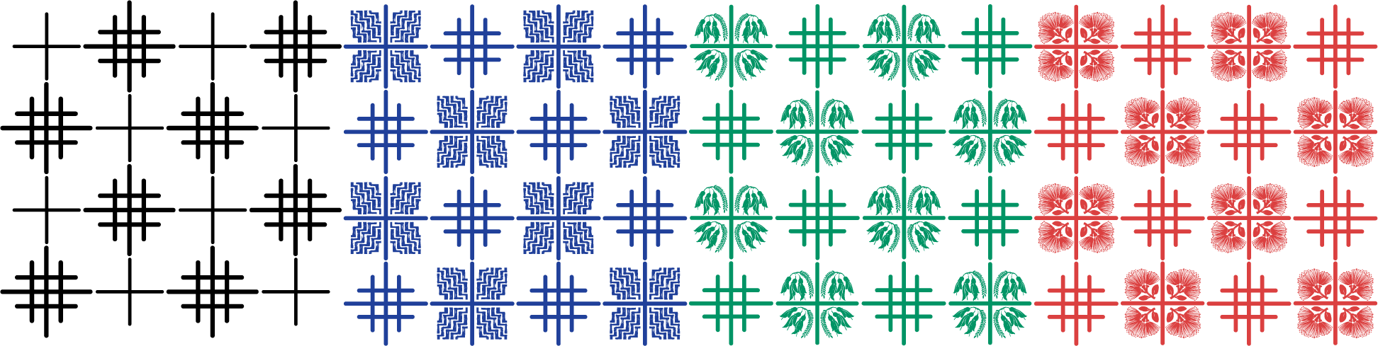
Graphic Symbology

Net cross
The net-cross. It symbolises Te Kupenga ‘the net of people’ because it is in the shape of a Greek Cross which is a symbol of the church (the people) as opposed to the Latin cross which represents the crucifixion.

Potama cross
The Potama pattern (the ‘stairway to heaven’) is a traditional Māori pattern that symbolises steps of learning.

Kowhai cross
In NZ the Kowhai flower symbolises abundant food. Here is means the nourishment of spiritual education.

Pohutukawa cross
The Pohutukawa flower symbolises the transitory nature of life. Here it relates to Nathaniel’s life and death and the moral ethics that surrounded it.
Patterns
The patterns are inspired by Pacifica tapa cloth design and tivaivai design. This is because Pacifica peoples are an important part of Catholic church in New Zealand. The patterns create the feeling of a large net.
Staff Clarity
Our process enabled the staff to understand and ‘be’ the organisation. By consulting with staff and presenting a clear branding system to staff we helped align their view of who they are. This has unified a culture amongst groups that were quite disparate.
“Now we can see how we fit together”
– Staff member