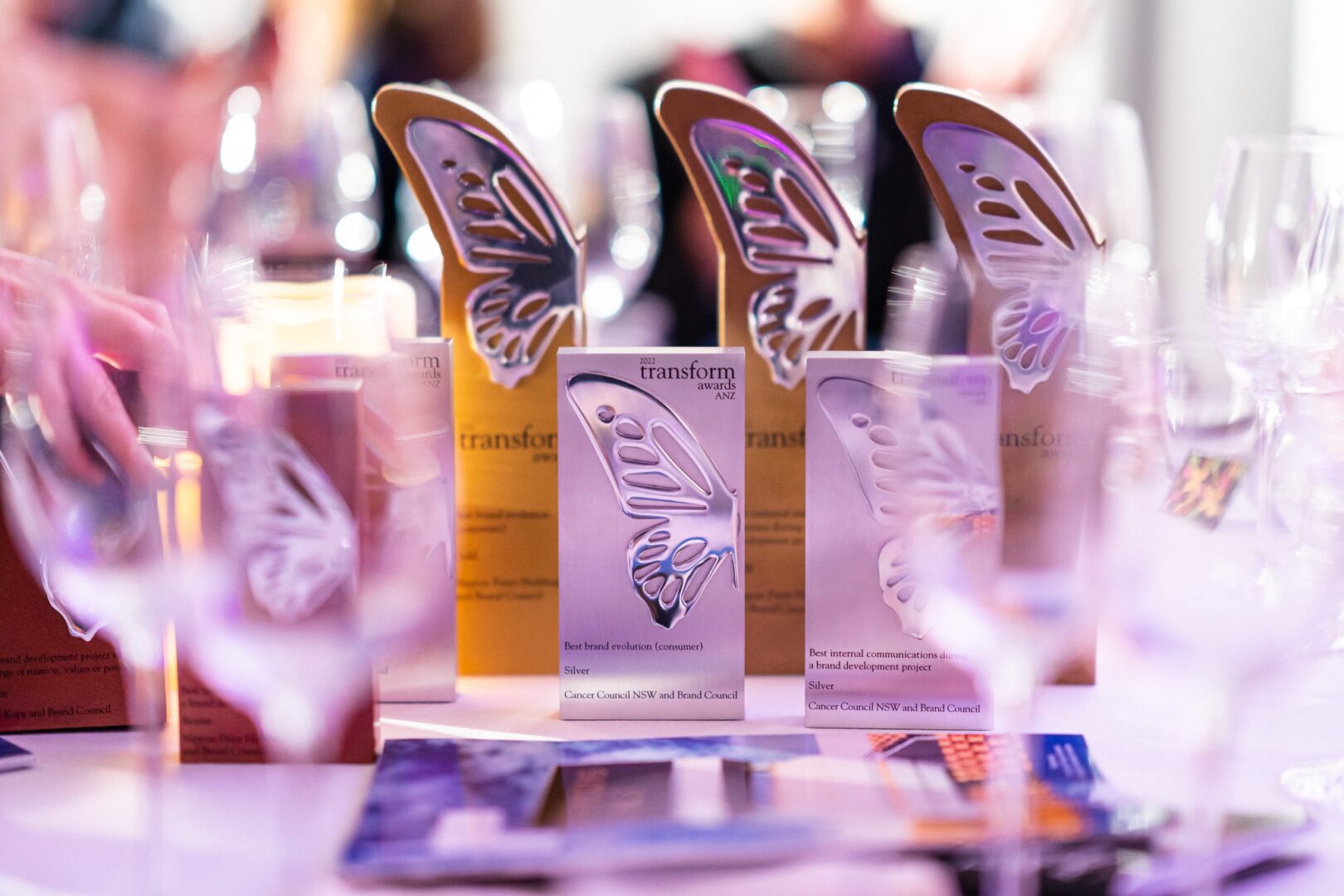
The 2022 Australasian Transform Branding have just concluded and we’ve won big again. In fact our best performance to date!
We picked up 3 GOLDS and 2 Silvers which against the best in the region is an incredible achievement. Let’s take a look.
Gold – Best use of packaging (Real Meals)
Wanting to move away from being perceived as a brand in the freeze-dried industry that exclusively caters for extreme adventure racers, Real Meals turned to Re:brand in the hope of increasing growth. The new packaging design created by the agency successfully underpinned the company’s ambitions of creating greater clarity, and positioned its products as everyday and for the mass market. Unlike competitors, Re:brand’s work utilised the rehydrated product and features it as the hero on the packaging. The hope that this could lead the brand to better stand out on shelf was confirmed by exceptional sales figures.
Judges were greatly impressed by the fact sales doubled in the first year since the rebrand. “A great example of repositioning for success,” said one judge. Another added, “Excellent example of how elevating the packaging and honing in a brand’s unique positioning can lead to powerful results.”
Gold – Best naming strategy (Real Meals)

Formerly known as Absolute Wilderness, freeze-dried brand Real Meals sought the help of Re:brand to reposition itself to the mass market, as opposed to just extreme adventure racers. The agency’s research informed it that one word kept occurring over and over: ‘Real.’ Making use of the brand’s unique offering that each of its meals are cooked beforehand by a qualified chef, Re:brand created a name which it hoped would align better to consumer needs. Sales of the newly named Real Meals doubled in the first year following the brand refresh.
“I love the name and articulated challenge,” commented one judge. “Plus, the insight-led strategy was really well done and communicated well in the submission.” Other judges praised the project for clearly understanding the consumers’ needs and therefore creating a well-positioned brand to match them with its no-nonsense name.
Gold – Best place or nation brand (KRL)

The combining of three Wellington suburbs (Kilbirnie, Rongotai and Lyall Bay) to form a single Business Improvement District resulted in the creation of KRL by Re:brand. The creative challenge of unifying the suburbs was solved by imitating an airport luggage tag, which also became the logo, thus making it feel like a destination brand of choice. The new brand was successfully able to bring to life the uniqueness of the area, highlighting its best parts such as the beach, shops and breweries.
“Love this,” said one judge. “All the elements – from naming, visuals and application across channels and messaging – were excellent.” Another judge, meanwhile, praised the depth of research undertaken during the project. “A fun and creative delivery; you feel you’re on the journey!” added another judge.
Silver – Best visual identity from the FMCG sector (Real Meals)
In changing its name from Absolute Wilderness to Real Meals, Re:brand helped open the freeze-dried brand up to a wider market. Its visual identity followed suit with a logo change to a simpler design featuring a sage leaf along with a colour alteration to a dark brown and other muted organic colours. “Good measurement and results,” noted one judge.
Silver – Best visual identity from the industrial and basic materials sector (pH7)

Hazard and chemical supplier Dalton International, later renamed pH7, came to the realisation it needed a new brand strategy. Re:brand took up the mantle and, after renaming the brand, designed a logo with typography that adopts stencil lettering and therefore hints at the industrial process. “Very clever and achieved objectives. Great entry!” commented one judge.

