BRANDING THAT FINDS LEADERS
Rebranding for NZ’s leading executive search company based in Auckland.
Research | Brand strategy | Positioning | Copywriting | Design | Website
Hobson Leavy Executive Search talk about their branding experience. They explain how a strong brand has helped them increase profit and win them premium assignments.
Project outline
Hobson Leavy, an Executive Search firm in New Zealand, didn’t realise their decade-old, $200 brand ‘investment’ was hurting their business. It impacted upon staff understanding of who the company was. It reflected on the partners as not demonstrating leadership. Clients were presented with a brand that was inconsistent and dated. Their brand leadership was lost and needed to be found.
A brand assessment revealed a dated, monotone brand that wasn’t communicating its position in the market at all well. We spoke with their clients and this revealed some stark insights. The two founding partners were very prominent and their service delivery was perceived as world-leading, but they struggled to generate any brand recall of simple elements – a logo, colours, or more importantly, what they stood for. At this point we knew they had a brand issue.
After workshops with the partners and engaging the team we developed a strategy that would meet their objectives, being; to resolve the disconnect between high quality service yet poor brand recall, to move the brand away from just the partners, to establish themselves as Executive Search specialists and to differentiate in a slightly stagnant market.
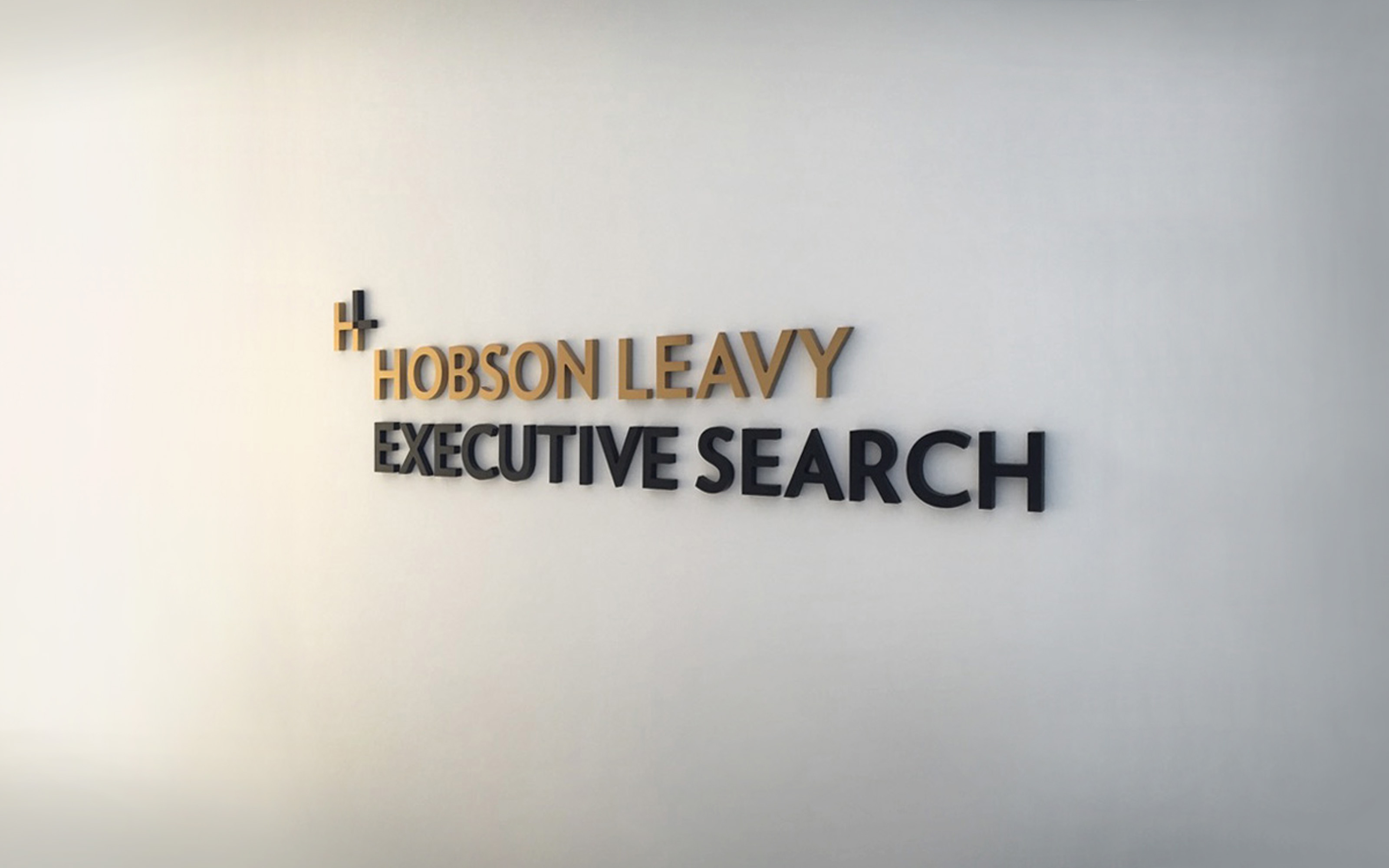
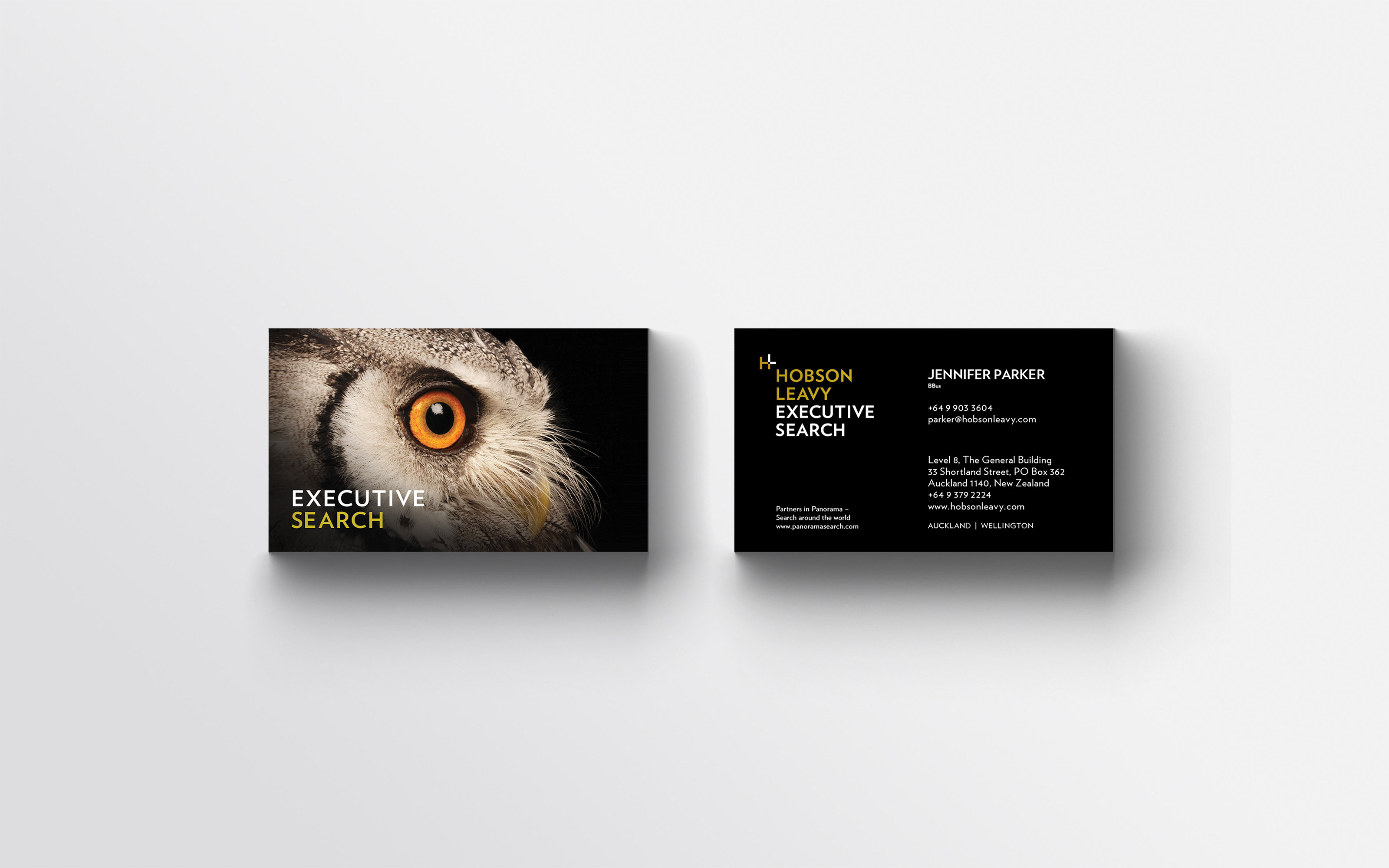
We started by distilling exactly what they do, how they do it and why they do it. This engaged staff and established ownership of the process. From here we devised a simple but ingenious idea to ‘own’ the market: elevate the words Executive Search in the logo giving equal prominence to the company name. This bold move stamped their ‘specialists’ ownership on the industry, it reduced the hierarchy of the two partners and clearly differentiated.
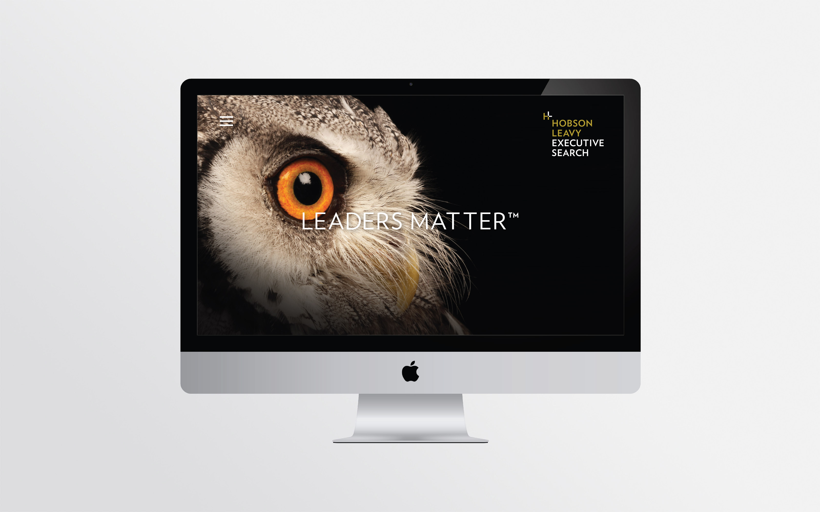
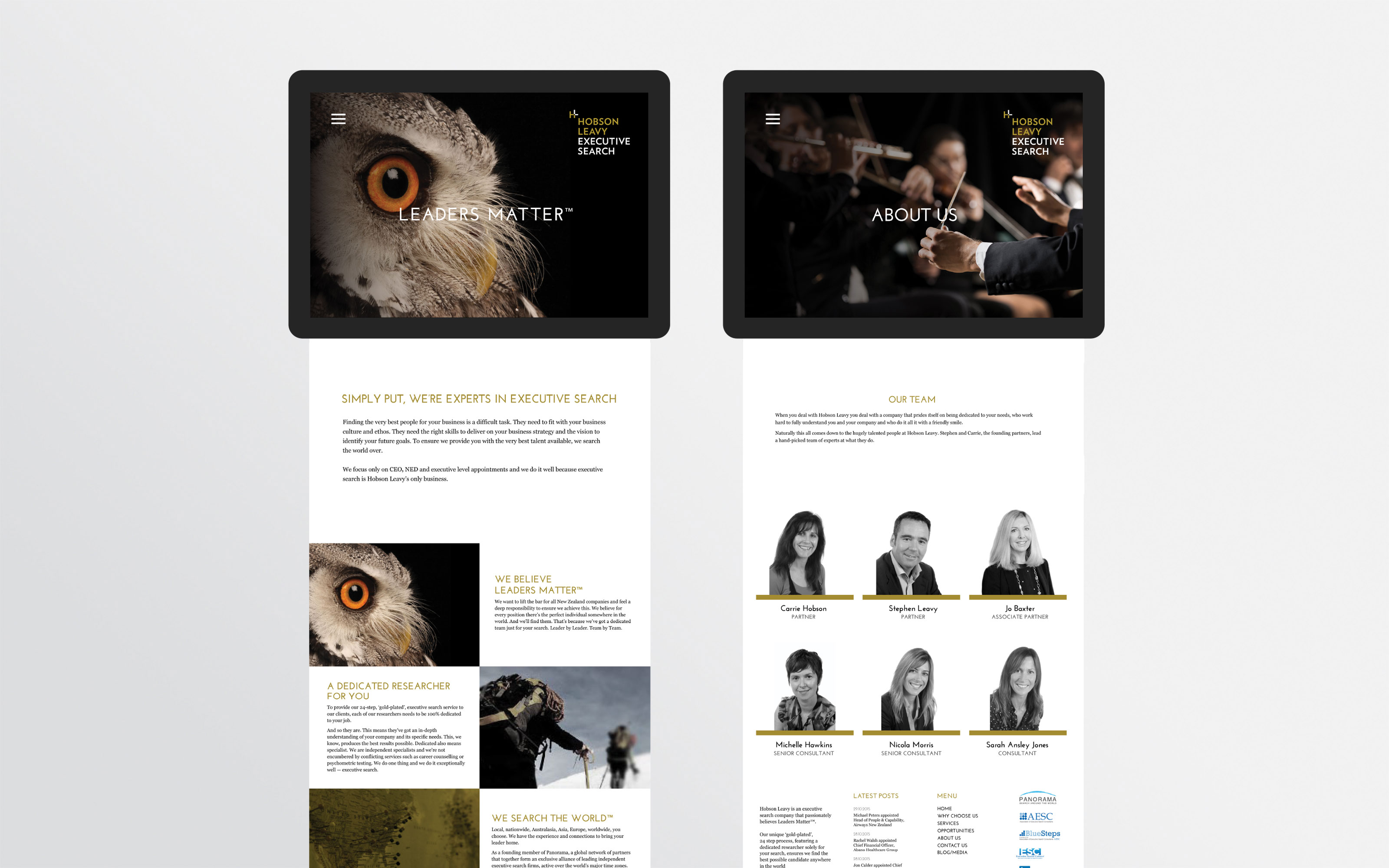
Next we elevated the brand to an executive feel and presence that matched the service quality and expectations of a very discerning target market. This was achieved by bold use of colour; black with gold foil. Stunning imagery lead by the wise, ‘search-king’ Owl cut through market uniformity. And this was supported by several key brand statements, with images, that we had resolved to communicate to a time-poor target market.
The end result is a brand that now sings – with all elements working in perfect harmony. In short, they’ve found their leaders.